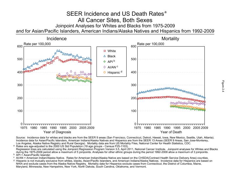
Here is a graph of the change in cancer diagnosis and mortality over time. Between 1975 and 1990, diagnosis went up 25% in whites, while deaths remained flat. Since 1990, diagnosis has been fairly flat, while deaths have declined a bit.
25% is less of an increase than I expected, but it varies from type to type. I don't think I'd notice a 25% increase over 15 years. Aging of the population (of the US, of your friends) is the main candidate for what you notice, but another possibility is that people are more open about having cancer today than in the past.
That site breaks down the data more finely, but it's not possible to link to most of it. Here is a tool for graphing their data.
Mentions include selection bias, lack of reproduction of results, naturalistic fallacy, status signalling, habituation, science as attire, and maybe some I didn't catch.
http://www.youtube.com/watch?v=3g1denSoAbc&feature=player_embedded