I'm skeptical of the accuracy of the income distribution chart. The Wikipedia page linked to below shows GDP per capita for every country. Many countries that we think of as "poor" are actually "middle income". For example, Malaysia is at 16K, Colombia is at 10K, Thailand is at 9K, and China is at 8K. Obviously these mean values are somewhat misleading because of inequality, but still. I lived for many years (in grad school) at an income level of only about 2x the average income of a person living in Thailand, so I think the fact that I don't feel rich is well-grounded in reality.
Edit: there is an issue with the LW markup and Wikipedia's URL naming convention, so I included a TinyUrl instead.
I was going to say, "double the (global) median income still sounds pretty rich." But the median income for individuals in the US is $42,693, and I would consider double that to be well-off but not Scrooge McDuck-style rich.
Why give globally? Why give money? Why health charities? Why single-issue organizations? At first glance these all seem like arbitrary choices: what if I would rather volunteer, or donate to local charities? Why does it matter? It comes down to two distributions: cost-effectiveness and income.
DALYs per $1000
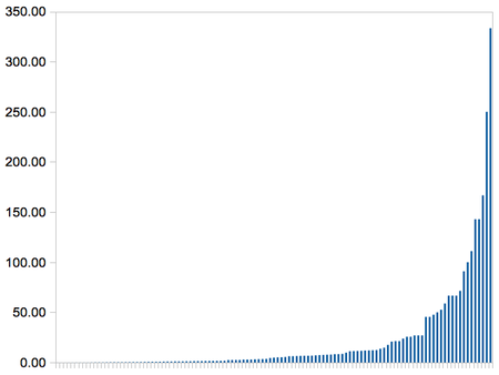
This shows the cost-effectiveness of a large number of health interventions, with taller bars in cases where we can avert more death and suffering per dollar. The shape of this chart is important: while we can do a lot of good if we pick an intervention at random or support a 'horizontal' effort that works on everything, we can do 300 times better by picking one in the top 10%. This is why single-issue charities make sense: you can pick one that focuses on a top intervention.
(Don't let the small bars on the left fool you: nearly every intervention on that chart is worth doing [1], some are just far more valuable than others.)
This only considers health: what about other ways of helping people? Political advocacy, development, literacy, human rights, why not them? The big thing health has going for it is that we can measure impact, which lets us choose only the best options. In other fields where we can't measure we could end up anywhere on the impact curve.
Let's look at another distribution:
So some people have a lot more money that other people, we knew that, right? But have a look at the scale. Someone earning at the poverty line in the US is richer than 90% of people. This is why giving globally is so powerful: small amounts of your money can mean a huge amount to people who have so much less.
Neither of these distributions are intuitive: we don't feel that rich, and charities all seem kind of interchangeable. But understanding them can make the difference between trying to do good and really succeeding.
(I first saw these charts in a talk by Toby Ord of Giving What We Can (GWWC). The data for the first chart, DALYs per $1000, comes from the DCP2. This was a project that, among other things, compiled cost effectiveness estimates for a very wide range of health interventions. I made the chart from the csv version of the data from here, excluding the ~60 interventions (of 171) that didn't have estimates. The second chart is straight from GWWC's website, and you can read the details there by clicking on footnote 4.)
[1] The median intervention there is $207/DALY, which roughly means it can give someone an extra year of healthy life for $207. Which is an incredible deal, that I think most of us would jump at. And it's less than 5 pixels high.
I also posted this on my blog.