Marginal Revolution linked a post at Genomes Unzipped, "Size matters, and other lessons from medical genetics", with the interesting centerpiece graph:

This is from pg 3 of an Ioannidis 2001 et al article (who else?) on what is called a funnel plot: each line represents a series of studies about some particularly hot gene-disease correlations, plotted where Y = the odds ratio (measure of effect size; all results are 'statistically significant', of course) and X = the sample size. The 1 line is the null hypothesis, here. You will notice something dramatic: as we move along the X-axis and sample sizes increase, everything begins to converge on 1:
Readers familiar with the history of medical association studies will be unsurprised by what happened over the next few years: initial excitement (this same polymorphism was associated with diabetes! And longevity!) was followed by inconclusive replication studies and, ultimately, disappointment. In 2000, 8 years after the initial report, a large study involving over 5,000 cases and controls found absolutely no detectable effect of the ACE polymorphism on heart attack risk. In the meantime, the same polymorphism had turned up in dozens of other association studies for a wide range of traits ranging from obstetric cholestasis to meningococcal disease in children, virtually none of which have ever been convincingly replicated.
(See also "Why epidemiology will not correct itself" or the DNB FAQ.)
This graph is interesting as it shows 8 different regressions to the mean. What is also interesting is what a funnel plot is usually used for, why I ran into it in the first place reading Cochrane Group materials - it's used to show publication bias.
That is, suppose you were looking at a gene you know for certain not to be correlated (you knew the null result to be true), and you ran many trials, each with a different number of samples; you would expect that the trials with small samples would have a wide scattering of results (sometimes the effect size would look wildly large and sometimes they would look wildly small or negative), and that this scattering would be equally for and against any connection (on either side of the 1 line). By the same reasoning you would expect that your largest samples would only be scattered a little bit on either side of the 1 line, and the larger the sample the closer they will be to the 1/null line.
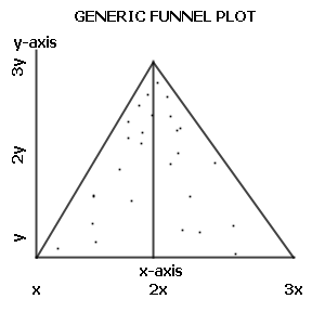
If you plotted your hypothetical trials on the above graph, you'd see what looks pretty much like the above graph - a kind of triangular cloud, wide on the left and ever narrowing towards the right as sample sizes increase and variance decreases.
Now here's the question: given that all 8 correlations trend steadily towards the null hypothesis, one would seem to expect them to actually be the null result. But if that is so, where are the random trials scattered on the other side of the 1 line? Not one sequence of studies ever crosses the 1 line!
The ACE story is not unique; time and time again, initial reports of associations between candidate genes and complex diseases failed to replicate in subsequent studies. With the benefit of hindsight, the problem is clear: in general, common genetic polymorphisms have very small effects on disease risk. Detecting these subtle effects requires studying not dozens or hundreds, but thousands or tens-of-thousands of individuals. Smaller studies, which had no power to detect these small effects, were essentially random p-value generators. Sometimes the p-values were “significant” and sometimes not, without any correlation to whether a variant was truly associated. Additionally, since investigators were often looking at only a few variants (often just one!) in a single gene that they strongly believed to be involved in the disease, they were often able to subset the data (splitting males and females, for example) to find “significant” results in some subgroup. This, combined with a tendency to publish positive results and leave negative results in a desk drawer, resulted in a conflicted and confusing body of literature which actively retarded medical genetics progress.
Wikipedia's funnel chart graph shows us how a plot should look (with this time sample size being the Y axis and odds being the X axis, so the triangle is rotated):
Does that describe any of the sequences graphed above?
I'm planning on doing a statistical study with a sample size of 21 companies. This is a financial study, and the companies chosen are the only ones that will be reporting their 2011 financial results on a certain basis necessary for the testing. (Hence the sample size.)
I'm going to do this regardless of which hypothesis is supported (the null hypothesis, my alternative hypothesis, or neither). So, I'm promising an absence of publication bias. (The null hypothesis will be supported by a finding of little or no correlation; my alternative hypothesis by a negative correlation.)
In this case, the small sample size is the result of available data, and not the result of data-mining. If the results are statistically significant and have a sizable effect, I'm of the opinion that the conclusions will be valid.
Sadly, your commitment to this goal is not enough, unless you also have a guarantee that someone will publish your results even if they are statistically insignificant (and thus tell us absolutely nothing). I admit I've never tried to publish something, but I doubt that many journals would actually do that. If they did the result would be a journal rendered almost unreadable by the large percentage of studies it describes with no significant outcome, and would remain unread.
If your study doesn't prove either hypothesis, or possibly even if it proves the nu... (read more)