From reading the other comments, this poster makes a three-way top level distinction.
Along similar-ish lines, it might be possible to use the hierarchy to score the quality of an argument. Essentially you'd assign a score from -4 to +4 for DH0 to DH7, then score an argument based on it's content. Although once you know it contains (say) a DH4 argument, you wouldn't keep on adding points for more DH4 arguments (otherwise an argument that was purely lots of DH4 statements would get a higher score than one DH7 statement).
It depends.
Usually you don't make use of a fallacy, it's more that you unknowingly commit one. If that's the case then the bias is in both you and the person who is persuaded by it.
On the other hand if you intentionally use a fallacy in order to persuade someone, you're a) dabbling in the dark arts and b) not actually biased (as you're not convinced by your own fallacy). However if you succeed in persuading someone with this method then that person would be the one with bias.
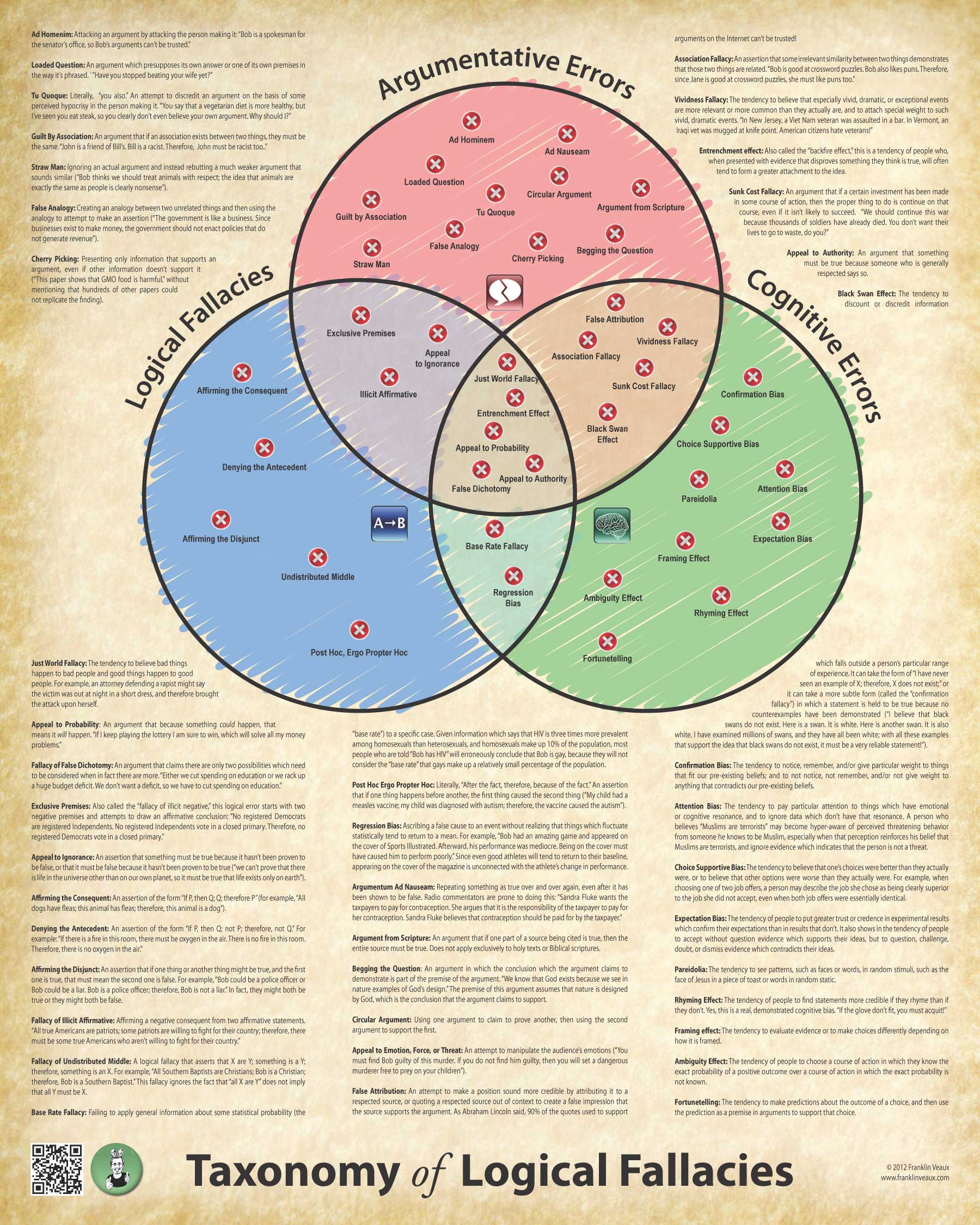
Following http://lesswrong.com/lw/bwo/logical_fallacy_poster/ some people complained about
Yet this poster has ONE key difference with the ideal poster, it exists.
If it sparks criticisms that lead to a new, LessWrong compatible poster, then it is well worth the critics.
The obvious next step then is to make a poster that would allow to take into account such well founded suggestion and synthesize the LessWrong lessons visually.
In your opinion then what would be a good structure, e.g. a hierarchy of fallacies, and a design theme?