[I'm unsure how much this rehashes things 'everyone knows already' - if old hat, feel free to downvote into oblivion. My other motivation for the cross-post is the hope it might catch the interest of someone with a stronger mathematical background who could make this line of argument more robust]

[Edit 2014/11/14: mainly adjustments and rewording in light of the many helpful comments below (thanks!). I've also added a geometric explanation.]

Many outcomes of interest have pretty good predictors. It seems that height correlates to performance in basketball (the average height in the NBA is around 6'7"). Faster serves in tennis improve one's likelihood of winning. IQ scores are known to predict a slew of factors, from income, to chance of being imprisoned, to lifespan.

What's interesting is what happens to these relationships 'out on the tail': extreme outliers of a given predictor are seldom similarly extreme outliers on the outcome it predicts, and vice versa. Although 6'7" is very tall, it lies within a couple of standard deviations of the median US adult male height - there are many thousands of US men taller than the average NBA player, yet are not in the NBA. Although elite tennis players have very fast serves, if you look at the players serving the fastest serves ever recorded, they aren't the very best players of their time. It is harder to look at the IQ case due to test ceilings, but again there seems to be some divergence near the top: the very highest earners tend to be very smart, but their intelligence is not in step with their income (their cognitive ability is around +3 to +4 SD above the mean, yet their wealth is much higher than this) (1).

The trend seems to be that even when two factors are correlated, their tails diverge: the fastest servers are good tennis players, but not the very best (and the very best players serve fast, but not the very fastest); the very richest tend to be smart, but not the very smartest (and vice versa). Why?

Too much of a good thing?

One candidate explanation would be that more isn't always better, and the correlations one gets looking at the whole population doesn't capture a reversal at the right tail. Maybe being taller at basketball is good up to a point, but being really tall leads to greater costs in terms of things like agility. Maybe although having a faster serve is better all things being equal, but focusing too heavily on one's serve counterproductively neglects other areas of one's game. Maybe a high IQ is good for earning money, but a stratospherically high IQ has an increased risk of productivity-reducing mental illness. Or something along those lines.

I would guess that these sorts of 'hidden trade-offs' are common. But, the 'divergence of tails' seems pretty ubiquitous (the tallest aren't the heaviest, the smartest parents don't have the smartest children, the fastest runners aren't the best footballers, etc. etc.), and it would be weird if there was always a 'too much of a good thing' story to be told for all of these associations. I think there is a more general explanation.

The simple graphical explanation

[Inspired by this essay from Grady Towers]

Suppose you make a scatter plot of two correlated variables. Here's one I grabbed off google, comparing the speed of a ball out of a baseball pitchers hand compared to its speed crossing crossing the plate:

It is unsurprising to see these are correlated (I'd guess the R-square is > 0.8). But if one looks at the extreme end of the graph, the very fastest balls out of the hand aren't the very fastest balls crossing the plate, and vice versa. This feature is general. Look at this data (again convenience sampled from googling 'scatter plot') of this:

Or this:

Or this:

Given a correlation, the envelope of the distribution should form some sort of ellipse, narrower as the correlation goes stronger, and more circular as it gets weaker: (2)

The thing is, as one approaches the far corners of this ellipse, we see 'divergence of the tails': as the ellipse doesn't sharpen to a point, there are bulges where the maximum x and y values lie with sub-maximal y and x values respectively:

So this offers an explanation why divergence at the tails is ubiquitous. Providing the sample size is largeish, and the correlation not too tight (the tighter the correlation, the larger the sample size required), one will observe the ellipses with the bulging sides of the distribution. (3)

Hence the very best basketball players aren't the very tallest (and vice versa), the very wealthiest not the very smartest, and so on and so forth for any correlated X and Y. If X and Y are "Estimated effect size" and "Actual effect size", or "Performance at T", and "Performance at T+n", then you have a graphical display of winner's curse and regression to the mean.

An intuitive explanation of the graphical explanation

It would be nice to have an intuitive handle on why this happens, even if we can be convinced that it happens. Here's my offer towards an explanation:

The fact that a correlation is less than 1 implies that other things matter to an outcome of interest. Although being tall matters for being good at basketball, strength, agility, hand-eye-coordination matter as well (to name but a few). The same applies to other outcomes where multiple factors play a role: being smart helps in getting rich, but so does being hard working, being lucky, and so on.

For a toy model, pretend that wealth is wholly explained by two factors: intelligence and conscientiousness. Let's also say these are equally important to the outcome, independent of one another and are normally distributed. (4) So, ceteris paribus, being more intelligent will make one richer, and the toy model stipulates there aren't 'hidden trade-offs': there's no negative correlation between intelligence and conscientiousness, even at the extremes. Yet the graphical explanation suggests we should still see divergence of the tails: the very smartest shouldn't be the very richest.

The intuitive explanation would go like this: start at the extreme tail - +4SD above the mean for intelligence, say. Although this gives them a massive boost to their wealth, we'd expect them to be average with respect to conscientiousness (we've stipulated they're independent). Further, as this ultra-smart population is small, we'd expect them to fall close to the average in this other independent factor: with 10 people at +4SD, you wouldn't expect any of them to be +2SD in conscientiousness.

Move down the tail to less extremely smart people - +3SD say. These people don't get such a boost to their wealth from their intelligence, but there should be a lot more of them (if 10 at +4SD, around 500 at +3SD), this means one should expect more variation in conscientiousness - it is much less surprising to find someone +3SD in intelligence and also +2SD in conscientiousness, and in the world where these things were equally important, they would 'beat' someone +4SD in intelligence but average in conscientiousness. Although a +4SD intelligence person will likely be better than a given +3SD intelligence person (the mean conscientiousness in both populations is 0SD, and so the average wealth of the +4SD intelligence population is 1SD higher than the 3SD intelligence people), the wealthiest of the +4SDs will not be as good as the best of the much larger number of +3SDs. The same sort of story emerges when we look at larger numbers of factors, and in cases where the factors contribute unequally to the outcome of interest.

When looking at a factor known to be predictive of an outcome, the largest outcome values will occur with sub-maximal factor values, as the larger population increases the chances of 'getting lucky' with the other factors:

So that's why the tails diverge.


A parallel geometric explanation

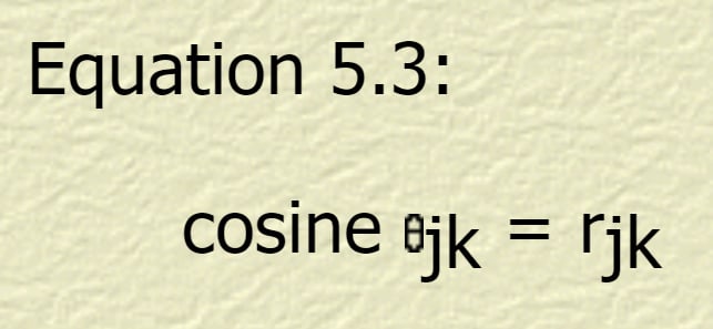
There's also a geometric explanation. The R-square measure of correlation between two sets of data is the same as the cosine of the angle between them when presented as vectors in N-dimensional space (explanations, derivations, and elaborations here, here, and here). (5) So here's another intuitive handle for tail divergence:

Grant a factor correlated with an outcome, which we represent with two vectors at an angle theta, the inverse cosine equal the R-squared. 'Reading off the expected outcome given a factor score is just moving along the factor vector and multiplying by cosine theta to get the distance along the outcome vector. As cos theta is never greater than 1, we see regression to the mean. The geometrical analogue to the tails coming apart is the absolute difference in length along factor versus length along outcome|factor scales with the length along the factor; the gap between extreme values of a factor and the less extreme values of the outcome grows linearly as the factor value gets more extreme. For concreteness (and granting normality), an R-square of 0.5 (corresponding to an angle of sixty degrees) means that +4SD (~1/15000) on a factor will be expected to be 'merely' +2SD (~1/40) in the outcome - and an R-square of 0.5 is remarkably strong in the social sciences, implying it accounts for half the variance.(6) The reverse - extreme outliers on outcome are not expected to be so extreme an outlier on a given contributing factor - follows by symmetry.


Endnote: EA relevance

I think this is interesting in and of itself, but it has relevance to Effective Altruism, given it generally focuses on the right tail of various things (What are the most effective charities? What is the best career? etc.) It generally vindicates worries about regression to the mean or winner's curse, and suggests that these will be pretty insoluble in all cases where the populations are large: even if you have really good means of assessing the best charities or the best careers so that your assessments correlate really strongly with what ones actually are the best, the very best ones you identify are unlikely to be actually the very best, as the tails will diverge.

This probably has limited practical relevance. Although you might expect that one of the 'not estimated as the very best' charities is in fact better than your estimated-to-be-best charity, you don't know which one, and your best bet remains your estimate (in the same way - at least in the toy model above - you should bet a 6'11" person is better at basketball than someone who is 6'4".)

There may be spread betting or portfolio scenarios where this factor comes into play - perhaps instead of funding AMF to diminishing returns when its marginal effectiveness dips below charity #2, we should be willing to spread funds sooner.(6) Mainly, though, it should lead us to be less self-confident.


1. Given income isn't normally distributed, using SDs might be misleading. But non-parametric ranking to get a similar picture: if Bill Gates is ~+4SD in intelligence, despite being the richest man in america, he is 'merely' in the smartest tens of thousands. Looking the other way, one might look at the generally modest achievements of people in high-IQ societies, but there are worries about adverse selection.

2. As nshepperd notes below, this depends on something like multivariate CLT. I'm pretty sure this can be weakened: all that is needed, by the lights of my graphical intuition, is that the envelope be concave. It is also worth clarifying the 'envelope' is only meant to illustrate the shape of the distribution, rather than some boundary that contains the entire probability density: as suggested by homunq: it is an 'pdf isobar' where probability density is higher inside the line than outside it. 

3. One needs a large enough sample to 'fill in' the elliptical population density envelope, and the tighter the correlation, the larger the sample needed to fill in the sub-maximal bulges. The old faithful case is an example where actually you do get a 'point', although it is likely an outlier.


4. It's clear that this model is fairly easy to extend to >2 factor cases, but it is worth noting that in cases where the factors are positively correlated, one would need to take whatever component of the factors which are independent of one another.

5. My intuition is that in cartesian coordinates the R-square between correlated X and Y is actually also the cosine of the angle between the regression lines of X on Y and Y on X. But I can't see an obvious derivation, and I'm too lazy to demonstrate it myself. Sorry!

6. Another intuitive dividend is that this makes it clear why you can by R-squared to move between z-scores of correlated normal variables, which wasn't straightforwardly obvious to me.

7. I'd intuit, but again I can't demonstrate, the case for this becomes stronger with highly skewed interventions where almost all the impact is focused in relatively low probability channels, like averting a very specified existential risk.

New to LessWrong?

New Comment
102 comments, sorted by Click to highlight new comments since: Today at 7:10 AM
Some comments are truncated due to high volume. (⌘F to expand all)Change truncation settings

It's not just that the tails stop being correlated, it's that there can be a spurious negative correlation. In any of your scatterplots, you could slice off the top right corner (with a diagonal line running downwards to the right), and what was left above the line would look like a negative correlation. This is sometimes known as Berkson's paradox.

There's also a related problem in that population substructures can give you multiple negatively correlated associations stacked beside each other in a positively correlated way (think of it like several diagonal lines going downwards to the right, parallel to each other), giving an 'ecological fallacy' when you switch between levels of analysis.

(A real-world case of this is religiosity and health. Internationally, countries which are less religious tend to be healthier, but often within first world countries, religion confers a survival benefit.)

Another example I've heard is SAT scores. At any given school, the math and verbal scores are negatively correlated, because schools tend to select people who have around the same total score. But overall, math and verbal scores are positively correlated.

3owencb10y
Looks like you can get this if you cut the corner off in a box shape too, which may be more surprising.

IMO this should be in main

The upvoters have spoken. Moving to Main and promoting.

-8ishi10y

So in other words, it's not that the strongest can't also be the tallest (etc), but that someone getting that lucky twice more or less never happens. And if you need multiple factors to be good at something, getting pretty lucky on several factors is more likely than getting extremely lucky on one and pretty lucky on the rest.

I enjoyed this post - very clear.

8Thrasymachus10y
^^ but not, alas, as clear as your one paragraph summary! Thanks!
1Vulture10y
Should the first "pretty" there be "very", or am I misunderstanding the point?
5ShardPhoenix10y
To put it more simply, there's no causal reason why the tallest shouldn't also be the strongest - it's just unlikely in practice for anyone to be both at the same time, because both traits (super-height and super-strength) are rare and (sufficiently) independent.

This is all correct so far as I can tell. Yay! (Posting because of the don't-only-post-cricitism discipline.)

One angle for thinking about why the tails come apart (which seems worth highlighting even more than it was highlighted in the OP) is that the farther out you go in the tail on some variable, the smaller the set of people you're dealing with.

Which is better, the best basketball team that you can put together from people born in Pennsylvania or the best basketball team that you can put together from people born in Delaware? Probably the Pennsylvania team, since there are about 13x as many people in that state so you get to draw from a larger pool. If there were no other relevant differences between the states then you'd expect 13 of the best 14 players to be Pennsylvanians, and probably the two neighboring states are similar enough so that Delaware can't overcome that population gap.

Now, imagine you're picking the best 10 basketball players from the 1,000 tallest basketball-aged Americans (20-34 year-olds), and you're putting together another group consisting of the best 10 basketball players from the next 100,000 tallest basketball-aged Americans. Which is a better group of basketball players? In this case it's not obvious - getting to pick from a pool... (read more)

Just as markets are anti-inductive, it turns out that markets reverse the "tails come apart" phenomenon found elsewhere. When times are "ordinary", performance in different sectors is largely uncorrelated, but when things go to shit, they go to shit all together, a phenomenon termed "tail dependence".

6Thrasymachus10y
Interesting: Is there a story as to why that is the case? One guess that springs to mind is that market performance in sectors is always correlated, but you don't see it in well functioning markets due to range restriction/tails-come-apart reasons, but you do see it when things go badly wrong as it reveals more of the range.
4Cyan10y
The problem is the word "always". If I interpret it to mean "over all possible time scales" then the claim is basically false; if I interpret it to mean "over the longest time scales" then the claim is true, but trivially so given that sector performances are sometimes correlated. We won't get to an explanation by just thinking about probability measures on stochastic processes. What's needed here is a causal graph. The basic causal graph has the financial sector internally highly connected, with the vast majority of the connections between lenders/investors and debtors/investees passing through it. That, I think, is sufficient to explain the stylized fact in the grandparent (although of course financial researchers can and do find more to say).

Great article overall. Regression to the mean is a key fact of statistics, and far too few people incorporate it into their intuition.

But there's a key misunderstanding in the second-to-last graph (the one with the drawn-in blue and red "outcome" and "factor"). The black line, indicating a correlation of 1, corresponds to nothing in reality. The true correlation is the line from the vertical tangent point at the right (marked) to the vertical tangent point at the left (unmarked). If causality indeed runs from "factor" (height) to "outcome" (skill), that's how much extra skill an extra helping of height will give you. Thus, the diagonal red line should follow this direction, not be parallel to the 45 degree black line. If you draw this line, you'll notice that each point on it has equal vertical distance to the top and bottom of the elliptical "envelope" (which is, of course, not a true envelope for all the probability mass, just an indication that probability density is higher for any point inside than any point outside).

Things are a little more complex if the correlation is due to a mutual cause, "reverse" causation (from... (read more)

3Thrasymachus10y
Thanks for this important spot - I don't think it is a nitpick at all. I'm switching jobs at the moment, but I'll revise the post (and diagrams) in light of this. It might be a week though, sorry!
2homunq10y
Bump. (I realize you're busy, this is just a friendly reminder.) Also, I added one clause to my comment above: the bit about "imperfectly measured", which is of course usually the case in the real world.
1Thrasymachus9y
Belatedly updated. Thanks for your helpful comments!

This looks cool. My biggest caution would be that this effect may be tied to the specific class of data generating processes you're looking at.

Your framing seems to be that you look at the world as being filled with entities whose features under any conceivable measurements are distributed as independent multivariate normals. The predictive factor is a feature and so is the outcome. Then using extreme order statistics of the predictive factor to make inferences about the extreme order statistics of the outcome is informative but unreliable, as you illustrated. Playing around in R, reliability seems better for thin-tailed distributions (e.g., uniform) and worse for heavy-tailed distributions (e.g., Cauchy). Fixing the distributions and letting the number of observations vary, I agree with you that the probability of picking exactly the greatest outcome goes to zero. But I'd conjecture that the probability that the observation with the greatest factor is in some fixed percentile of the greatest outcomes will go to one, at least in the thin-tailed case and maybe in the normal case.

But consider another data generating process. If you carry out the following little experiment in R

fac &
... (read more)
5Thrasymachus10y
Thanks for doing what I should have done and actually run some data! I ran your code in R. I think what is going on in the Cauchy case is that the variance on fac is way higher than the normal noise being added (I think the SD is set to 1 by default, whilst the Cauchy is ranging over some orders of magnitude). If you plot(fac, out), you get a virtually straight line, which might explain the lack of divergence between top ranked fac and out. I don't have any analytic results to offer, but playing with R suggests in the normal case the probability of the greatest factor score picking out the greatest outcome goes down as N increases - to see this for yourself, replace rcauchy with runf or rnorm, and increase the N to 10000 or 100000. In the normal case, it is still unlikely that max(fax) picks out max(out) with random noise, but this probability seems to be sample size invariant - the rank of the maximum factor remains in the same sort of percentile as you increase the sample size. I can intuit why this is the case: in the bivariate normal case, the distribution should be elliptical, and so the limit case with N -> infinity will be steadily reducing density of observations moving out from the ellipse. So as N increases, you are more likely to 'fill in' the bulges on the ellipse at the right tail that gives you the divergence, if the N is smaller, this is less likely. (I find the uniform result more confusing - the 'N to infinity case' should be a parallelogram, so you should just be picking out the top right corner, so I'd guess the probability of picking out the max factor might be invariant to sample size... not sure.)
3Lumifer10y
Another issue is that real-life processes are, generally speaking, not stationary (in the statistical sense) -- outside of physics, that is. When you see an extreme event in reality it might be that the underlying process has heavier tails than you thought it does, or it might be that the whole underlying distribution switched and all your old estimates just went out of the window...
3othercriteria10y
Good point. When I introduced that toy example with Cauchy factors, it was the easiest way to get factors that, informally, don't fill in their observed support. Letting the distribution of the factors drift would be a more realistic way to achieve this. I like to hope (and should probably endeavor to ensure) that I don' t find myself in situations like that. A system that generatively (what the joint distribution of factor X and outcome Y looks like) evolves over time, might be discriminatively (what the conditional distribution of Y looks like given X) stationary. Even if we have to throw out our information about what new X's will look like, we may be able to keep saying useful things about Y once we see the corresponding new X.
4Lumifer10y
It comes with certain territories. For example, any time you see the financial press talk about a six-sigma event you can be pretty sure the underlying distribution ain't what it used to be :-/

I ran some simulations in Python, and (if I did this correctly), it seems that if r > 0.95, you should expect the most extreme data-point of one variable to be the same in the other variable over 50% of the time (even more if sample size <= 100)

http://nbviewer.jupyter.org/github/ricardoV94/stats/blob/master/correlation_simulations.ipynb

4gwern4y
You can simulate it out easily, yeah, but the exact answer seems more elusive. I asked on CrossValidated whether anyone knew the formula for 'probability of the maximum on both variables given a r and n', since it seems like something that order statistics researchers would've solved long ago because it's interesting and relevant to contests/competitions/searches/screening, but no one's given an answer yet.
6gwern4y
I have found something interesting in the 'asymptotic independence' order statistics literature: apparently it's been proven since 1960 that the extremes of two correlated distributions are asymptotically independent (obviously when r != 1 or -1). So as you increase n, the probability of double-maxima decreases to the lower bound of 1/n. The intuition here seems to be that n increases faster than increased deviation for any r, which functions as a constant-factor boost; so if you make n arbitrarily large, you can arbitrarily erode away the constant-factor boost of any r, and thus decrease the max-probability. I suspected as much from my Monte Carlo simulations (Figure 2), but nice to have it proven for the maxima and minima. (I didn't understand the more general papers, so I'm not sure what other order statistics are asymptotically independent: it seems like it should be all of them? But some papers need to deal with multiple classes of order statistics, so I dunno - are there order statistics, like maybe the median, where the probability of being the same order in both samples doesn't converge on 1/n?)
4gjm4y
I can do n=1 (the probability is 1, obviously) and n=2 (the probability is 12+1πsin−1r, not so obviously). n=3 and up seem harder, and my pattern-spotting skills are not sufficient to intuit the general case from those two :-).
4gwern4y
Heh. I've sometimes thought it'd be nice to have a copy of Eureqa or the other symbolic tools, to feed the Monte Carlo results into and see if I could deduce any exact formula given their hints. I don't need exact formulas often but it's nice to have them. I've noticed people can do apparently magical things with Mathematica in this vein. All proprietary AFAIK, though.
2gwern4y
Writeup: https://www.gwern.net/Order-statistics#probability-of-bivariate-maximum

Upvoted. I really like the explanation.

In the spirit of Don't Explain Falsehoods, it would be nice to test the ubiquity of this phenomenon by specifying a measure of this phenomenon (e.g. correlation) on some representative randomly-chosen pairs. But I don't mean to suggest that you should have done that before posting this.

1Thrasymachus10y
I was a little too lazy to knock this up in R. Sorry! I am planning on some followups when I've levelled up more in mathematics and programming, although my thoughts would be quant finance etc. would have a large literature on this, as I'd intuit these sorts of effects are pretty important when picking stocks etc.

I must quibble with some of the epistemological terminology here. Both "graphical explanation" and "geometric explanation" are not properly speaking explanations. They merely restate the original empirical observation in graphical or statistical terms, but do not explain why the tails-coming-apart phenomenon occurs. The "intuitive explanation" on the other hand does explain why the phenomenon occurs (i.e. the distributions of other factors influencing the outcome come into play). Similarly, "regression to the mean" is merely a restatement of the empirical ... (read more)

Good post.


If the ellipse is very narrow, things are indeed well-modeled by a linear relationship, and the biggest Y coordinate for a point is likely to also have close to biggest X coordinate.

If the ellipse is not narrow, that could be for two reasons. Either the underlying truth is indeed linear, but your data is very noisy. Or the underlying truth is not linear, and you should not use a linear model. (Or both, naturally).


If the underlying truth is linear, but your data is very noisy, then what happens to the X coordinate of points with given Y val... (read more)

2Stuart_Armstrong10y
Because in many fields, linear models (even poor ones) are the best we're going to get, with more complex models losing to overfitting. http://psycnet.apa.org/index.cfm?fa=buy.optionToBuy&id=1979-30170-001
5IlyaShpitser10y
I don't follow you. Overfitting happens when your model has too many parameters, relative to the amount of data you have. It is true that linear models may have few parameters compared to some non-linear models (for example linear regression models vs regression models with extra interaction parameters). But surely, we can have sparsely parameterized non-linear models as well. ---------------------------------------- All I am saying is that if things are surprising it is either due to "noise" (variance) or "getting the truth wrong" (bias). Or both. ---------------------------------------- I agree that "models we can quickly and easily use while under publish-or-perish pressure" is an important class of models in practice :). Moreover, linear models are often in this class, while a ton of very interesting non-linear models in stats are not, and thus are rarely used. It is a pity.
5henry4k2PH410y
A technical difficulty with saying that overfitting happens when there are "too many parameters" is that the parameters may do arbitrarily complicated things. For example they may encode C functions, in which case a model with a single (infinite-precision) real parameter can fit anything very well! Functions that are linear in their parameters and inputs do not suffer from this problem; the number of parameters summarizes their overfitting capacity well. The same is not true of some nonlinear functions. To avoid confusion it may be helpful to define overfitting more precisely. The gist of any reasonable definition of overfitting is: If I randomly perturb the desired outputs of my function, how well can I find new parameters to fit the new outputs? I can't do a good job of giving more detail than that in a short comment, but if you feel confused about overfitting, here's a good (and famous) article about frequentist learning theory by Vladimir Vapnik that may be useful: http://web.mit.edu/6.962/www/www_spring_2001/emin/slt.pdf
3IlyaShpitser10y
This is about "reasonable encoding" not "linearity," though. That is, linear functions of parameters encode reasonably, but not all reasonable encodings are linear. We can define a parameter to be precisely one bit of information, and then ask for the minimum of bits needed. I don't understand why people are so hung up on linearity.
4A1987dM10y
Sure, technically if Alice fits a small noisy data set as y(x) = a*x+b and Bob fits it as y(x) = c*Ai(d*x) (where Ai is the Airy function) they've used the same number of parameters, but that won't stop me from rolling my eyes at the latter unless he has a good first-principle reason to privilege the hypothesis.
3Stuart_Armstrong10y
The problem is more practical than theoretical (don't have the links to hand. but you can find some in my silos of expertise post). Statisticians do not adjust properly for extra degrees of freedom, so among some category of published models, the linear ones will be best. Also, it seems that linear models are very good for modelling human expertise - we might think we're complex, but we behave pretty linearly.
3IlyaShpitser10y
"Statisticians" is a pretty large set. ---------------------------------------- I still don't understand your original "because." I am talking about modeling the truth, not modeling what humans do. If the truth is not linear and humans use a linear modeling algorithm, well then they aren't a very good role model are they? ---------------------------------------- [ edit: did not downvote. ]
1Stuart_Armstrong10y
Because human flaws creep in in the process of modelling as well. Taking non linear relationships into account (unless there is a causal reason to do so) is asking for statistical trouble unless you very carefully account for how many models you have tested and tried (which almost nobody does).
3[anonymous]10y
How do I account for how many models I've tested? No, really, I don't know what that'd even be called in the statistics literature, and it seems like if a general technique for doing this were known the big data people would be all over it.
4Stuart_Armstrong10y
What we're doing at the FHI is acting like a machine learning problem: splitting the data into a training and a testing set, checking as much as we want on the training set, formulating the hypotheses, then testing them on the testing set.
3Stuart_Armstrong10y
The Bayesian approach with multiple models seems to be exactly what we need. eg http://www.stat.washington.edu/raftery/Research/PDF/socmeth1995.pdf
1Stuart_Armstrong10y
Another approach seems to be stepwise regression: http://en.wikipedia.org/wiki/Stepwise_regression
6EHeller10y
I see a lot of stepwise regression being used by non-statisticians, but I think statisticians themselves think its something of a joke. If you have more predictors than you can fit coefficients for, and want an understandable linear model you are better off with something like LASSO. Edit: Don't just take my word for it, google found this blog post for me: http://andrewgelman.com/2014/06/02/hate-stepwise-regression/
1Lumifer10y
I concur. Stepwise regression is a very crude technique. I find it useful as an initial filter if I have to dig through a LOT of potential predictors, but you can't rely on it to produce a decent model.
1[anonymous]10y
So it wasn't as clear with the previous link, but it seems to me that the nth step of this method doesn't condition on the fact that the last n-1 steps failed.
3IlyaShpitser10y
If you array the full might of statistics/machine learning/knowledge representation in AI/math/signal processing, and took the very best, I am very sure they could beat a linear model for a non-linear ground truth very easily. If so, maybe the right thing to do here is to emulate those people when doing data analysis, and not use the model we know to be wrong.
1Stuart_Armstrong10y
Proper Bayesianism will triumph! But not in the hands of everyone.
3Lumifer10y
First, the structure of your model should be driven by the structure you're observing in your data. If you are observing nonlinearities, you'd better model nonlinearities. Second, I don't buy that going beyond linear models is asking for statistical trouble. It just ain't so. People who overfit can (and actually do, all the time) stuff a ton of variables into a linear model and successfully overfit this way.
3Stuart_Armstrong10y
And the number of terms explode when you add non linearities. 5 independent variables with quadratic terms give you 21 values to play with (1 constant + 5 linear + 15 quadratic); it's much easier to justify conceptually "lets look at quadratic terms" than "lets add in 15 extra variables" even though the effect on degrees of freedom is the same.
1Lumifer10y
No, they don't. You control the number of degrees of freedom in your models. If you don't, linear models won't help you much, and if you do linearity does not matter. I think you're confusing quadratic terms and interaction terms. It also seems that you're thinking of linear models solely as linear regressions. Do you consider, e.g. GLMs to be "linear" models? What about transformations of input variables, are they disallowed in your understanding of linear models?
2Stuart_Armstrong10y
I'm talking about practice, not theory. And most of the practical results that I've seen is that regression linear models are full of overfitting if they aren't linear. Even beyond human error, it seems that in many social science areas the data quality is poor enough that adding non-linearities can be seen, a priori, to be a bad thing to do. Except of course if there is a firm reason to add a particular non-linearity to the problem. I'm not familiar with the whole spectrum of models (regression models, beta distributions, some conjugate prior distributions, and some machine learning techniques is about all I know), so I can't confidently speak about the general case. But, extrapolating from what I've seen and known biases and incentives, I'm quite confident in predicting that generic models are much more likely to be overfitted than to have too few degrees of freedom.
3Lumifer10y
Oh, I agree completely with that. However there are a bunch of forces which make it so starting with the publication bias. Restricting the allowed classes of models isn't going to fix the problem. It's like observing that teenagers overuse makeup and deciding that a good way to deal with that would be to sell lipstick only in three colors -- black, brown, and red. Not only it's not a solution, it's not even wrong :-/ Why do you believe that a straight-line fit should be the a priori default instead of e.g. a log or a power-law line fit?
1Stuart_Armstrong10y
I disagree; it would help at the very least. I would require linear models only, unless a) there is a justification for non-linear terms or b) there is enough data that the result is still significant even if we inserted all the degrees of freedom that the degree of non-linearities would allow. In most cases I've seen in the social science, the direction of the effect is of paramount importance, the other factor less so. It would probably be perfectly fine to restrict to only linear, only log, or only power-law; it's the mixing of different approaches that explodes the degrees of freedom. And in practice letting people have one or the other just allows them to test all three before reporting the best fit. So I'd say pick one class and stick with it.
1Lumifer10y
I think this translates to "Calculate the signficance correctly" which I'm all for, linear models included :-) Otherwise, I still think you're confused between the model class and the model complexity (= degrees of freedom), but we've set out our positions and it's fine that we continue to disagree.
0othercriteria10y
It's easy to regularize estimation in a model class that's too rich for your data. You can't "unregularize" a model class that's restrictive enough not to contain an adequate approximation to the truth of what you're modeling.
5Lumifer10y
That's privileging a particular class of models just because they historically were easy to calculate. If you're concerned about overfitting you need to be careful with how many parameters are you using, but that does not translate into an automatic advantage of a linear model over, say, a log one. The article you linked to goes to pre-(personal)computer times when dealing with non-linear models was often just impractical.
2gwern10y
I don't think that's true. What fields show optimal performance from linear models where better predictions can't be gotten from other techniques like decision trees or neural nets or ensembles of techniques? Showing that crude linear models, with no form of regularization or priors, beats human clinical judgement, doesn't show your previous claim.
0Stuart_Armstrong10y
Modelling human clinical judgement is best done with linear models, for instance.
4gwern10y
Best done? Better than, say, decision trees or expert systems or Bayesian belief networks? Citation needed.
1Stuart_Armstrong10y
Goldberg, Lewis R. "Simple models or simple processes? Some research on clinical judgments." American Psychologist 23.7 (1968): 483.
5gwern10y
1968? Seriously?
5Stuart_Armstrong10y
Well there's Goldberg, Lewis R. "Five models of clinical judgment: An empirical comparison between linear and nonlinear representations of the human inference process." Organizational Behavior and Human Performance 6.4 (1971): 458-479. The main thing is that these old papers seem to still be considered valid, see eg Shanteau, James. "How much information does an expert use? Is it relevant?." Acta Psychologica 81.1 (1992): 75-86.

(It would be nice if you would link fulltext instead of providing citations; if you don't have access to the fulltext, it's a bad idea to cite it, and if you do, you should provide it for other people who are trying to evaluate your claims and whether the paper is relevant or wrong.)

I've put up the first paper at https://dl.dropboxusercontent.com/u/85192141/1971-goldberg.pdf / https://pdf.yt/d/Ux7RZXbo0n374dUU I don't think this is particularly relevant: it only shows that 2 very specific equations (pg4, #3 & #4) did not outperform the linear model on a particular dataset. Too bad for Einhorn 1971.

Your second paper doesn't support the claims:

A third possibility is that incorrect methods were used to measure the amount of information in experts’ judgments; use of the “correct” measurement method might support the Information-Use Hypothesis. In the studies reported here, four techniques were used to measure information use: protocol analysis, multiple regression analysis, analysis of variance, and self-ratings by judges. Despite differences in measurement methods, comparable results were reported. Other methodological issues might be raised, but the studies seem varied enough t

... (read more)
1Stuart_Armstrong10y
I tend to agree with you about models, once overfitting is sorted. This I've still seen no evidence for.

Interesting read! That makes sense.

One little side note, though.

So, ceritus paribus,

Did you mean ceteris paribus?

(Ha, finally a chance for me as a language geek to contribute something to all the math talk. :P )

I'd say that this is regression to the mean. If two variables are correlated with |r| < 1, then extreme values on one variable will be associated with somewhat less extreme values on the other variable. So people who are +4 SD in height will tend to be less than +4 SD in basketball ability, and people who are +4 SD in basketball ability will tend to be less than +4 SD in height.

Thank you for pointing that high IQ problem is probably a statistical effect rather than "too much of a good thing" effect. That was very interesting.

Let me attempt the problem from a simple mathematical point of view.

Let basketball playing ability, Z, is just a sum of height, X, and agility, Y. Both X and Y are Gaussian distributed with mean 0 and variance 1. Assume X and Y are independent.

So, if we know that Z>4, what is the most probable combination of X and Y?

The probability of X>2 and Y>2 is: P(X>2)P(Y>2)=5.2e-4

The probabili... (read more)

Given a correlation, the envelope of the distribution should form some sort of ellipse

That isn't an explanation, but a stronger claim. Why should it form an ellipse?

A model of an independent factor or noise is an explanation of the ellipse, and thus of the main point. But people may find a stumbling block this middle section, with its assertion that we should expect ellipses. Also, regression to the mean and the tails coming apart are much more general than ellipses, but ellipses are pretty common.


It generally vindicates worries about regression to t

... (read more)
6nshepperd10y
Multivariate CLT perhaps? The precondition seems like it might be a bit less common than the regular central limit theorem, but still plausible, if you assume x and y are correlated by being affected by a third factor, z, which controls the terms that sum together to make x and y. Once you have a multivariate normal distribution, you're good, since they always have (hyper-)elliptical envelopes.

Also: this is very reminiscent of St. Rev's old post about economic inequality. http://st-rev.livejournal.com/383957.html

[-][anonymous]10y40

Isn't the far simpler and more likely scenario that you never have just one variable accounting for all of an outcome? If other variables are not perfectly correlated with the variable you are graphing you will get noise. Why is it surprising that that noise also exists in the most extreme points?

EDIT: misunderstood last few paragraphs.

This post has been a core part of how I think about Goodhart's Law. However, when I went to search for it just now, I couldn't find it, because I was using Goodhart's Law as a search term, but it doesn't appear anywhere in the text or in the comments.

So, I thought I'd mention the connection, to make this post easier for my future self and others to find. Also, other forms of this include:

... (read more)

Following on your Toy Model concept, let's say the important factors in being (for example) a successful entrepreneur are Personality, Intelligence, Physical Health, and Luck.

If a given person has excellent (+3SD) in all but one of the categories, but only average or poor in the final category, they're probably not going to succeed. Poor health, or bad luck, or bad people skills, or lack of intelligence can keep an entrepreneur at mediocrity for their productive career.

Really any competitive venue can be subject to this analysis. What are the important skills? Does it make sense to treat them as semi-independent, and semi-multiplicative in arriving at the final score?

1Thrasymachus10y
It might give a useful heuristic in fields where success is strongly multifactorial - if you aren't at least doing well at each sub-factor, don't bother entering. It might not work so well when there's a case that success almost wholly loads on one factor and there might be more 'thresholds' for others (e.g. to do theoretical physics, you basically need to be extremely clever, but also sufficiently mentally healthy and able to communicate with others). I'm interested in the distribution of human ability into the extreme range, and I plan to write more on it. My current (very tentative) model is that the factors are commonly additive, not multiplicative. A proof for this is alas too long for this combox to contain, etc. etc. ;)

Statistical point: the variance of forecast error for correctly specified simple regression problems is equal to:

Sigma^2(1 + 1/N + (x_o - x_mean)^2 / (Sigma ( x_i - x_mean) ^2))

So forecast error increases as x_o moves away from x_mean, especially when the variance of x is low by comparison.

Edit: Sub notation was apparently indenting things. I'm going to take a picture from my stats book tonight. Should be more readable.

Edit: Here's a more readable link. http://i.imgur.com/pu8lg0Wh.jpg

2Douglas_Knight9y
(1) Imgur offers editing capabilities. (2) LW allows images.
0[anonymous]9y
The get the image use the following code in your comment: ![](http://latex.codecogs.com/png.latex?%5Ctextit%7Bvar%7D%28f%29%20%3D%20%5Csigma%20%5E%202%20%5Cleft%20%28%201+%5Cfrac%7B1%7D%7BN%7D%20+%20%5Cfrac%7B%28x_0%20-%20%5Cbar%7Bx%7D%29%5E2%7D%7B%5Csum%20%28x_i-%5Cbar%7Bx%7D%29%5E2%7D%20%5Cright%20%29) See Comment formatting/Using LaTeX to render mathematics on the wiki for more details. I've used codecogs editor and fixed an issue in the URL manually; there are other options listed on the wiki. The LaTeX code for the codecogs editor is this: \textit{var}(f) = \sigma ^ 2 \left ( 1+\frac{1}{N} + \frac{(x_0 - \bar{x})^2}{\sum (x_i-\bar{x})^2} \right )

For business in particular I think network size and effects are the reason that the very top end of earners are much more deviant in earnings than in intellect. The fact that you can capture entire billions of dollars markets because modern society allows a single product to be distributed worldwide will multiply the value of the "top" product by a lot more than its quality might justify.

Interesting post. Well thought out, with an original angle.

In the direction of constructive feedback, consider that the concept of sample size -- while it seems to help with the heuristic explanation -- likely just muddies the water. (We'd still have the effect even if there were plenty of points at all values.)

For example, suppose there were so many people with extreme height some of them also had extreme agility (with infinite sample size, we'd even reliably have that the best players we're also the tallest.) So: some of the tallest people are also the... (read more)

1philh10y
Are you talking about relative sample sizes, or absolute? The effect requires that as you go from +4sd to +3sd to +2sd, your population increases sufficiently fast. As long as that holds, it doesn't go away if the total population grows. (But that's because if you get lots of points at +4sd, then you have a smaller number at +5sd. So you don't have "plenty of points at all values".) If you have equal numbers at +4 and +3 and +2, then most of the +4 still may not be the best, but the best is likely to be +4. (Warning: I did not actually do the math.)
1byrnema10y
I don't believe we disagree on anything. For example, I agree with this: If you have equal numbers at +4 and +3 and +2, then most of the +4 still may not be the best, but the best is likely to be +4. By 'plenty of points'... I was imagining that we are taking a finite sample from a theoretically infinite population. A person decides on a density that represents 'plenty of points' and then keeps adding to the sample until they have that density up to a certain specified sd.

Great post!

The R-square measure of correlation between two sets of data is the same as the cosine of the angle between them when presented as vectors in N-dimensional space

Not R-square, just R:

I've made a visualization tool for that:

https://codepen.io/qbolec/pen/qBybXQe

It generates an elliptical cloud of white points where X is distributed normally, and Y=normal + X*0.3, so the two are correlated. Then you can define a green range on X and Y axis, and the tool computes the correlation in a sample (red points) restricted to that (green) range.

So, the correlation in the general population (white points) should be positive (~0.29). But if I restrict attention to upper right corner, then it is much lower, and often negative.

Fantastic, I wish I'd had this back when almost everyone in LW/EA circles I met was reading the biography of everyone in the ' fortune 400 and trying to spot the common factors. A surprisingly common strategy that's likely not to work for exactly these reasons.

My guess is that there are several variables that are indeed positively correlated throughout the entire range, but are particularly highly correlated at the very top. Why not? I'm pretty sure we can come up with a list.

What is interesting is the strength of these relationships appear to deteriorate as you advance far along the right tail.

I read that claim as saying that if you sample the 45% to 55% percentile you will get a stronger correlation than if you sample the 90% to 100% percentile. Is that what you are arguing?

5Thrasymachus10y
This was badly written, especially as it offers confusion with range restriction. Sorry! I should just have said "what is interesting is that extreme values of the predictors predictors seldom pick out the most extreme outcomes".
1ChristianKl10y
If you think you know know how to write it better, feel free to edit.
3Luke_A_Somers10y
45% to 55% of what measure? Part of the point of this is that how you cut your sample will change these things. If you take it as 45% to 55% of one of the other contributing factors, then the correlation should be much stronger!
1ChristianKl10y
Does he argue it for any measure? Height for the basketball players?

I don't think there's anything special about the tails.

Take a sheet of paper, and cover up the left 9/10 of the high-correlation graph. That leaves the right tail of the X variable. The remaining datapoints have a much less linear shape.

But: take two sheets of paper, and cover up (say) the left 4/10, and the right 5/10. You get the same shape left over! It has nothing to do with the tail -- it just has to do with compressing the range of X values.

The correlation, roughly speaking, tells you what percentage of the variation is not caused by random error. When you compress the X, you compress the "real" variation, but leave the "error" variation as is. So the correlation drops.

5Thrasymachus10y
I agree that range restriction is important, and I think a range-restriction story can become basically isomorphic to my post (e.g. "even if something is really strongly correlated, range restricting to the top 1% of this distribution, this correlation is lost in the noise, so it should not surprise us that the biggest X isn't the biggest Y.") My post might be slightly better for people who tend to visualize things, and I suppose it might have a slight advantage as it might provide an explanation why you are more likely to see this as the number of observations increases, which isn't so obvious when talking about a loss of correlation.
0AnneOminous10y
"At the extremes, other factors may weigh more." Nothing that hasn't been said before, and in my opinion better. I don't particularly like your "ellipse" generalization, either, because it's just wrong. We already know a perfect correlation would be linear. We already know a lesser correlation is "fatter". Bringing ellipses into the issue is just an intuitive, illustrative fiction, which I really don't appreciate very much because it's not particularly informative and it isn't scientifically sound at all. Please don't misunderstand me: I do think it is illustrative, and I do think it has its place. In the newby section maybe. Understand, I am aware that may come across as overly harsh, but it isn't meant that way. I'm not trying to be impolite. It's just my opinion and I honestly don't know a better way to express it right now without being dishonest.
1Lumifer10y
I think you're mistaken about that. An ellipse is the shape of a multivariate normal distribution, for example. In fact, there is the entire family of elliptical distributions which are, to quote Wikipedia, "a broad family of probability distributions that generalize the multivariate normal distribution. Intuitively, in the simplified two and three dimensional case, the joint distribution forms an ellipse and an ellipsoid, respectively, in iso-density plots." That's a meaningless phrase, correlation is linear by definition. Moreover, it's a particular measure of dependency which can be misleading.
0Richard_Kennaway10y
A better way would be to make the criticisms more concrete. What does "not particularly informative and it isn't scientifically sound at all" mean? You might, for example, have said something to the effect that the ellipses are contours of the bivariate normal distribution with the same correlation, and pointed out that not all bivariate distributions are normal. But on the other hand the scatterplots presented aren't so far away from normal that the ellipses are misleading. The ellipses are indeed intuitive and illustrative; but calling them "just fiction" is another way of expressing criticism too vague to respond to. The point masses and frictionless pulleys of school physics problems are also fictions, but none the worse for that. This is also vague: (Where, and what did they say? We cannot know what better resources you know of unless you tell us.) And this: There is no "newby section" on LessWrong. Besides, you're talking there about something you previously called "just wrong". First it's "just wrong", then it's "not particularly informative", then it's "illustrative", then "it has its place in the newby section". It reminds me of the old adage about the stages of truth, with the entire sequence here compressed into a single comment.
0AnneOminous9y
What isn't "concrete" about it? I think the whole article is an exercise in stating the obvious, to those who have had basic education in statistics. Stricter correlations tend to be more linear. A broader spectrum of data points is pretty much by definition "fatter". I don't see how this is actually very instructive. And to be honest, I don't see how I could be much more specific. You mean you've never had a statistics class? Honestly? I'm not trying to be snide, just asking. Extreme data points are often called "outliers" for a reason. Since (again, almost -- but not quite -- by definition, it depends on circumstances) they do not generally show as strong a correlation, "other factors may weigh more". This is a not a revelation. I don't disagree with it, I'm simply saying it's rather elementary logic. Which brings us back to the main point I was making: I did not feel this was particularly instructive. Wrong in the sense that I don't see any actual demonstrated relationship between his ellipses and the data, except for simple, rather intuitive observation. It's merely an illustrative tool. More specifically: This is an incorrect statement. What he is offering is a way to describe how data at the extreme ends may vary from correlation. Not "why". There is nothing here establishing causation. If we are to be "less wrong", then we should endeavor to not make confused comments like that.