In the "top 10" aggregate, you are at risk of the following Simpsonian problem: you have two posters A and B; one writes longer comments than the other and also happens to be cleverer / more interesting / funnier / better at appealing to the prejudices of the LW crowd. So in the whole group there is a positive correlation between length and quality, but actually everyone likes A's shorter comments better and everyone likes B's shorter comments better. (Or, of course, likewise but with "longer" and "shorter" switched.)
One story is that people are more willing to read long comments from Yvain or Eliezer because they have reputations for being insightful.
I think this is probably true, and I have seen cases where e.g. Eliezer is highly upvoted for a certain comment, and some other person little or not at all for basically the same insight in a different case.
However, it also seems to me that their long comments do tend to be especially insightful in fact.
I think these plots would by much improved by adding error bars. In particular, I suspect that the number of short posts is greater than the number of long posts and so the average-karma estimates for long posts are more uncertain.
Also, did you bucketize the word counts? What do specific points on your plots correspond to?
Each point on the graph corresponds to an average of several hundred (about two thousand for the middle graph) data points. A number of short posts is indeed greater than the number of long posts, so the horizontal distance between the points on the graph increases with increasing number of characters.
Any particular reason you did a plot this way instead of having a cloud of points and drawing some kind of regression line or curve through? You are unnecessarily losing information by aggregating into buckets.
True, but it is virtually impossible to see a meaningful pattern when you have thousands data points on the graph and R2<0.2.
I disagree. I find point clouds useful, as long as they are not pure black. Kernel density plots are better, though.
But Lumifer gave you a concrete suggestion: plot a regression curve, not a bunch of buckets. Bucketing and drawing lines between points are kinds of smoothing, so you should instead use a good smoothing. Say, loess. Just use ggplot and trust its defaults. (not loess with this many points)
Well, one question is if it's "impossible to see a meaningful pattern", should you melt-and-recast the data so that the pattern appears X-/
Another observation is that you are constrained by Excel. R can deal with such problems easily -- do you have the raw dataset available somewhere?
You cannot use observed dependences in the data to suggest decision changes because p(y | x) is not in general equal to p(y | do(x)).
What should cleonid do instead (if anything)? And even if something is not true in general, could it still be used as an approximation?
Run a trial, or barring that, correct for obvious confounders that affect both post length and post quality (I am sure we can both think of a few right now).
Run a trial, or barring that, correct for obvious confounders that affect both post length and post quality (I am sure we can both think of a few right now).
Why not be more specific about what confounders should be included or how a trial should look like?
Upvotes are in my opinion a poor metric to measure the quality of a post. You're confusing information on how insightful, thoughtful or useful your writing is with information on how pleasing it is due to the upvoter due to providing social confirmation of their beliefs or entertaining them for other reasons.
A much more useful way to measure the quality of your own writing is to look at how interesting or thoughtful the replies you get are: this shows that people find your ideas worth engaging with. This is a subjective assessment however that can't be captured by the real line.
I think some of my most-researched comment / posts have gotten relatively few replies. The more thorough you are, the less room there is for people to disagree without putting a decent amount of thought in. On the other hand, if you dash out a post without much fact-checking, you'll probably get lots of replies :).
Naturally, even if your longer comments are rated higher than the short ones, this does not mean that inflating comments would always produce positive results.
Here's where I got really hopeful that you would address the part about correlation and causation, Goodhart's law, etc.
Would statistical feedback on the style and content of your posts be useful to you?
[pollid:1010]
I would have preferred a weaker option like "It might be interesting,and it might conceivably help me to improve my posts".
I liked it for the sheer level of awesomeness of investing work to analyse comments, and I like the reminder how really chaotic stuff can be quantified as well, but I find comments not really that important, important stuff tends to be rewritten as a post, so I treat them more as just a discussion. Similar to chatting about a post in person.
However if you want to know the usefulness, I think depends on whether you care about upvotes. I care about them only in a negative way, I tend to recycle usernames on Reddit when they get too much karma although I have not done it here yet.
I don't think if I would optimize my upvotes it would also result in optimizing the usefulness of my comments for others. If anything, the number of replies I get is a better measure, blatantly stupid stuff usually gets ignored, if something gets answered a lot then at the very least it is wrong in an interesting way.
I mean, for example here, I think the fact that I reply to your post and survey hopefully means more to you than if I just hit the upvote button. Same story.
I don't know whether feedback would affect how I post. It would depend on whether the feedback made sense to me and whether it pointing in a direction of something I thought I could do and was worth doing.
Since I critiqued the graphs in the OP and offered to make them better, cleonid was gracious enough to provide me with the dataset for Eliezer (EY) and Yvain (Scott Alexander) (SA) posts and invite me to play with it. For convenience, I'll split my comment into two parts -- the preliminaries and the analysis itself.
First, two caveats.
I'm looking at data for posts by EY and SA. They, being superstars, are not representative of LW members. This analysis will not tell you, gentlereader, whether you would get more karma by making your posts longer or shorter (unless, of course, you are EY or SA :-D).
Next, the data that I have lacks timestamps. Therefore I'm forced to make the assumption (almost certainly false) that nothing changed with time and treat the data as a blended uniform mass. The temporal dimension is, sadly, lacking.
A brief description of the data: we have two tables (EY and SA) which list the number of characters in a post, as well as the number of upvotes and downvotes that the post received. There are about 3100 data points for EY and about 1400 for SA.
The distribution of post lengths for EY and for SA is rather different: EY posts tend to be much shorter. This is visible in the following graph which plots the empirical distributon of post lengths (cut off at 2000 chars, but there is a long thin tail beyond it).
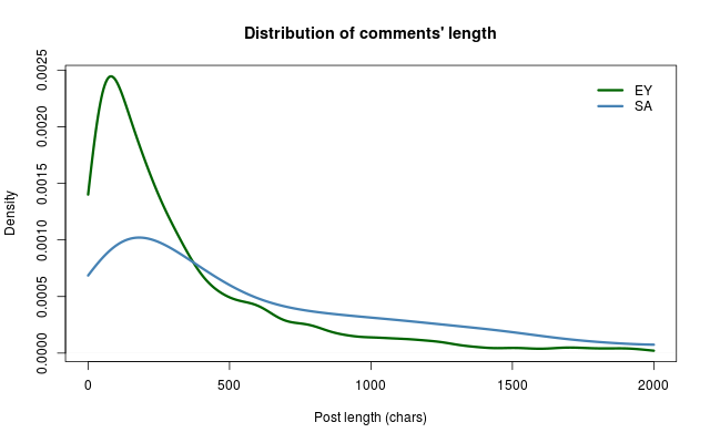
In numbers, the median length of an EY post is only about 200 characters -- half of his posts are less than that. In fact, a quarter of his posts are less than 87 characters. On the other side, 10% of his posts are longer than 950 characters, 5% are longer than about 1500 characters. The mode of the distribution -- the most frequent length of the post -- is around 70 characters.
SA writes more: his median post length is 450 characters, more than double that of EY's. The shortest quarter of the posts is below 165 characters, the longest 10% are over 1900 characters and the longest 5% -- over 2700 characters. The mode for SA's posts is 180 characters, two and a half times as much as EY's mode.
Continued in post 2.
My prior expectation would be: A long comment from a specific user has more potential to be interesting than a short one because it has more content. But, A concise commenter has more potential to write interesting comments of a given length than a verbose commenter.
So while long comments might on average be rated higher, shorter versions of the same comment may well rate higher than longer versions of the same comment would have. It seems like this result does nothing to contradict that view but in the process seems to suggest people should write longer comments. The problem is that verbosity is per-person while information content is per-comment. Also verbosity in general can't be separated from other personal traits that lead to better comments.
You could test this by having people write both long and short versions of comments that appear to different pools of readers and comparing the ratings.
Continued from part 1.
The gist of part 2 is four graphs.
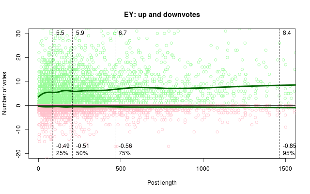
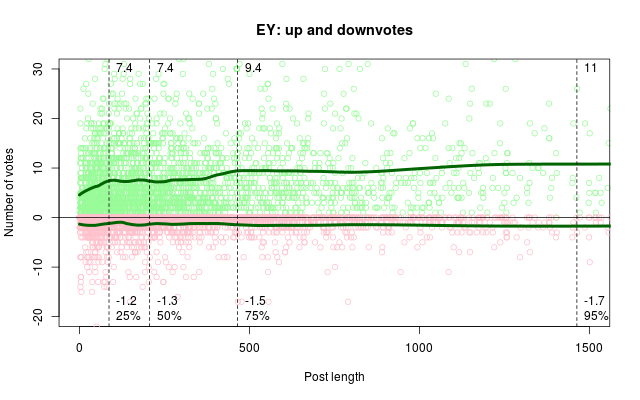
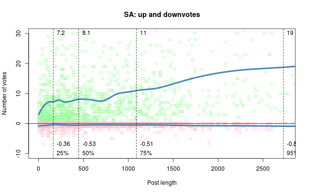
The graphs plot most of the data (except for outliers) in the following form. Each post is represented by two points with the same X coordinate: the number of characters. The Y coordinate for one point is the number of upvotes the post received, the Y coordinate of the other point is the number of downvotes for the same post. Upvotes are light green and downvotes are pink.
The upvotes and the downvotes are modeled separately by two loess (local regression) curves. The difference between two graphs for each of the posters is in the details of the fit. Specifically, one fit assumes gaussian errors and so the loess curve tends to approximate the local mean. The other fit assumes heavy-tailed errors and its loess curve tends to approximate the local median. Since the distribution of votes is skewed, the mean and the median are noticeably different.
Each plot has four vertical lines at four quantiles: 25%, 50%, 75%, and 95%. The lower numbers represent the loess estimate of the number of downvotes for this particular post length. The upper numbers represent the loess estimate of the number of upvotes.
We will start with the robust fit which approximates the median. Here is the plot for EY
and here is the plot for SA
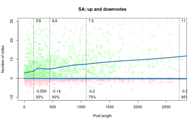
As you can see, longer posts pay off though not in a particularly spectacular manner for EY -- long posts work better for SA. The downvotes also increase, but insignificantly. If we treat the loess estimate as the median, in all cases half of the posts has zero downvotes.
Since the votes are positively skewed, the means should be higher than the medians and we can see it in the second set of graphs with non-robust loess fits. EY
and SA
The overall pattern is very much the same, but the numbers are higher. Again, longer posts bring much more karma for SA, not so much but still some for EY.
I would love to see mine, considering I have two very different styles of post which have different average lengths.
You can get the rating statistics of your LW comments by registering on Omnilibrium and then clicking on this link.
If cleonid is willing to do in this level of analysis for us in their spare time, I say they deserve all the registrations they get.
But he does provide the data for LW comments on that page :) The page also told me how many comments I have written on LW which LW doesn't even tell me, so it's cool ;)
I tried to register there just now but the email which is supposed to contain the link to verify my email is empty (no link). What can I do about it?
I would be interested to see the results of some Clustering Algorithm on the comment data. It may be, that long comments can be classified into high karma and low karma and we can then analyze what the differences between them are. If it is possible to extract features of high-quality posts, then those features can be the goal, instead of just the length.
I also think it's dangerous to focus too strongly on karma, because karma score is only a rough approximation of actual quality. For example, I believe many short comments, that only ask for some clarification are generally more important than is reflected by their karma.
Some comments are very insightful and are not particularly long. I recently have been reading Roissy's site, and I searched a few terms at LW. I discovered the user Vladimir_M who had some very interesting comments, not only on that front. HughRistik was also someone who stood out. Both of their commenting were very insightful. I am disappointed those people were not on the list.
My other problem with this is that if karma is a good indicator. That pretty much depends on the userbase; I guess we have another thing to test here.
I think there may be a collective action problem here. Optimizing length to maximize upvotes seems like a way to encourage others' biases. Then there are prisoner's dilemma possibilities. If everybody increases their comment length, won't we have to increase our comment length even more to stand out?
I wonder if the value of a post is not correlated with upvotes. i.e. a post that is 1.3* more valuable than another might have to be 100 words longer but only get 10% more upvotes.
I feel like even if we could encourage only the posts who are below 500 characters that seem to have downvotes to consider increasing their length in order to roughly correlate with sharing more words = being clearer = providing more value. Even at the worst effects of the results of such a strategy, we would probably see the garden get a little nicer.
And continuing the metaphor, its not like we are chopping down trees, just clearing out a few weed around the roses.
I propose a character count on the comment boxes so that people know how many characters they are writing, then possibly a popup (similar to the one about comments on downvoted posts), that says,
"we noticed that comments are more meaningful, helpful and thought out when they are at a minimum 500 characters, you can still post a shorter comment but you have N characters to go to cross the arbitrary threshold we decided on. You can still post but it will cost -1 karma. If you think that you will get at least one upvote more than usual then its certainly worthwhile posting as is; otherwise can you add more useful characters to your post?"
[pollid:1011]
"we noticed that comments are more meaningful, helpful and thought out when they are at a minimum 500 characters, you can still post a shorter comment but you have N characters to go to cross the arbitrary threshold we decided on. You can still post but it will cost -1 karma. If you think that you will get at least one upvote more than usual then its certainly worthwhile posting as is; otherwise can you add more useful characters to your post?"
I can tell you exactly what the outcome of that will be. I am sure you'll figure it out, too, if you think about your suggestion for a minute or two.
no I couldn't think of it before I sugested the idea, please be explicit about it. exactly what will go wrong and is there a way to solve that without breaking the entire idea?
People will still write short replies.
Andthenfilltheremainderof500characterswithtrashjustsothatthestupidmachinebesatisfiedandtheywouldnothavetopaythe-1karmapricesinceit'seasytojustfillupspacewatchme:ooohaaahooohaaahooohaaahooohaaahooohaaahooohaaahooohaaahooohaaahooohaaahooohaaahooohaaahooohaaahooohaaahooohaaahooohaaahooohaaahooohaaahooohaaahooohaaahooohaaahooohaaahooohaaahphew.
And then get a storm of downvotes that cancels out the benefit they hoped to gain by padding their comment. And then probably not do it again.
What I'd be more worried about is that short comments may be more valuable than you would think from their average karma -- e.g., perhaps in some cases short not-exceptionally-insightful comments form (as it were) the skeleton of a discussion, within which insights might emerge. Or perhaps if everyone felt they mustn't post short comments unless they were exceptionally insightful, the barrier to participation would feel high enough that scarcely anyone would ever post anything, and LW would just wither.
sure. some people will. and some people will re-think their choices and write with more effort. and some people will accept -1 karma. I don't see these 3 choices as a problem, if we can marginally increase the quality of interactions...
I don't expect that an incentive to add some unnecessary volume will improve the quality of comments.
Recall Blaise Pascal's "I would have written a shorter letter, but I did not have the time" :-)
a lovely quote, I would not say that volume is correlated with quality, but I would say the potential benefits outweigh the disadvantages. Obviously enough people disagree with me.
I don't think this would be helpful, basically for the reason Lumifer said. In terms of how I vote personally, if I consider a comment unproductive, being longer increases the probability that I will downvote, since it wastes more of my time.
A few months ago we have launched an experimental website. In brief, our goal is to create a platform where unrestricted freedom of speech would be combined with high quality of discussion. The problem can be approached from two directions. One is to help users navigate through content and quickly locate the higher quality posts. Another, which is the topic of this article, is to help users improve the quality of their own posts by providing them with meaningful feedback.
One important consideration for those who want to write better comments is how much detail to leave out. Our statistical analysis shows that for many users there is a strong connection between the ratings and the size of their comments. For example, for Yvain (Scott Alexander) and Eliezer_Yudkowsky, the average number of upvotes grows almost linearly with increasing comment length.
This trend, however, does not apply to all posters. For example, for the group of top ten contributors (in the last 30 days) to LessWrong, the average number of upvotes increases only slightly with the length of the comment (see the graph below). For quite a few people the change even goes in the opposite direction – longer comments lead to lower ratings.
Naturally, even if your longer comments are rated higher than the short ones, this does not mean that inflating comments would always produce positive results. For most users (including popular writers, such as Yvain and Eliezer), the average number of downvotes increases with increasing comment length. The data also shows that long comments that get most upvotes are generally distinct from long comments that get most downvotes. In other words, long comments are fine as long as they are interesting, but they are penalized more when they are not.
The rating patterns vary significantly from person to person. For some posters, the average number of upvotes remains flat until the comment length reaches some threshold and then starts declining with increasing comment length. For others, the optimal comment length may be somewhere in the middle. (Users who have accounts on both Lesswrong and Omnilibrium can check the optimal length for their own comments on both websites by using this link.)
Obviously length is just one among many factors that affect comment quality and for most users it does not explain more than 20% of variation in their ratings. We have a few other ideas on how to provide people with meaningful feedback on both the style and the content of their posts. But before implementing them, we would like to get your opinions first. Would such feedback be actually useful to you?