I have started using a visual metaphor to diagram biases in my attempts to remove and mitigate them in myself. I have found this to be incredibly useful, particularly when dealing with multiple compounding biases.
I view an inference as an interaction between external inputs/premises and the resulting cognitions/conclusions. It can be read either as "if x then y," or "x therefore y." A basic inference looks like this:

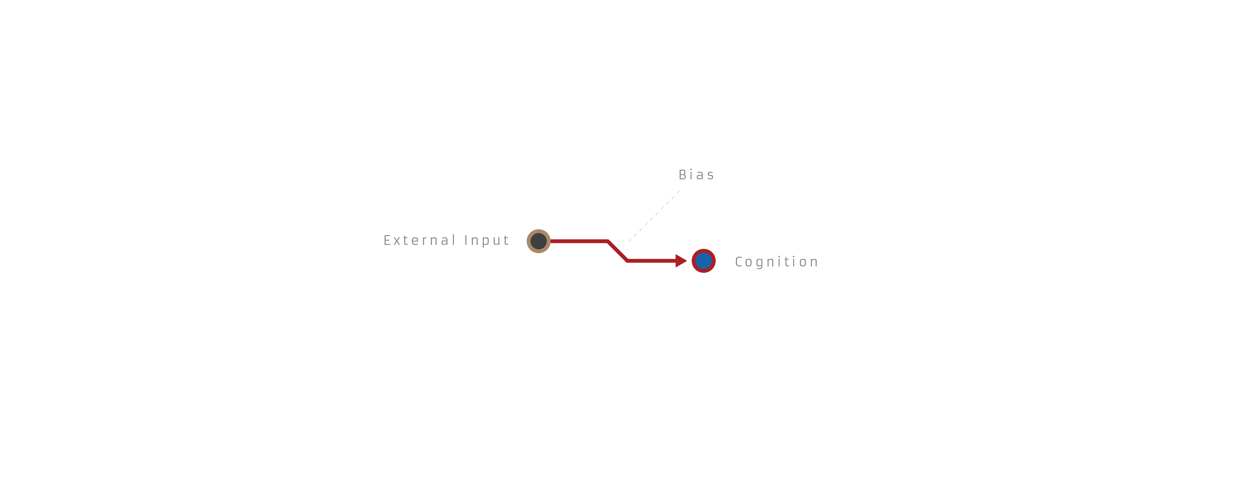
A biased inference looks like this:
This is obviously a simplification of complex cognitive shit, but it's meant to be more of a functional interface than any kind of theory.
So to run through a few example biases, the fallacy of the undistributed middle:

The planning fallacy:

Planning fallacy corrected:

A little awkward, but it can capture basic failures in Bayesian reasoning as well:

Bayesian reasoning corrected:

And an example of compounding biases resulting in a distorted worldview:

I'm curious if anyone sees downsides to this framework, has other ideas to improve it, or thinks I'm hopelessly naive for even trying to capture human reasoning in a tidy diagram.
No, it is a bug in virtually all cases. A model which depicts a broad class of phenomena in a single way is a bad model unless the class of phenomena are actually very similar along the axis the model is trying to capture. These phenomena are not similar along any useful axis. In fact, there is no observable criterion you could choose to distinguish the examples depicted as biased from the examples depicted as correct. A biased inference, a correct inference where no bias you know of played a substantial role, an instance where multiple biases canceled out, an instance where you overcompensated for bias (e.g. "the world isn't actually dangerous, so that guy at the bus top with a drawn knife probably doesn't actually mean me harm"), and a Gettier case are all structurally identical.
This diagram format is a pure placebo and any value you perceive it to have given you is incorrectly attributed.