[this is a linkpost to Analysis of World Records in Speedrunning]
ETA: a more recent analysis can be found here.
TL;DR: I have scraped a database of World Record improvements for fastest videogame completition for several videogames, noted down some observations about the trends of improvement and attempted to model them with some simple regressions. Reach out if you'd be interested in researching this topic!
Key points
- I argue that researching speedrunning can help us understand scientific discovery, AI alignment and extremal distributions. More.
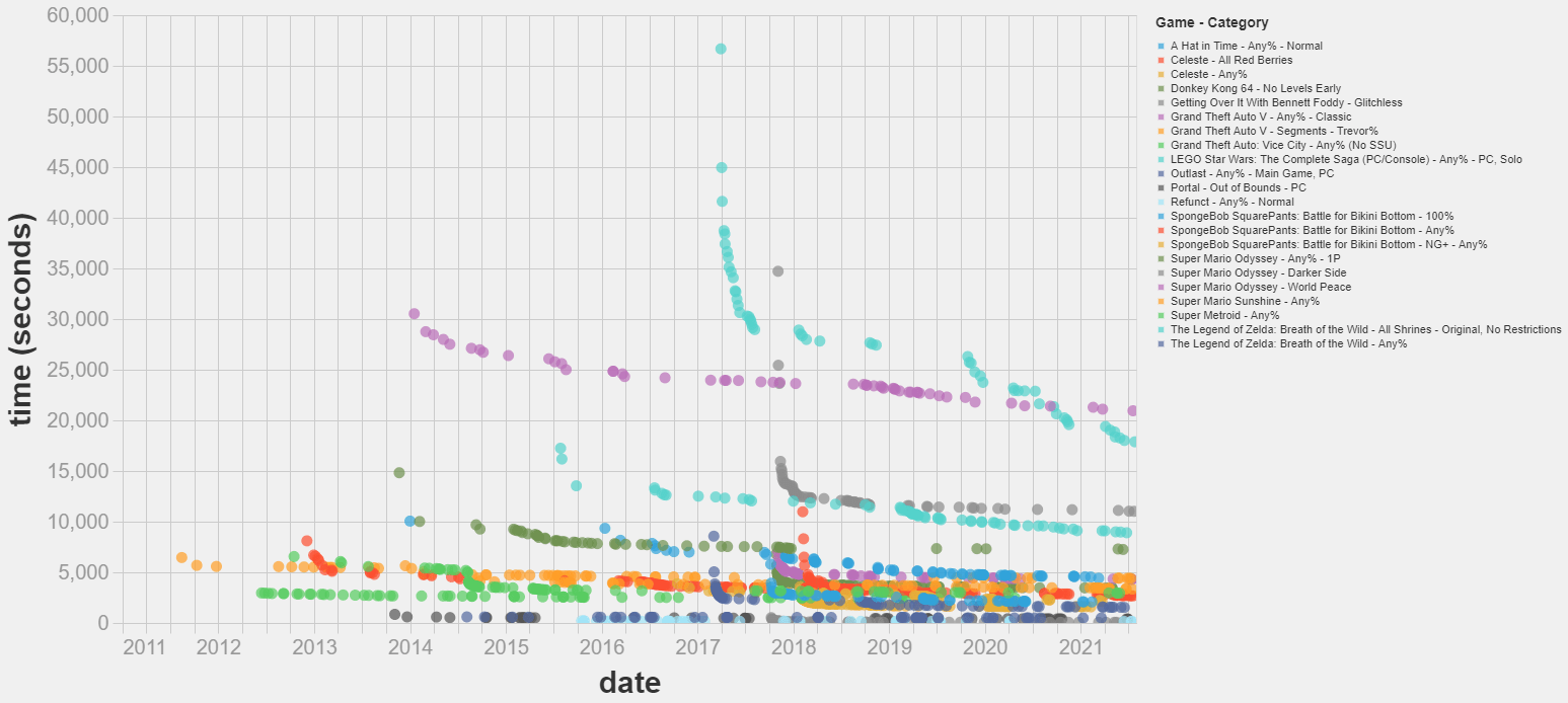
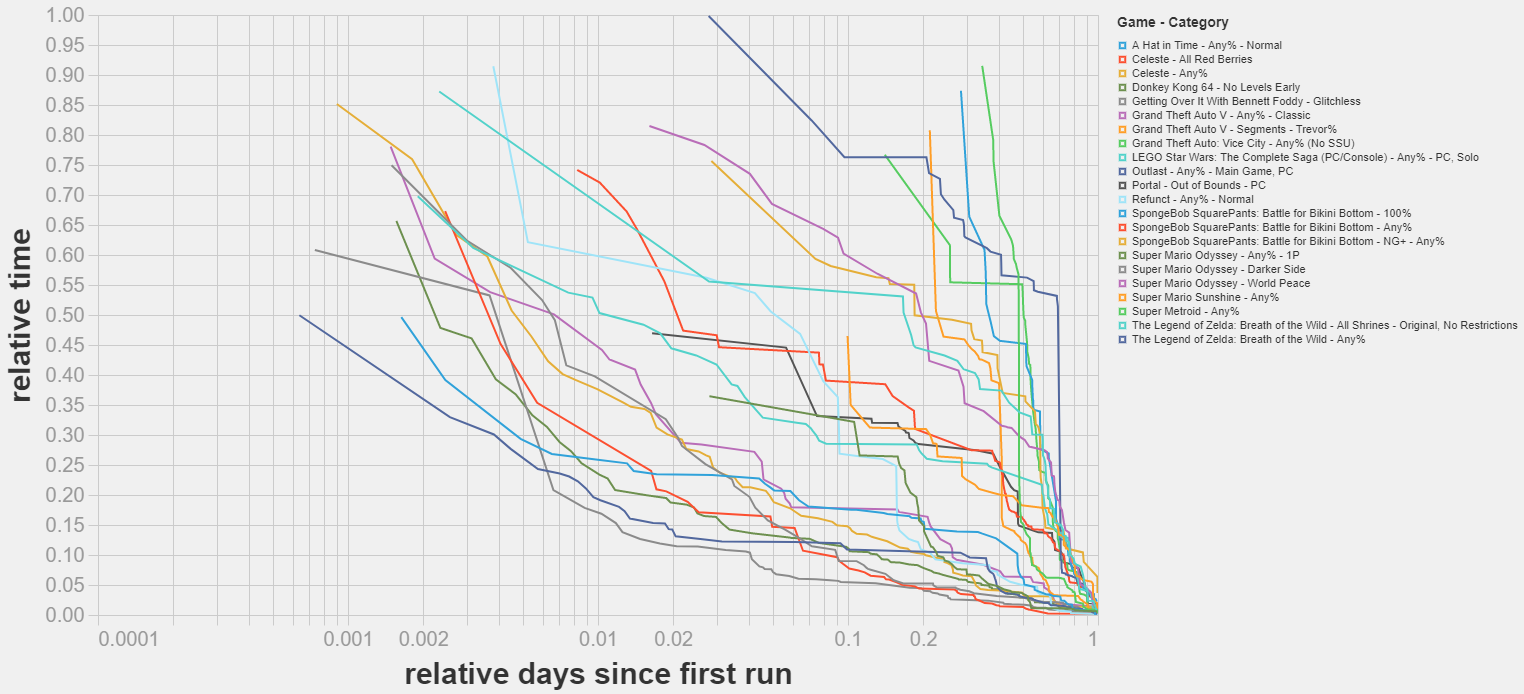
- I’ve scraped a dataset on world record improvements in videogame speedrunning. It spans 15 games, 22 categories and 1462 runs. More.
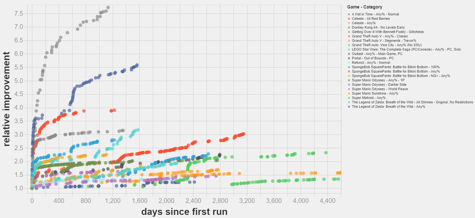
- Most world record improvements I studied follow a diminishing returns pattern. Some exhibit successive cascades of improvements, with continuous phases of diminishing returns periodically interrupted by (presumably) sudden discoveries that speed up the rate of progress. More.
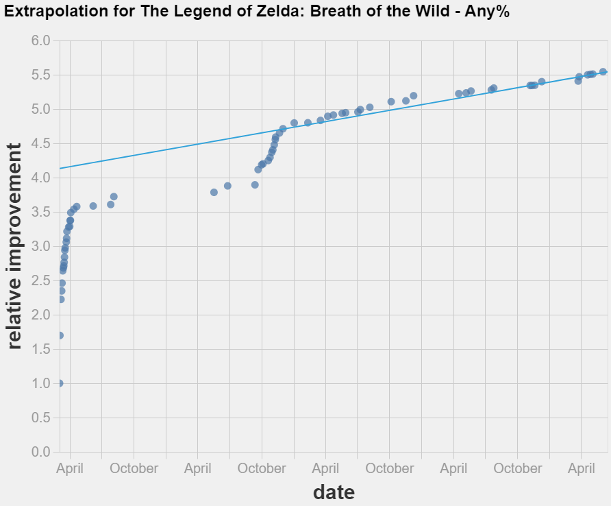
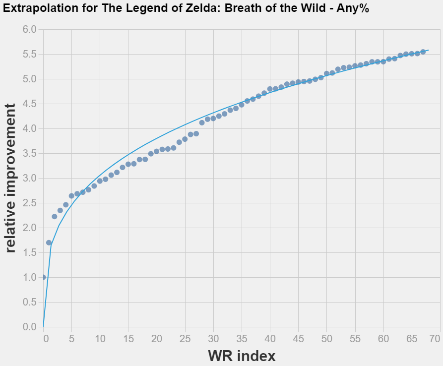
- Simple linear extrapolation techniques could not improve on just guessing that the world record will not change in the near future. More.
- Possible next steps include trying different extrapolation techniques, modelling the discontinuities in the data and curating a dataset of World Record improvements in Tool Assisted Speedruns. More.
The script to scrape the data and extrapolate it is available here. A snapshot of the data as of 30/07/2021 is available here.
Feedback on the project would be appreciated. I am specially keen on discussion about:
- Differences and commonalities to expect between speedrunning and technological improvement in different fields.
- Discussion on how to mathematically model the discontinuities in the data.
- Ideas on which techniques to prioritize to extrapolate the observed trends.

This is so cool!
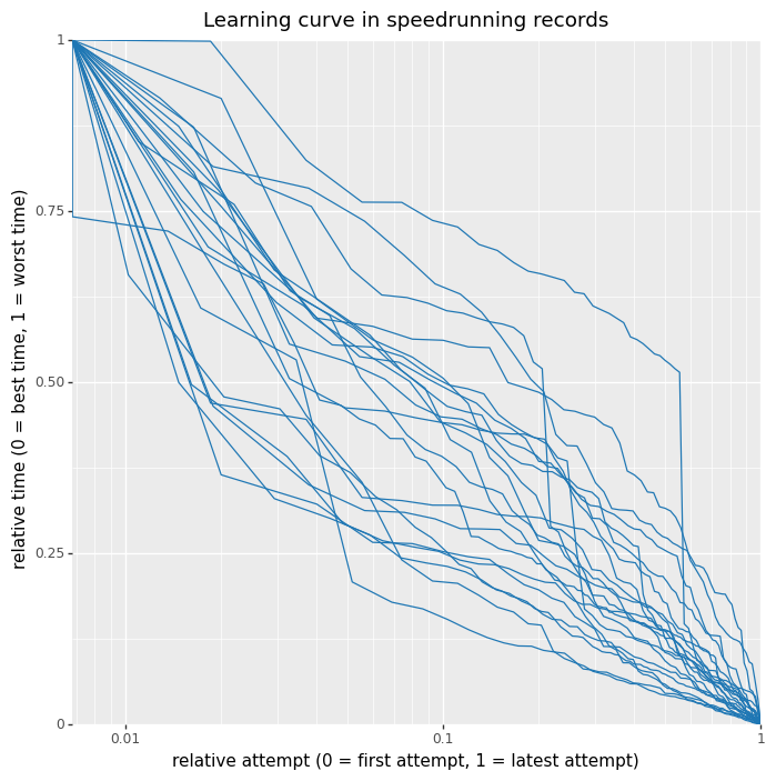
It seems like the learning curves are reasonable close to the diagonal, which means that:
On the other hand, despite all curves being close to the diagonal, they seem to mostly undershoot it. This might imply that the rate of improvement is slighly decreasing over time.
One thing that tripped me from this graph for other readers: the relative attempt is wrt to the amount of WR improvements. That means that if there are 100 WRs, the point with relative attempt = 0.5 is the 50th WR improvement, not the one whose time is closer to the average between the date of the first and last attempt.
So this graph is giving information about "conditional on you putting enough effort to beat the record, by how much should you expect to beat it?" rather than on "conditional on spending X amount of effort on the margin, by how much should you expect to improve the record?".
Here is the plot that would correspond to the other question, where the x axis value is not proportional to the ordinal index of WR improvement but to the date when the WR was submitted.
It shows a far weaker correlation. This suggests that a) the best predictor of new WRs is the amount of runs overall being put into the game and 2) the amount of new WRs around a given time is a good estimate of the amount of runs overall being put into the game.
This has made me update a bit against plotting WR vs time, and in favor of plotting WR vs cumulative number of runs. Here are some suggestions about how one could go about estimating the number of runs being put into the game, if somebody want to look into this!
PS: the code for the graph above, and code to replicate Andy's graph, is now here