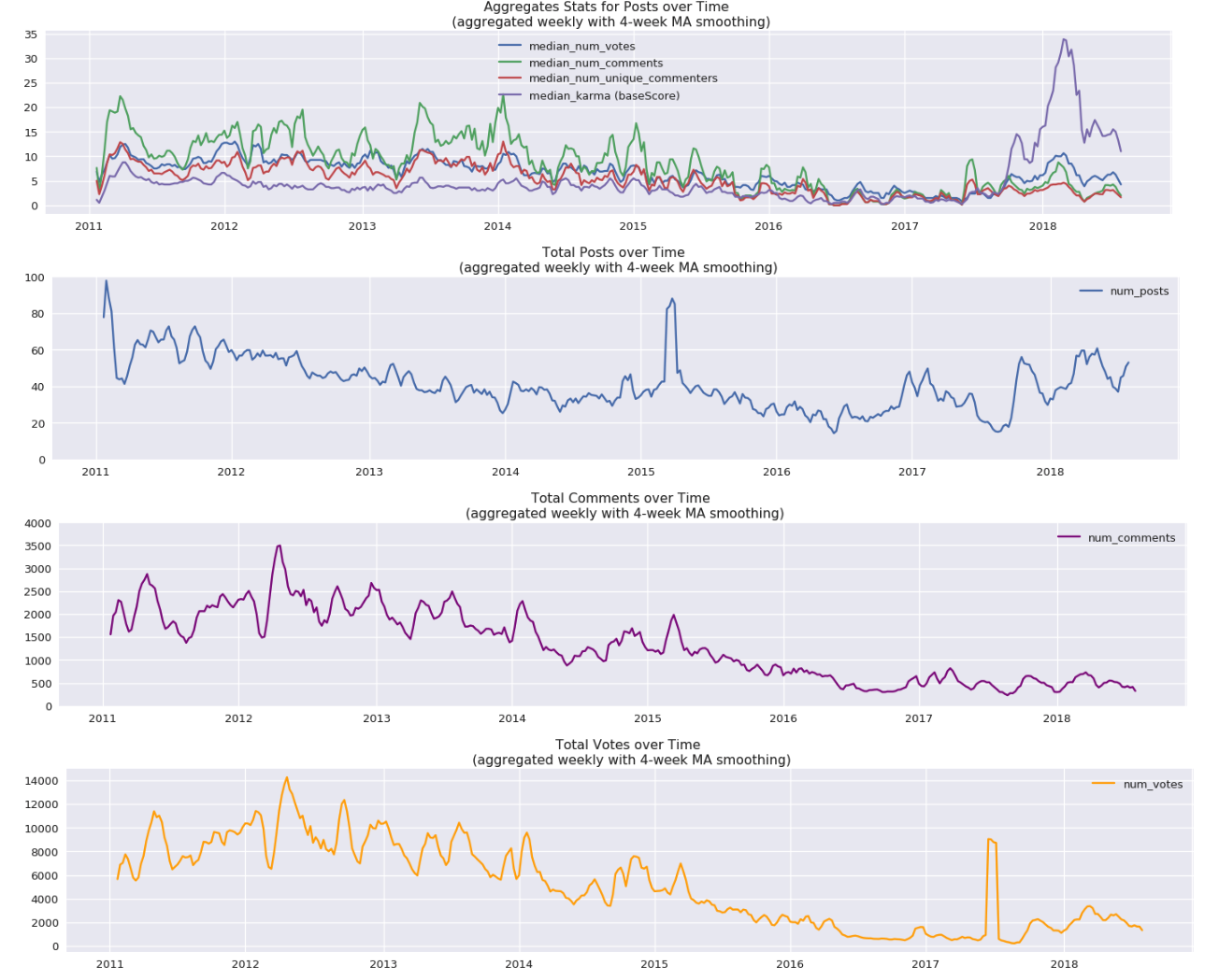
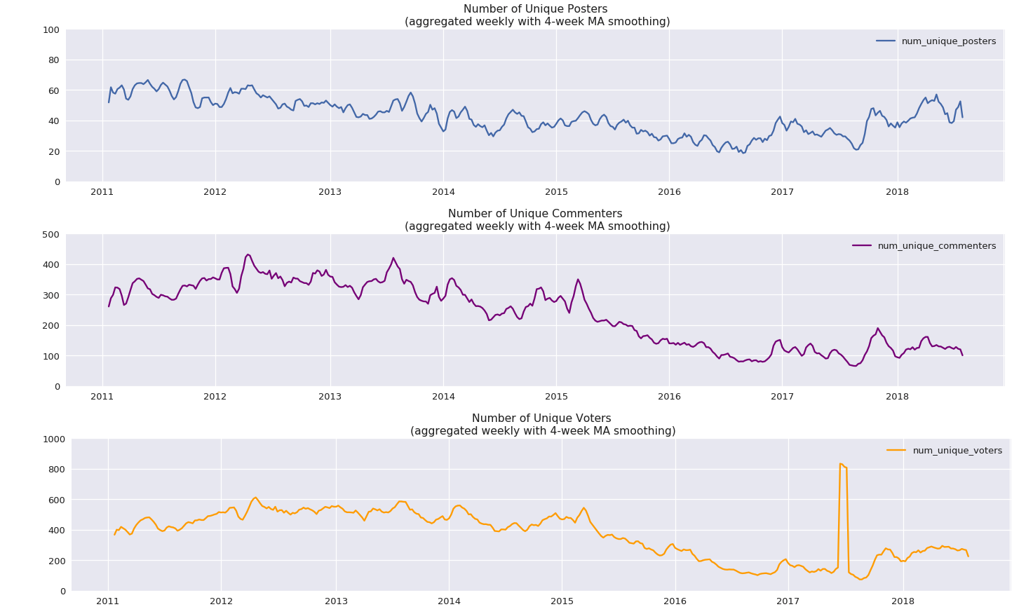
Some graphs showing posting activity on LessWrong through the years.
NOTE: If you’re reading this post on GreaterWrong, you can click on the images to enlarge, zoom in, and click through them all as a slideshow.
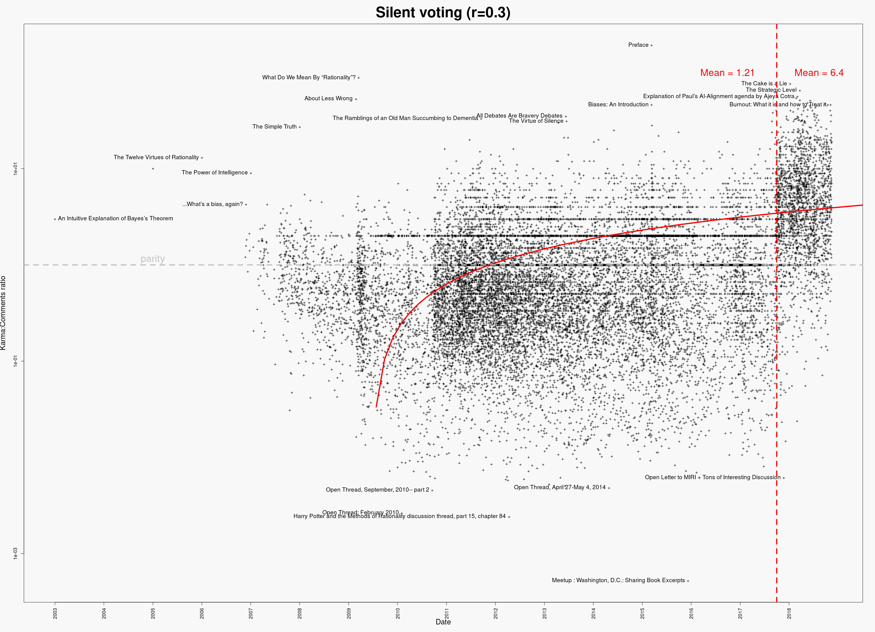
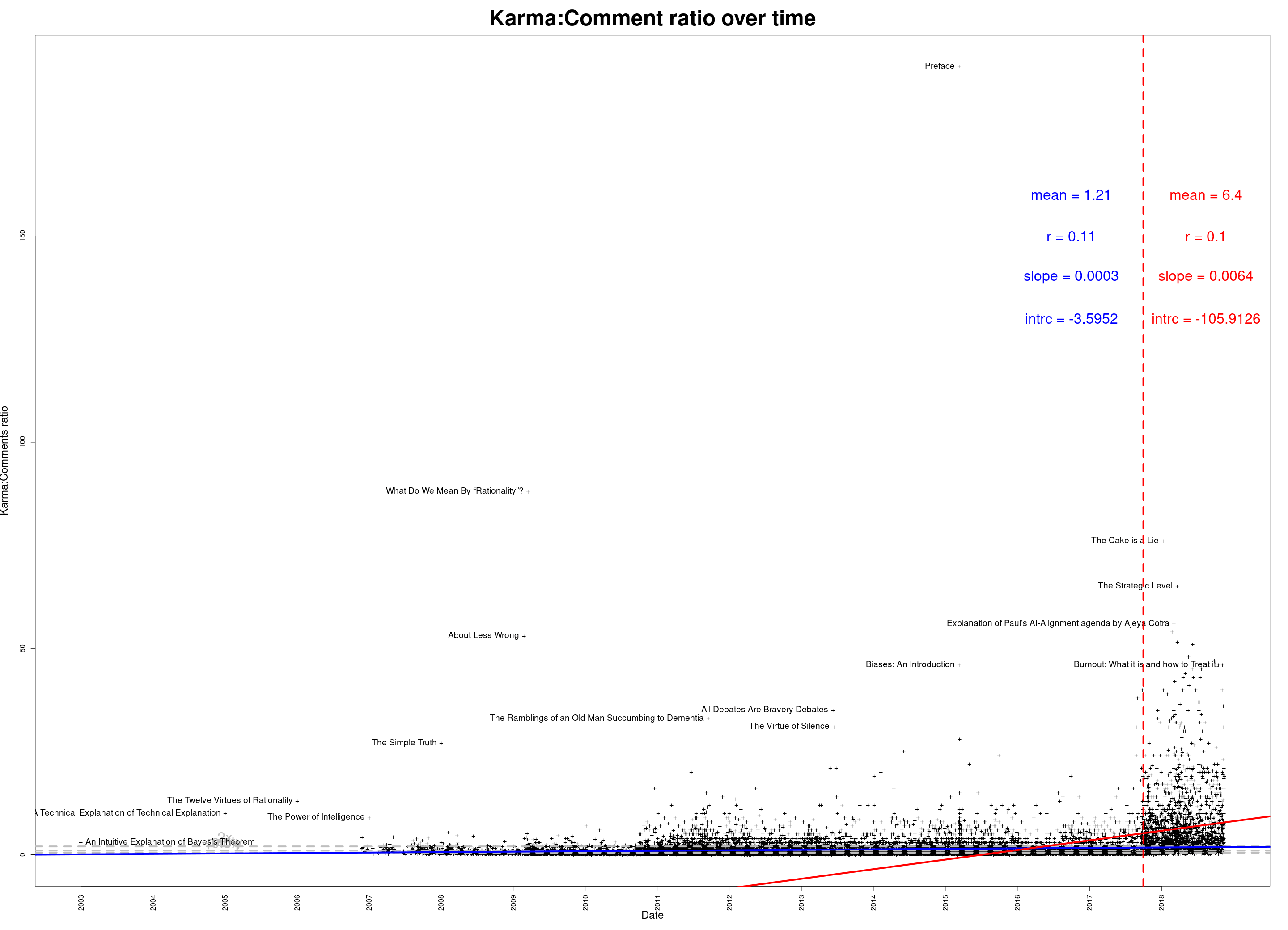
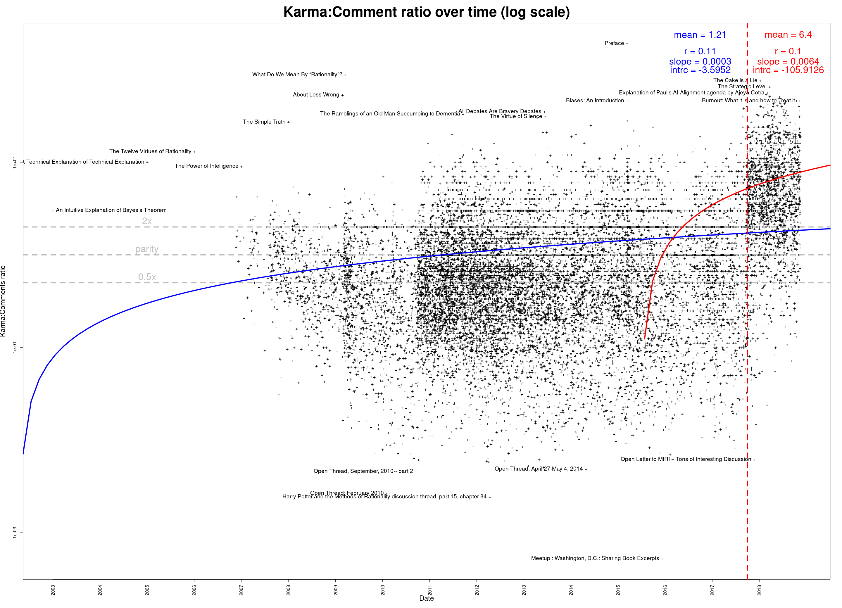
Comments per post:

The same thing, on a log scale:
")
Posts per month:

The 100 most prolific authors over LessWrong’s lifespan:

The same thing, on a log scale:
")
Whose posts have generated the most total discussion?

As above, but on a log scale:
")
Data available in a Google Docs spreadsheet. (Or download in CSV format.)
You can also download an Excel spreadsheet, which contains the above graphs and some intermediate processed data.
Edit 2018-11-16: Updated data; corrected some minor abnormalities caused by data retrieval issue. (If you’ve downloaded the data already, please re-download the corrected versions—the links are the same.)
Thanks for running GW ought properly to go to clone of saturn, who both wrote the server code (e.g.) and administers the server. I’m just the front-end guy! :)
As for the graphs/data—you’re quite welcome! (And, by the way, if you, or anyone, have suggestions on what other relationships or patterns might be interesting to extract from this data and make a chart of, let me know and I’ll add it to the post.)