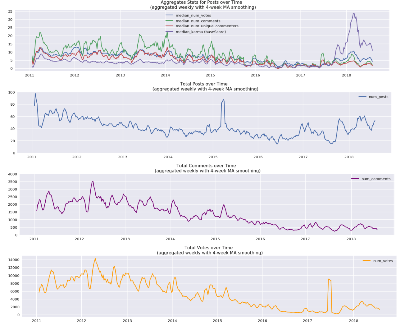
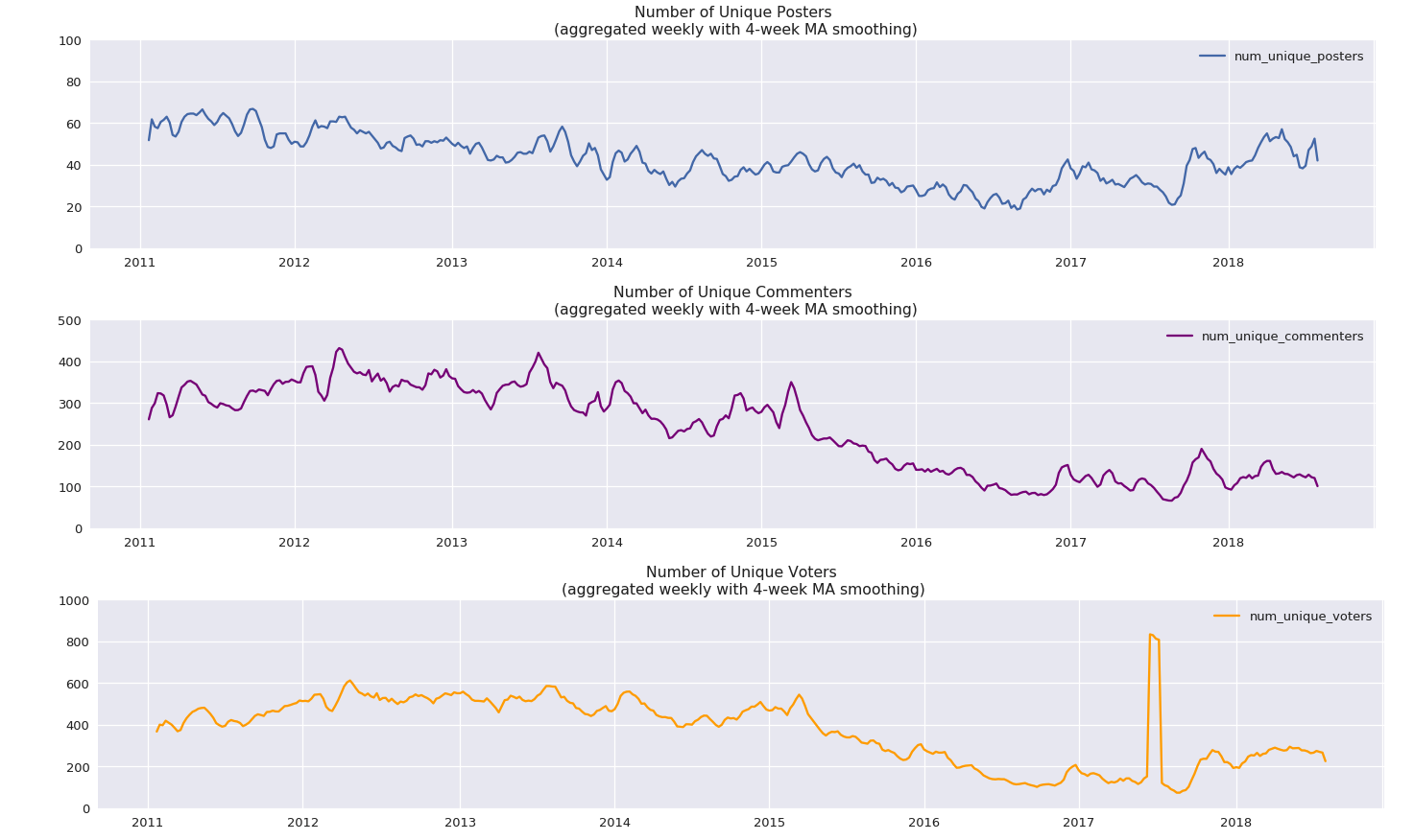
Some graphs showing posting activity on LessWrong through the years.
NOTE: If you’re reading this post on GreaterWrong, you can click on the images to enlarge, zoom in, and click through them all as a slideshow.
Comments per post:

The same thing, on a log scale:
")
Posts per month:

The 100 most prolific authors over LessWrong’s lifespan:

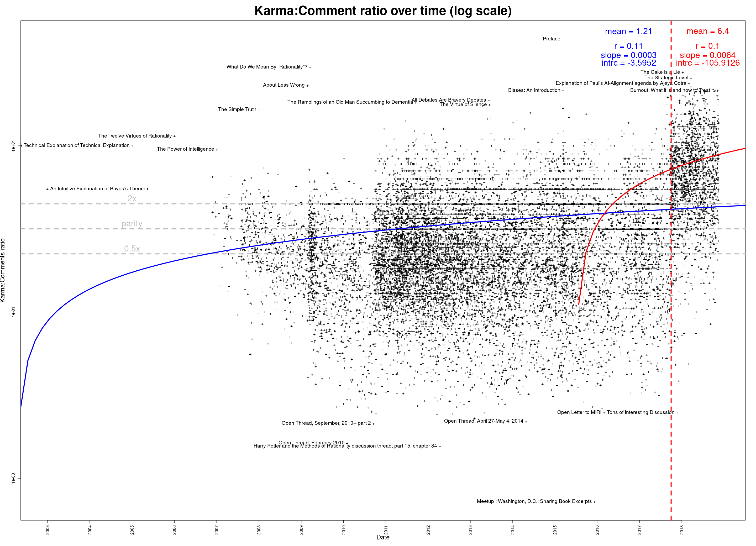
The same thing, on a log scale:
")
Whose posts have generated the most total discussion?

As above, but on a log scale:
")
Data available in a Google Docs spreadsheet. (Or download in CSV format.)
You can also download an Excel spreadsheet, which contains the above graphs and some intermediate processed data.
Edit 2018-11-16: Updated data; corrected some minor abnormalities caused by data retrieval issue. (If you’ve downloaded the data already, please re-download the corrected versions—the links are the same.)
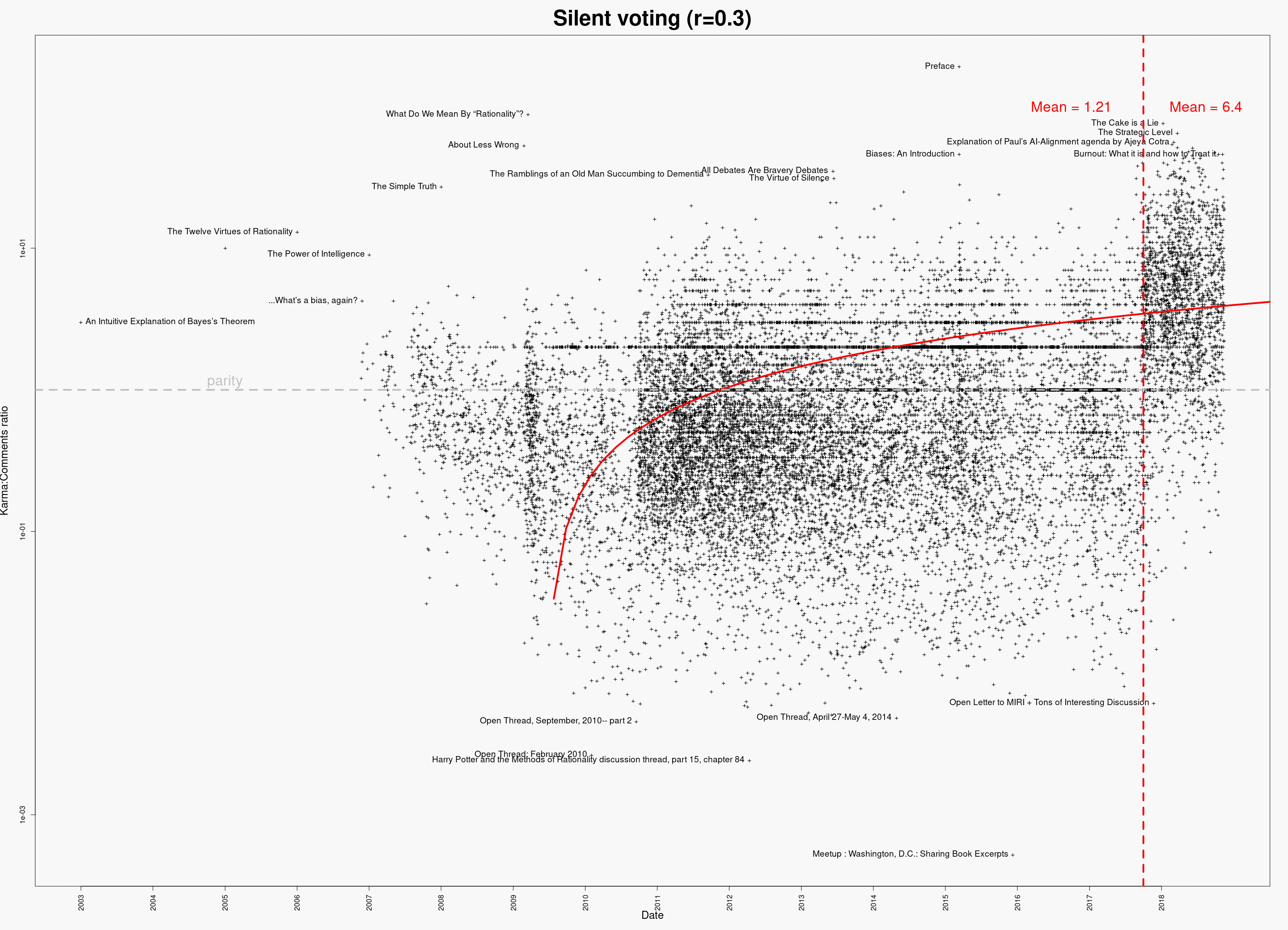
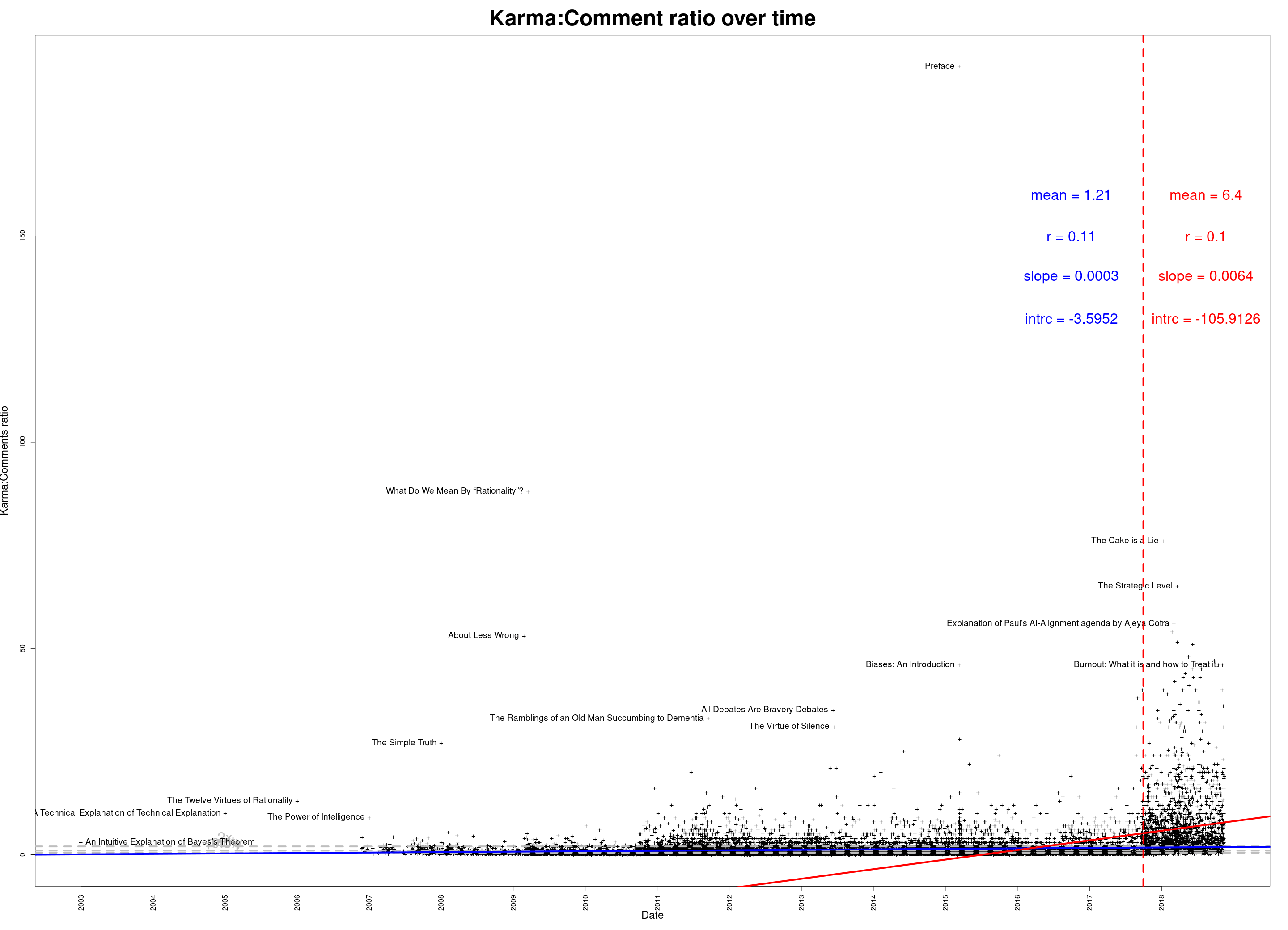
Hmm, the shift there seems mostly the cause of the changes to self-upvoting, as well as the increase in average karma weight. I think you might be able to adjust for that a bit by just using the vote count field (though obviously that ignores the difference between upvotes and downvotes). You could also resolve every individual anonymized vote and then count the upvotes to properly adjust for this, but that might be a bit of a pain.