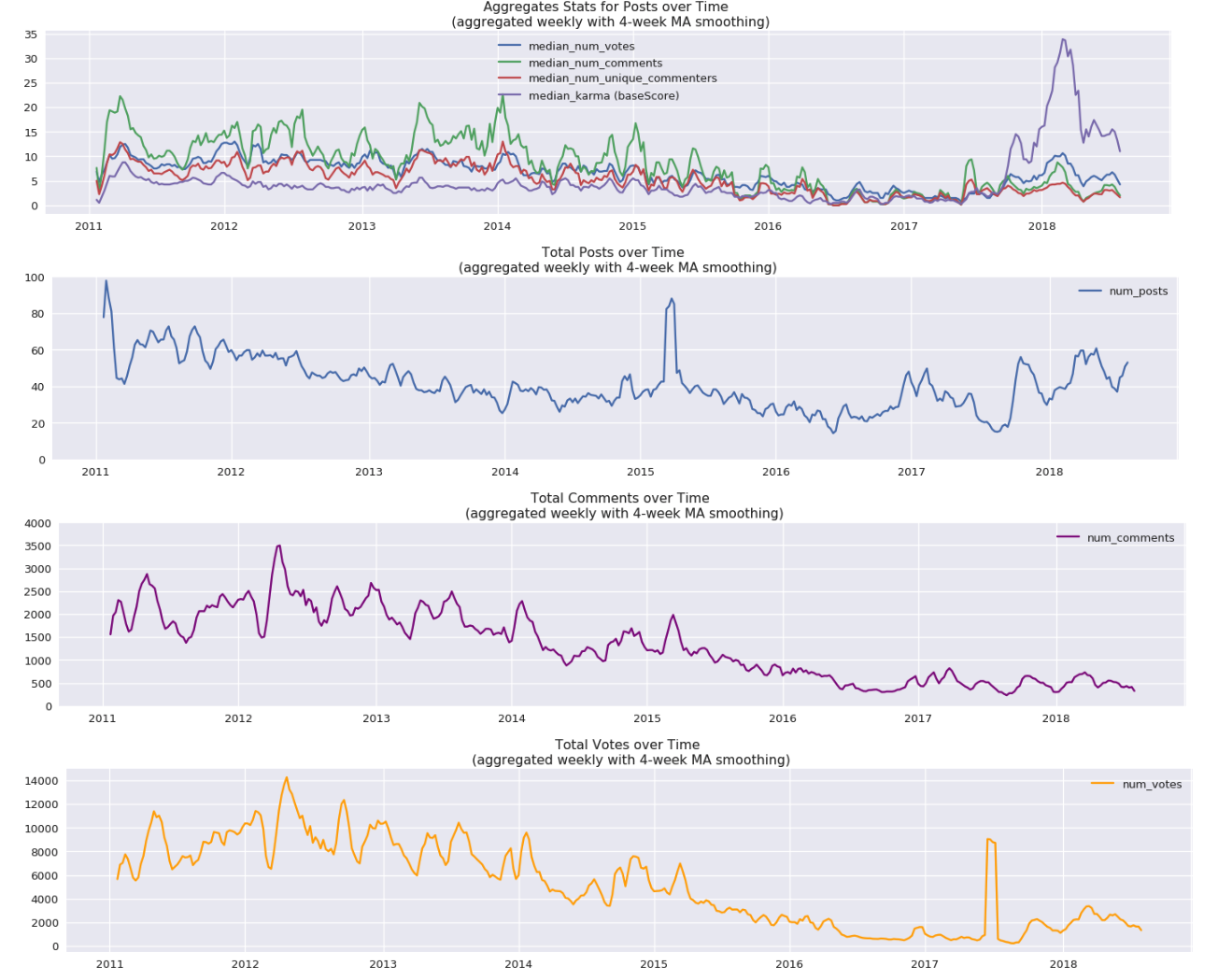
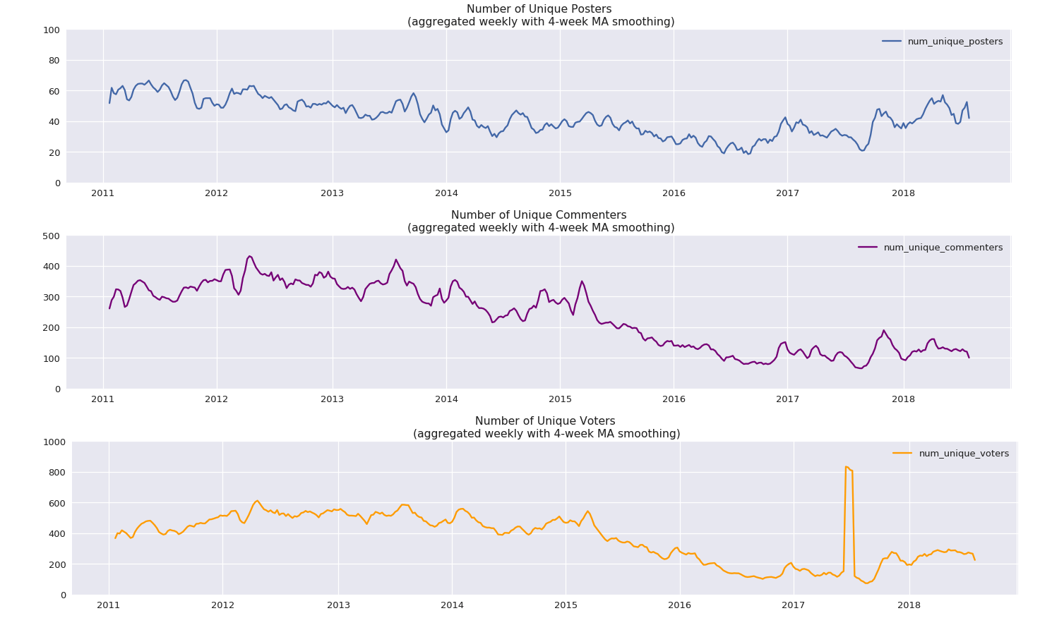
Some graphs showing posting activity on LessWrong through the years.
NOTE: If you’re reading this post on GreaterWrong, you can click on the images to enlarge, zoom in, and click through them all as a slideshow.
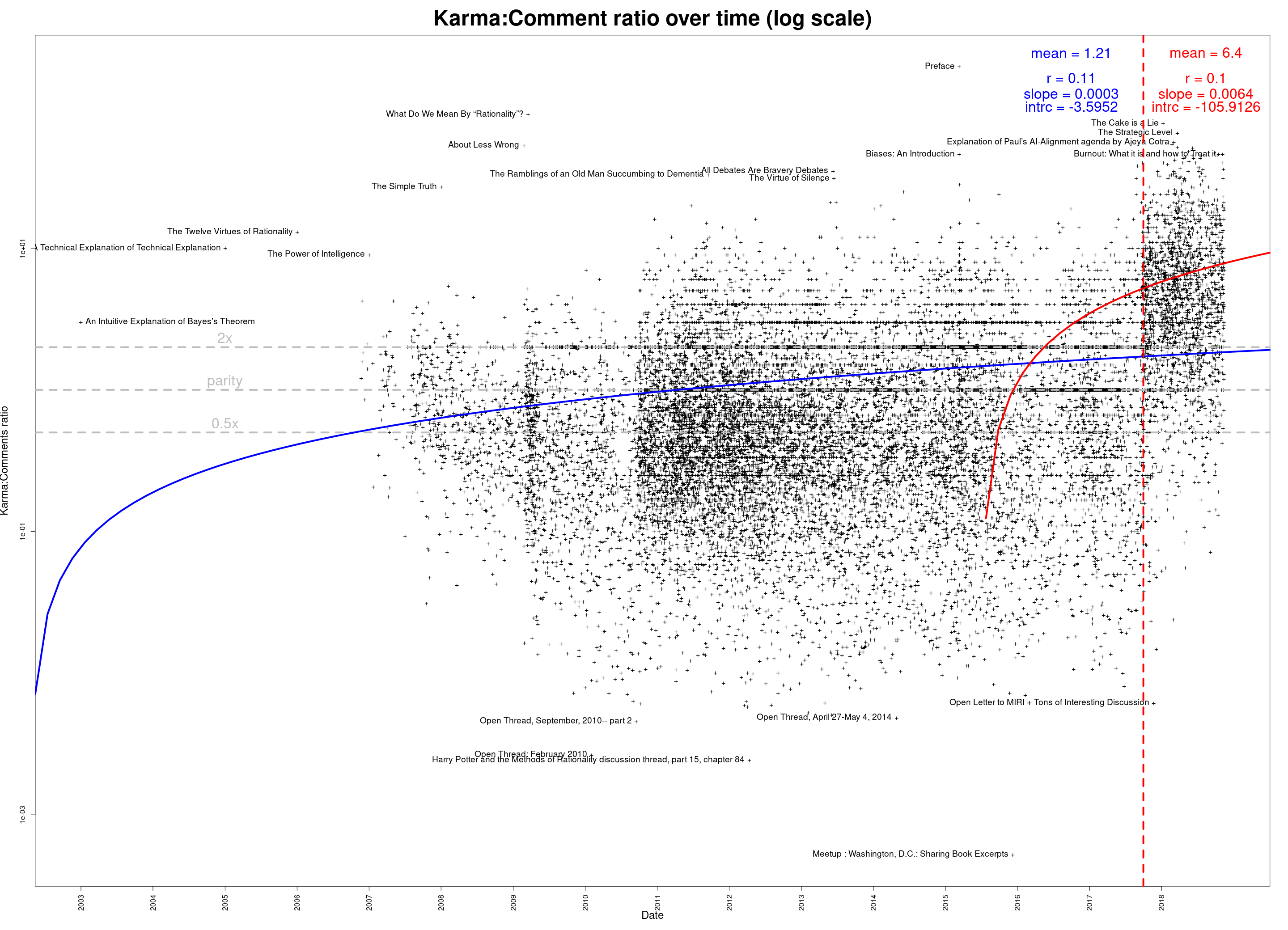
Comments per post:

The same thing, on a log scale:
")
Posts per month:

The 100 most prolific authors over LessWrong’s lifespan:

The same thing, on a log scale:
")
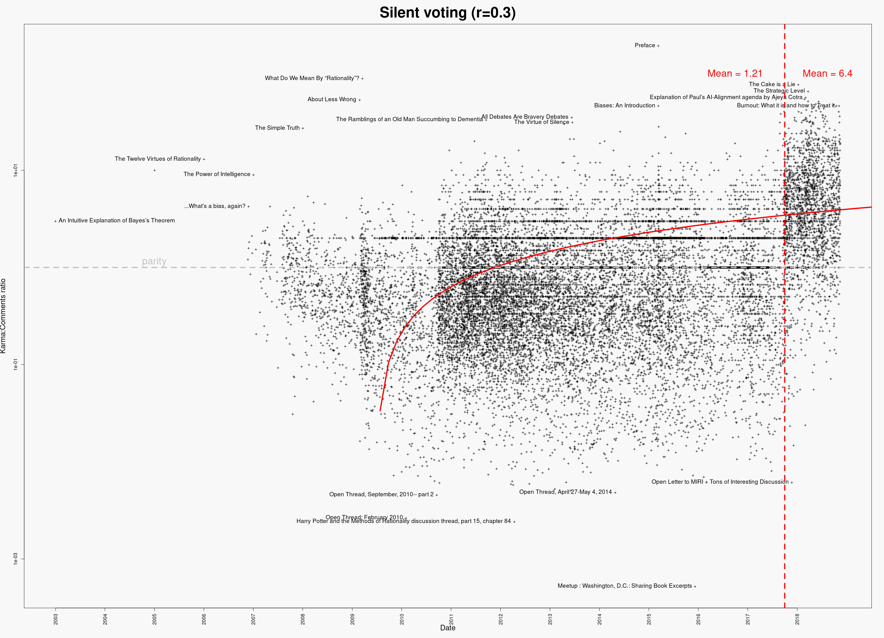
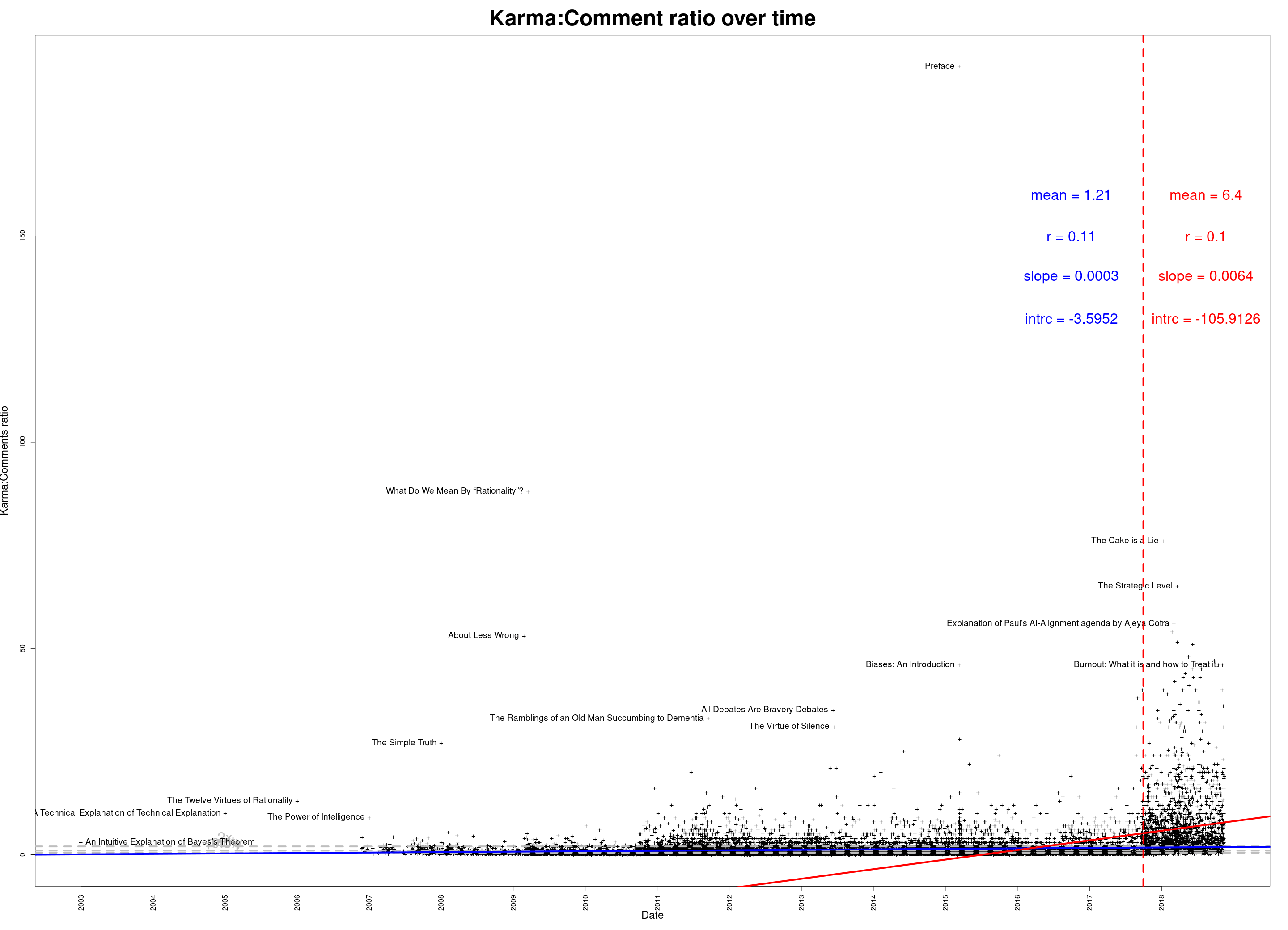
Whose posts have generated the most total discussion?

As above, but on a log scale:
")
Data available in a Google Docs spreadsheet. (Or download in CSV format.)
You can also download an Excel spreadsheet, which contains the above graphs and some intermediate processed data.
Edit 2018-11-16: Updated data; corrected some minor abnormalities caused by data retrieval issue. (If you’ve downloaded the data already, please re-download the corrected versions—the links are the same.)
Said, thanks for doing this, and also for running GW!
It looks like #posts/day is propped up by attention seeking, so it stays stable; while #comments/post is a more genuine indicator of health, and shows a slow decline. Also it's curious that the relaunch of LW didn't affect metrics much. Wonder what the mods would say about this.
Median number of comments/post seems to have gone up a bit since the relaunch, at least according to the graphs I posted below. Average number probably has probably stayed roughly the same, which I think is mostly the cause of Scott moving to his own blog, and his posts continuing to create infinite amounts of comments.
Overall, I think the launch shows up relatively clearly on a bunch of the metrics I posted below, and it's too hard to eye-ball scatter plots to judge on the plots above, though I agree that the overall effect of the relaunch on number of comments is relatively minor.