AI benchmarking has a Y-axis problem
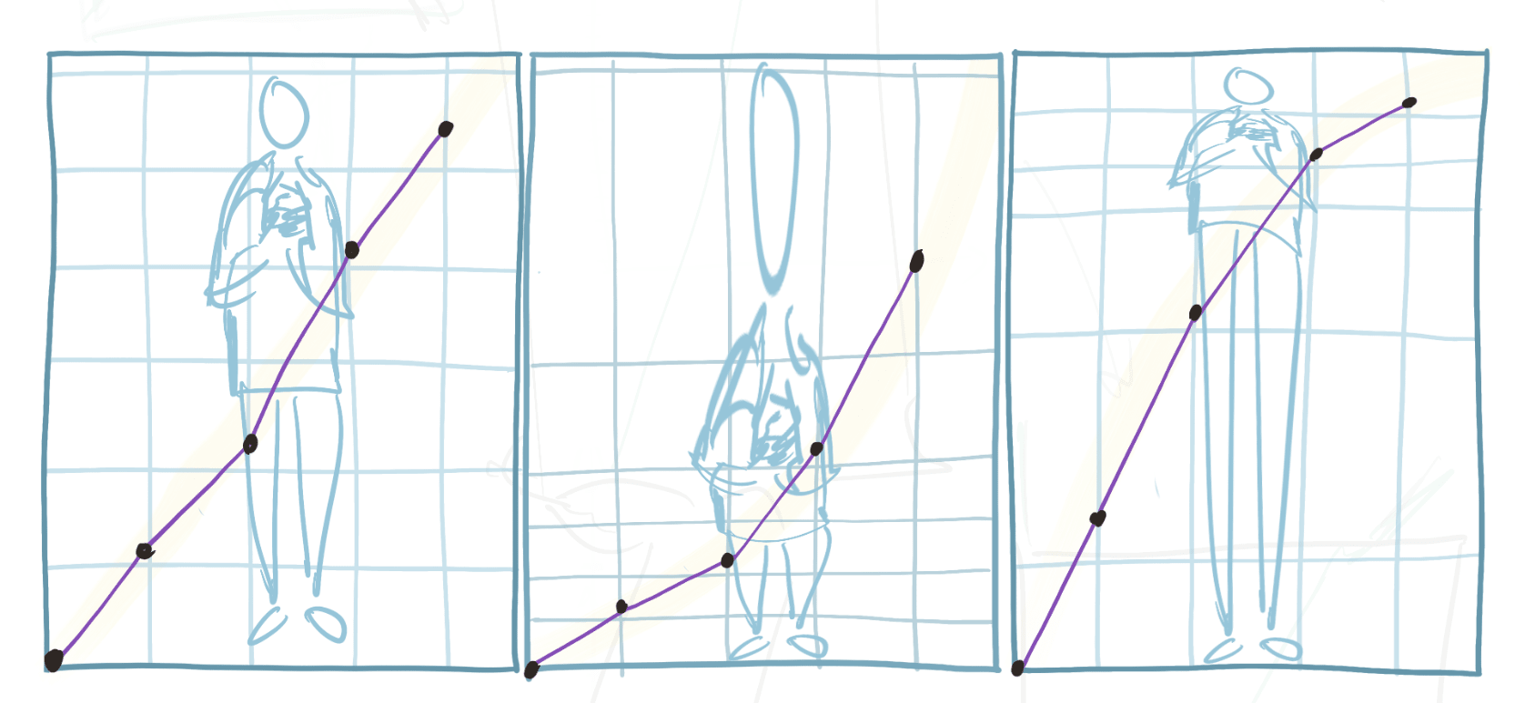
TLDR: People plot benchmark scores over time and then do math on them, looking for speed-ups & inflection points, interpreting slopes, or extending apparent trends. But that math doesn’t actually tell you anything real unless the scores have natural units. Most don’t. Think of benchmark scores as funhouse-mirror projections of “true” capability-space, which stretch some regions and compress others by assigning warped scores for how much accomplishing that task counts in units of “AI progress”. A plot on axes without canonical units will look very different depending on how much weight we assign to different bits of progress.[1] Epistemic status: I haven’t vetted this post carefully, and have no real background in benchmarking or statistics. Benchmark scores vs "units of AI progress" Benchmarks look like rulers; they give us scores that we want to treat as (noisy) measurements of AI progress. But since most benchmark score are expressed in quite squishy units, that can be quite misleading. * The typical benchmark is a grab-bag of tasks along with an aggregate scoring rule like “fraction completed”[2] * ✅ Scores like this can help us... * Loosely rank models (“is A>B on coding ability?”) * Operationalize & track milestones (“can a model do X yet?”) * Analyze this sort of data[3] * ❌ But they’re very unreliable for supporting conclusions like: * “Looks like AI progress is slowing down” / “that was a major jump in capabilities!” * “We’re more than halfway to superhuman coding skills” * “Models are on track to get 80% by EOY, which means...” * That's because to meaningfully compare score magnitudes (or interpret the shape of a curve), scores need to be proportional to whatever we're actually trying to measure * And grab-bag metrics don’t guarantee this: * Which tasks to include and how to weight them are often subjective choices that stretch or compress different regions of the scale * So a 10-point gain early on might reflec