I could get quite in depth about this but I'm going to assume most people have a fair amount of experience with this subject. Some examples to keep in mind so you have context for my point are Discord (new mobile app and changes to its' featureset over the years), Reddit (old.reddit compared to new), LessWrong (discussions feature).
Crux of my question is this: separate from enshittification due to capitalistic forces (changes made to attempt to please investors, create endless growth, make more money generally), are changes to apps and websites worse on-average in some clear and obvious way than their previous versions, or is the evident outrage for changes to the UI and concept of these platforms from a general 'fear or dislike of change' present in humans?
For example, let's point to things like logo and brand typeface changes. This is a change that has the least amount of actual effect on the average user of a platform, the usability of Reddit doesn't change at all between Logo A and Logo B (the new logo is on the right).

But a precursory search shows that the reaction is mostly negative.

This was true for Discord as well (new logo below.) When the logo and typeface changes for Discord were announced, the reaction was overwhelmingly negative.
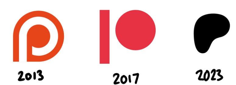
Last example here, this is the Patreon logo's recent change. People are so opposed to this change it's kind of hilarious. It's used as an indicator that the brand identity of corporations is trending towards amorphous blobs lacking any personality or identity. It's hard to find anyone who claims that the new Patreon logo is any good at all.
To be clear about the previous section: I don't think it's valuable to wonder whether the logos are better or worse. I think the previous logos are more striking and artistically interesting, but that's the purpose of my question. My intent is to point to the fact that the public response to these logo changes is almost always negative.
It's pretty easy to tell that when a company's logo changes, on average, people don't like it. I could go on by posting the logo changes of Pepsi, Coke, Burger King, facebook (oh, I mean F A C E B O O K), etc... if anyone can point out a case where a logo changed and received a positive response, I'd love to hear about it, but it's more or less besides the point.
My main question is whether the logo change outrage is indicative of the larger effect of people identifying with an app, website or brand and then feeling betrayed when that identity changes, or if the changes are actually negative on the whole, and their criticisms are valid.
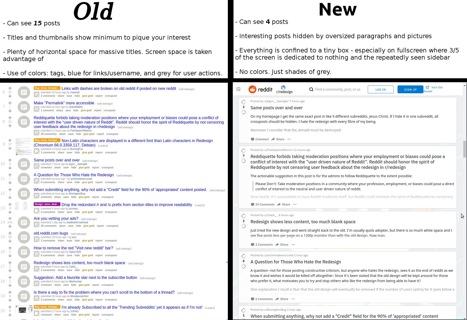
And if the changes are actually just bad by and large (I'm inclined to agree with the above infographic about Reddit) then why do websites get worse, rather than better, over time? Is it entirely the previously mentioned enshittification and related to 'market forces', or is it something else? Is it just really hard to improve a public-facing service that's already good by making incremental changes? Do UI/UX designers lack some understanding of good design, generally? That seems unlikely to me. Maybe they just often lack the context of actually using the given app regularly.
I'm a little worried that this is a pointless or meandering question. I'm just hoping to get some good discussion going and update my ideas about this sort of thing somewhat. Thanks for reading!


A great example of a product actually changing for the worse is Microsoft Office. Up until 2003, Microsoft Office had the standard "File, Edit, ..." menu system that was characteristic of desktop applications in the '90s and early 2000s. For 2007, though, Microsoft radically changed the menu system. They introduced the ribbon. I was in school at the time, and there was a representative from Microsoft who came and gave a presentation on this bold, new UI. He pointed out how, in focus group studies, new users found it easier to discover functionality with the Ribbon than they did with the old menu system. He pointed out how the Ribbon made commonly used functions more visible, and how, over time, it would adapt to the user's preferences, hiding functionality that was little used and surfacing functionality that the user had interacted with more often.
Thus, when Microsoft shipped Office 2007 with the Ribbon, it was a great success, and Office gained a reputation for having the gold standard in intuitive UI, right?
Wrong. What Microsoft forgot is that the average user of Office wasn't some neophyte sitting in a carefully controlled room with a one-way mirror. The average user of Office was upgrading from Office 2003. The average user of Office had web links, books, and hand-written notes detailing how to accomplish the tasks they needed to do. By radically changing the UI like that, Microsoft made all of that tacit knowledge obsolete. Furthermore, by making the Ribbon "adaptive", they actively prevented new tacit knowledge from being formed.
I was working helpdesk for my university around that time, and I remember just how difficult it was to instruct people with how to do tasks in Office 2007. Instead of writing down (or showing with screenshots) the specific menus they had to click through to access functionality like line or paragraph spacing, and disseminating that, I had to sit with each user, ascertain the current state of their unique special snowflake Ribbon, and then show them how to find the tools to allow them to do whatever it is they wanted to do. And then I had to do it all over again a few weeks later, when the Ribbon adapted to their new behavior and changed again.
This task was further complicated by the fact that Microsoft moved away from having standardized UI controls to making custom UI controls for each separate task.
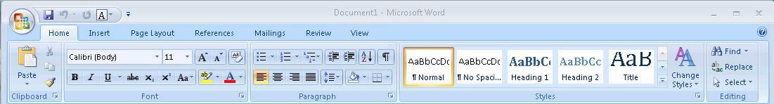
For example, here is the Office 2003 menu bar:
(Source: https://upload.wikimedia.org/wikipedia/en/5/54/Office2003_screenshot.PNG)
Note how it's two rows. The top row is text menus. The bottom row is a set of legible buttons and drop-downs which allow the user to access commonly used tasks. The important thing to note is that everything in the bottom row of buttons also exists as menu entries in the top row. If the user is ever unsure of which button to press, they can always fall back to the menus. Furthermore, documents can refer to the fixed menu structure allowing for simple text instructions telling the user how to access obscure controls.
By comparison, this is the Ribbon:
(Source: https://kb.iu.edu/d/auqi)
Note how the Ribbon is multiple rows of differently shaped buttons and dropdowns, without clear labels. The top row is now a set of tabs, and switching tabs now just brings up different panels of equally arcane buttons. Microsoft replaced text with hieroglyphs. Hieroglyphs that don't even have the decency to stand still over time so you can learn their meaning. It's impossible to create text instructions to show users how to use this UI; instructions have to include screenshots. Worse, the screenshots may not match what the user sees, because of how items may move around or be hidden.
I suspect that many instances of UIs getting worse are due to the same sort of focus-group induced blindness that caused Microsoft to ship the ribbon. Companies get hung up on how new inexperienced users interact with their software in a tightly controlled lab setting, completely isolated from outside resources, and blind themselves to the vast amount of tacit knowledge they are destroying by revamping their UI to make it more "intuitive". I think the Ribbon is an especially good example of this, because it avoids the confounding effect of mobile devices. Both Office 2003 and 2007 were strictly desktop products, so one can ignore the further corrosive effect of having to revamp the UI to be legible on a smartphone or tablet.
Websites and applications can definitely become worse after updates, but the company shipping the update will think that things are getting better, because the cost of rebuilding tacit knowledge is borne by the user, not the corporation.
A related issue here is the Schlitz effect (see my advertising experiments). Even if you do test, your testing is typically set up in an asymmetrical way where you are guaranteed to ratchet downward in quality.
So, if you test only on newbies, you will obviously never observe a degradation in performance for everyone else, and so you can expect to ratchet down indefinitely (some changes are strictly superior, but particularly after you pluck all the low-hanging fruit, you will now tend to be on a Pareto frontier & many changes will involve tradeoffs); b... (read more)