I'd guess that the benchmarks which METR uses have enough label noise and other issues (e.g. specification ambiguity) that measuring >=95% reliability isn't meaningful. 80% probably is meaningful.
When analyzing the high reliability regime, I think you'd want to get a ceiling on performance by baselining with human domain experts who are instructed to focus on reliability. (E.g. something like: "continue testing etc until you're very confident the task is completed successfully".) And then you'd compare this humans ceiling to AI performance (for AIs which are given similar instructions). I think humans (and AIs) typically don't aspire to that high of reliability by default. Ideally you'd also iterate on tasks and baselining strategies until the expert baseliners do >95% or whatever.
So, I expect that looking at 95% will underestimate AI progress.
Thanks for the comment.
In terms of the label noise I feel like that's decently accounted for already, as the calculations I'm using are actually not from specific model scores, but rather these points are sampled from me taking the intersecting points of a smoothed curve with the accuracy level for each of the models, and then I derive the factor that exists between that point and the 50% accuracy time horizon, as you can see here in the image at this link for example: https://prnt.sc/odMcvz0isuRU
Additionally, after I noted those factors for 50% to 80%, 90%, 95% and 99% individually for all 6 of those models, I averaged them across the models, which results in the final singular set of averaged factors, which I ended up using for formulating the 80%, 95% and 99% trend lines in the final chart I made. I think there is still some higher margin of error worth noting for those higher accuracy values perhaps, but unless I'm missing something I feel this methodology is relatively robust to being made redundant by label noise.
"I think you'd want to get a ceiling on performance by baselining with human domain experts who are instructed to focus on reliability." "So, I expect that looking at 95% will underestimate AI progress."
Yes I very much agree, I don't think it's fair for people to assume from my chart "AI won't be human level until it's doing these tasks at 99% reliability" and I hope people don't end up with that take-away.
And I don't intend to imply that 99% accuracy means "1% away from human level" either, as the human accuracy could be less than 99% or even less than 90% or 80% depending on the task within that time horizon bucket.
I don't have the resources at hand myself to implement such human testing you described though, however I think it's worth giving that feedback to the folks at METR, and then that could result in more useful data for people like me to make visualizations out of again :)
TLDR: Skip to the last image at the bottom of my post to see the visualization.
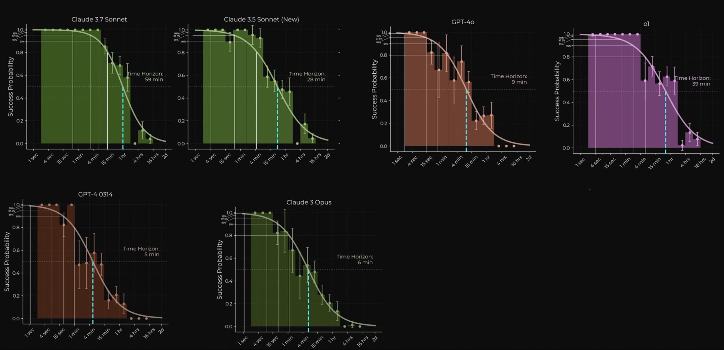
I don't usually post here, but I know you folks like forecasting and timelines, so I think you might appreciate this. The recent time horizons paper by METR is great, but it only visualized tasks that models could complete with 50-80% accuracy. I think it's highly useful, and arguably even more useful, to see when capabilities would hit 95% or 99% accuracy or beyond for various time horizons.
So I went through the paper with the goal of getting the information that will allow such a visualization to be created, and I found distributions shown of model-specific accuracy levels for specific time horizon buckets.
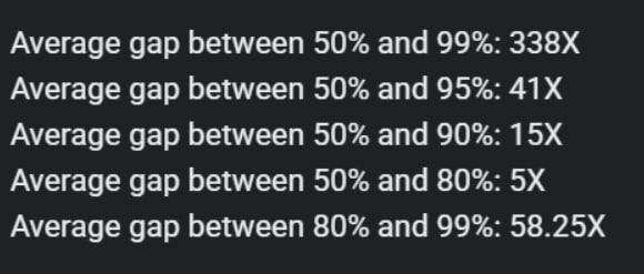
I noted these down and noticed there is similar, if not identical slopes for those higher accuracy levels compared to the lower ones when plotted against time horizons(they also noted in the paper how the slope for 80% accuracy was conveniently very similar to the slope for 50% accuracy too), So this makes the visualization math easier as well, I keep the slope steepness the same while just needing to apply the appropriate Y-axis adjustment relative to release date.
I noted down the multiple difference between the time horizons of 50% accuracy, 80% accuracy, 95% accuracy and 99% accuracy, and did this for the following 6 models:
- Claude-3.7-sonnet
- Claude-3.5-sonnet(new)
- O1
- GPT-4o
- Claude-3-Opus
- GPT-4-0314
The paper mentioned a 5X multiple difference they found between 50% and 80% accuracy, and when I averaged my numbers for these 6 models I arrived at the same figure for 50% to 80%, as for the other accuracy multiples, it looks like this:
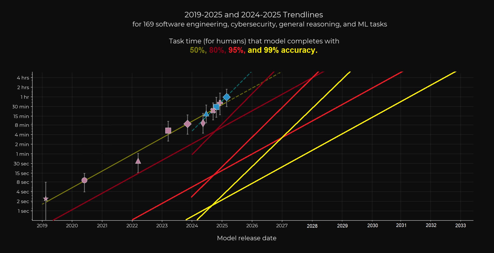
Finally, here is the visualization I ended up making, with expanded x-axis, as well as the short-term trend slope added of reasoning models for each of the new 80%-99% accuracy trends, which was also mentioned in the original paper (doubling every 4 months with the data points of 2024-2025)
I think there is good reason to believe that the short term trend of 4 month doublings may be over optimistic, but I can also see many arguments as to why the long term 7 month doubling trend is under-estimating progress. So I think it's good to include both here, some even believe the trend can go beyond the 4 month doubling soon, and frankly I can see that being reasonably possible too.
Edit: I see people are upvoting but not commenting. As this is one of my first posts here I would appreciate if anyone is willing to give feedback on my formatting, whether there is better ways I can represent images, or even just about how this maybe influences your timelines? (or even reasons as to why it doesn't influence your timelines).