I was reading a post on the economy from the political statistics blog FiveThirtyEight, and the following graph shocked me:
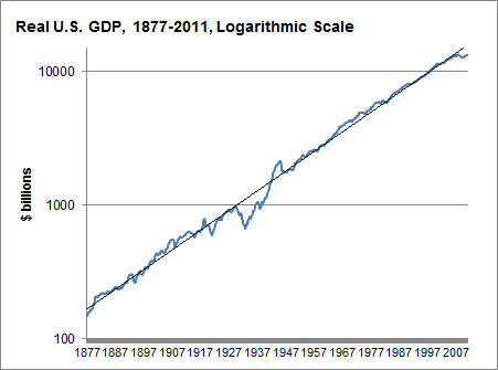
This, according to Nate Silver, is a log-scaled graph of the GDP of the United States since the Civil War, adjusted for inflation. What amazes me is how nearly perfect the linear approximation is (representing exponential growth of approximately 3.5% per year), despite all the technological and geopolitical changes of the past 134 years. (The Great Depression knocks it off pace, but WWII and the postwar recovery set it neatly back on track.) I would have expected a much more meandering rate of growth.
It reminds me of Moore's Law, which would be amazing enough as a predicted exponential lower bound of technological advance, but is staggering as an actual approximation:
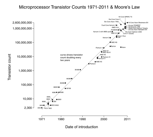
I don't want to sound like Kurzweil here, but something demands explanation: is there a good reason why processes like these, with so many changing exogenous variables, seem to keep right on a particular pace of exponential growth, as opposed to wandering between phases with different exponents?
EDIT: As I commented below, not all graphs of exponentially growing quantities exhibit this phenomenon- there still seems to be something rather special about these two graphs.

Abusing linear regression makes the baby Gauss cry... It's true that fitting lines on log-log graphs is what Pareto did back in the day when he started this whole power-law business, but "the day" was the 1890s. There's a time and a place for being old school; this isn't it. - Cosma Shalizi
Great link, thanks! I can't tell, though, whether this caution extends to graphs of change over time, in addition to sets of (supposedly independent) data points with a conjectured power law.