(Also announcing: annual review prediction markets & full-height table of contents. If you're looking for this year's review results, you can find them here)
The top 50 posts of each of LessWrong’s annual reviews have a new home: The LeastWrong.
What will I see when I click that link?
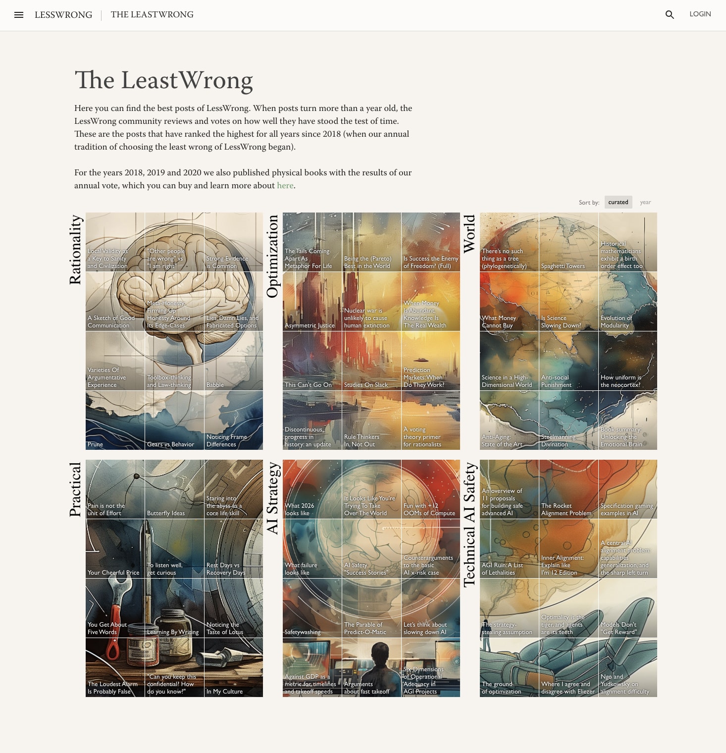
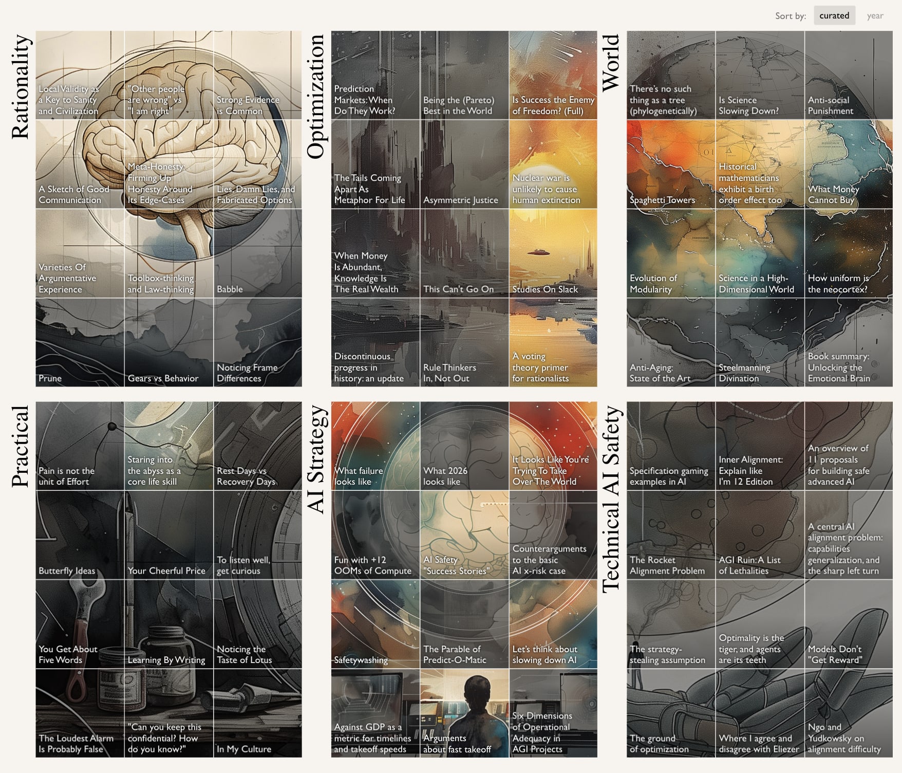
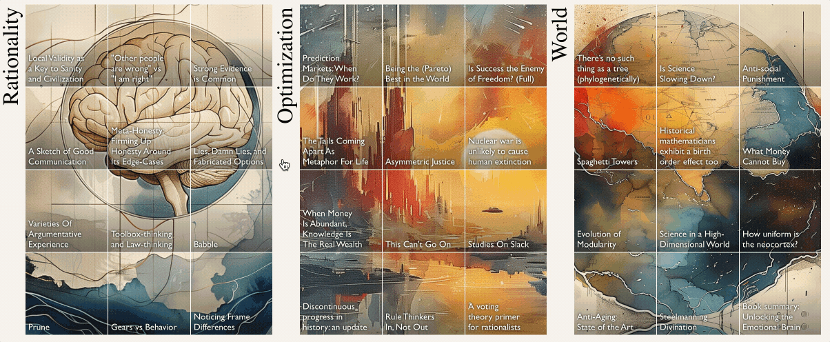
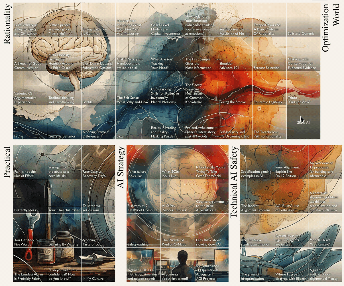
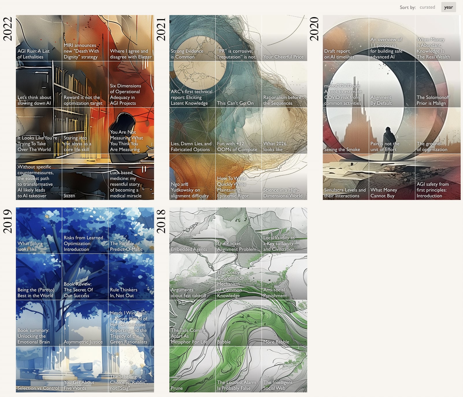
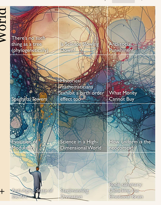
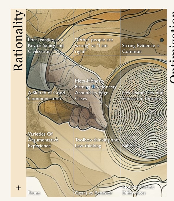
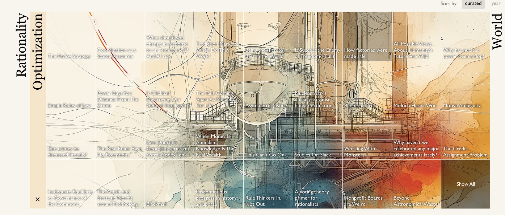
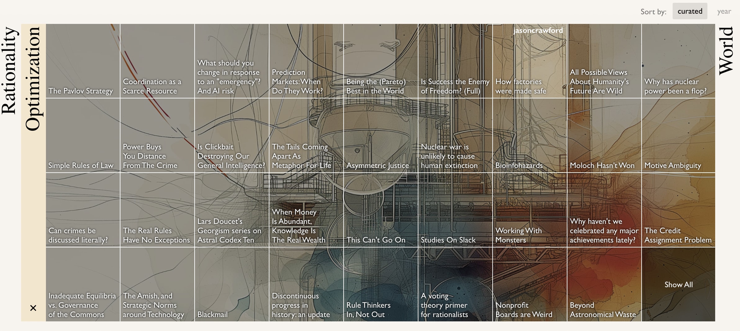
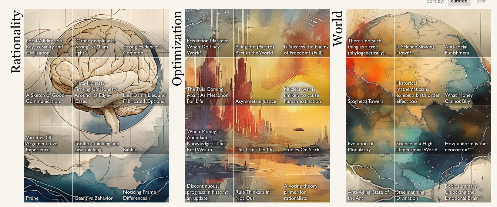
You will find the posts organized into six “books”: Rationality, Optimization, World, Practical, AI Strategy, and Technical AI Safety. Each square on the grid is a post that made the top 50 of the review in some year. The collections are ordered more-or-less with the aim of putting the accessible posts in the most prominent spots.
If you're logged-in the essays will be dark until you've read them, to help guide you to posts you've not read before.
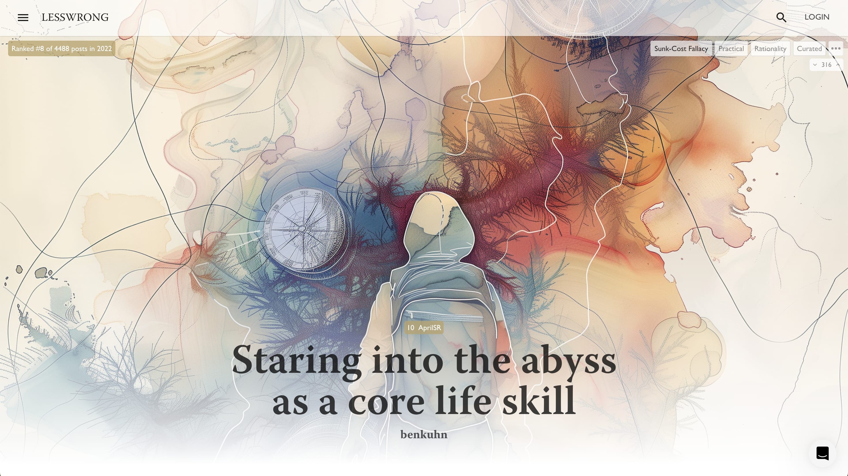
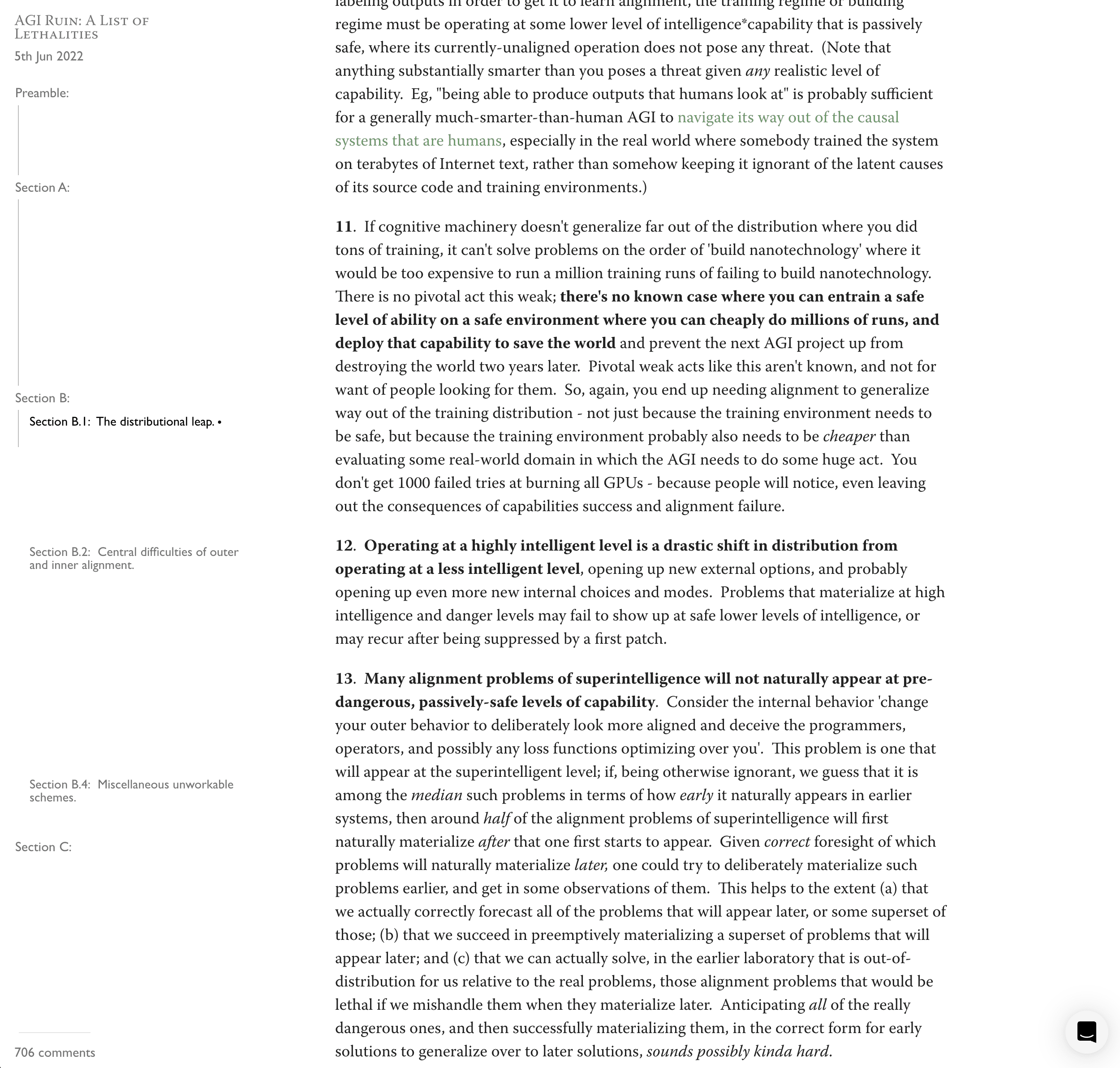
Each of the essays on this page also now has its own full-bleed art and updated post page:
How can I see more of a book?
If you click on the name of a book, like “Rationality”, you’ll get a full width view of the content.
Any other goodies?
Full height table of contents with a progress bar!
Markets on whether posts with over 100 karma will make it in to the top 50 of their year's review!
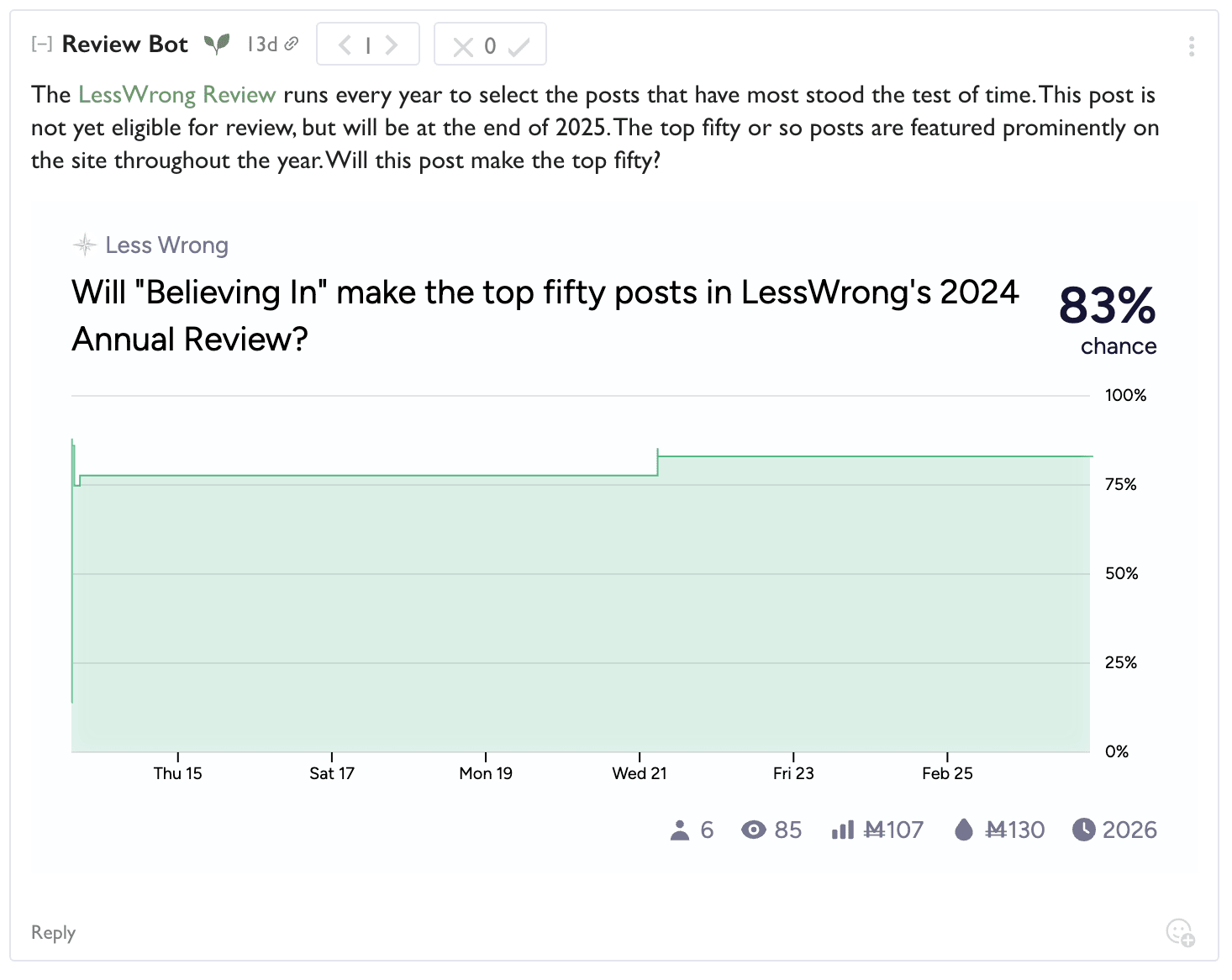
With golden highlighted karma if it's predicted with more than 50%!

Why did you make this?
Many people on the LW team wanted to celebrate the top posts in the review.
Historically we've printed annual review books, but only a small fraction of people who read the essays got to experience the books, and the effort that went into the books felt disconnected from the rest of the site. They also took a really long time to make, and required constant ongoing attention from the Lightcone team to handle logistics of shipping and sales and new print runs.
It seemed more appropriate to put effort into making the reading experience of these essays on LessWrong itself a more memorable and rewarding experience.
But what were the results of this year's review?
Read all about it in Ben's post!
That's it
I hope some of you really like it. And report any bugs with this new stuff in intercom in the bottom right.
Yeah, I also played around a bit with legibility before you posted this, and am likely pushing a change to make it so that when are hovering over something, the text contrast goes up a lot (instead of down). Here is your last screenshot with the new styling:
The text-legibility here seems a lot better. Will probably push in the next hour, curious about more comments from you after you see that change.
Ah, yeah, that's a solid point. I'll see how easy it is to fix something here (it's a bit more complicated since the visual space of the sections overlaps, so if you search for a word that has a hit in more than one section on the same row, we can't expand both, so I'll have to think about how to handle that case).