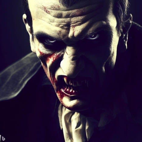
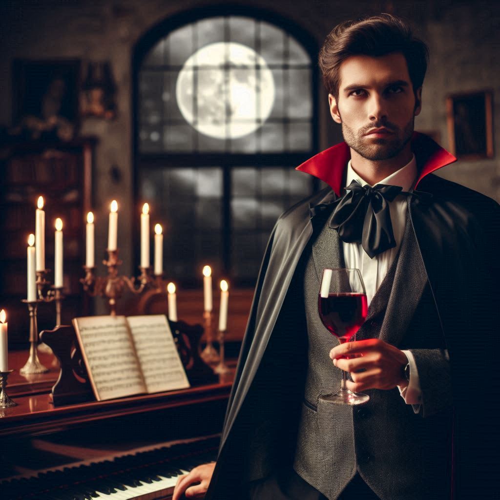
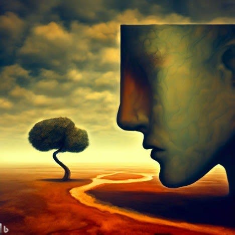
Yeah. Regarding Dall-E 3 specifically: Few people know that there was an unnamed model between Dall-E 2 and 3: "Dall-E 2.5", as I like to call it. It was initially used in Microsoft's Bing Image Creator. It often produced surprisingly good aesthetics, especially with very short or unspecific prompts.
Then it got replaced with Dall-E 3, which produces substantially fewer visual errors (like e.g. too many limbs), and it has a much better complex prompt following ability, but its style is also way worse than 2.5. Like apparently most other text-to-image models, Dall-E 3 largely produces tacky, aesthetically worthless kitsch. RIP Dall-E 2.5, which is now completely unavailable. :(
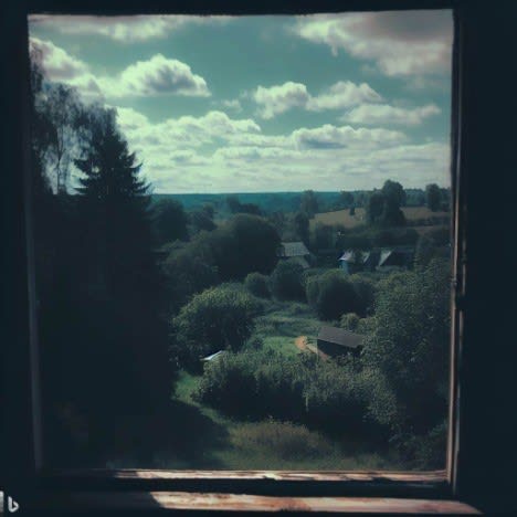
A few comparisons using old images I did a while ago:
Somewhat relatedly: when I started this post I planned to argue you should use midjourney instead of DallE, but then when I went to test it I found that Midjourney had become more generic in some way that was hard to place. I think it’s still better than DallE default but not a slam dunk
I decided to try out cubefox's prompts on current Midjourney to give a sense of it
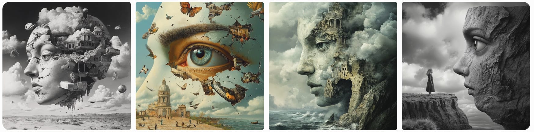
It actually did pretty well. I think my previous "hrm, it doesn't seem as good" was when I was specifically trying to get it to generate images for LessWrong posts, where it seemed to be defaulting to very generic landscapes (or generic women's faces). I'll try a round of those on recent curated posts.
I tried again with a recent curated post, just putting in the title. (historically, practice I usually start with the post title and see if that outputs anything interesting, and then started exploring other ideas based on my understanding of the post and what visuals I thought would be good. But, this is pretty time consuming, so seeing what the "one shot" result is is useful).
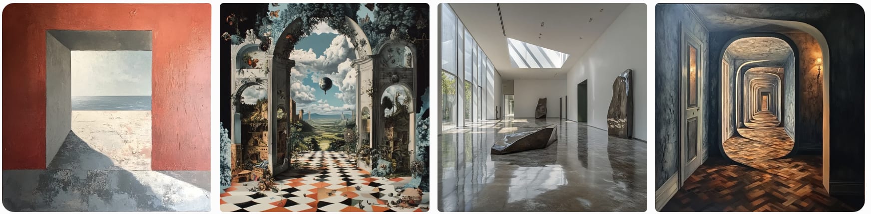
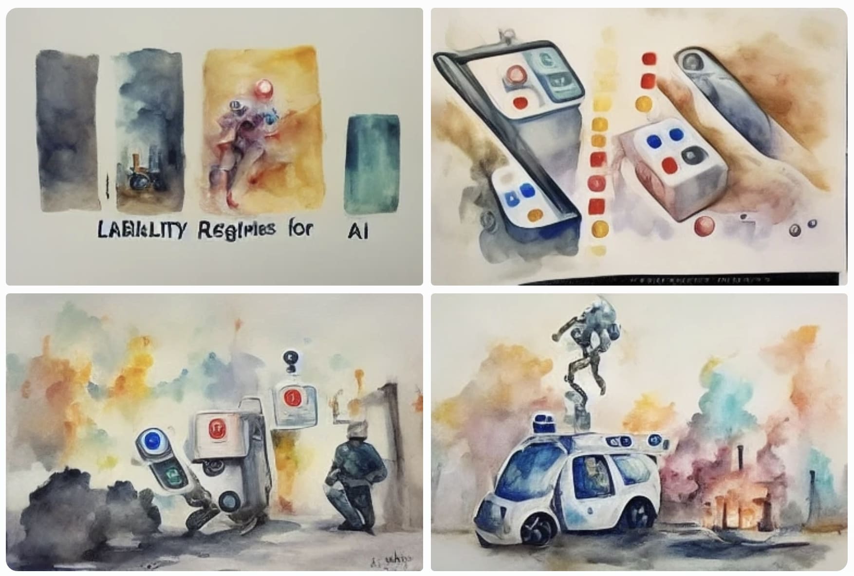
Here's "Liability regimes for AI, watercolor painting", from the latest Midjourney (v6)
for contrast, here's what Midjourney 4 resulted in:
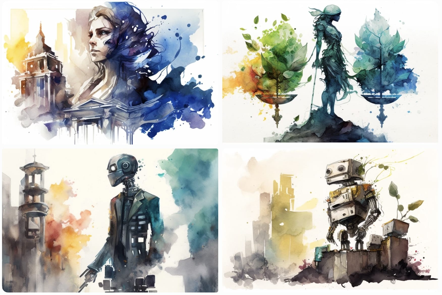
(I kinda like the Lady Justice optin)
Midjourney v3
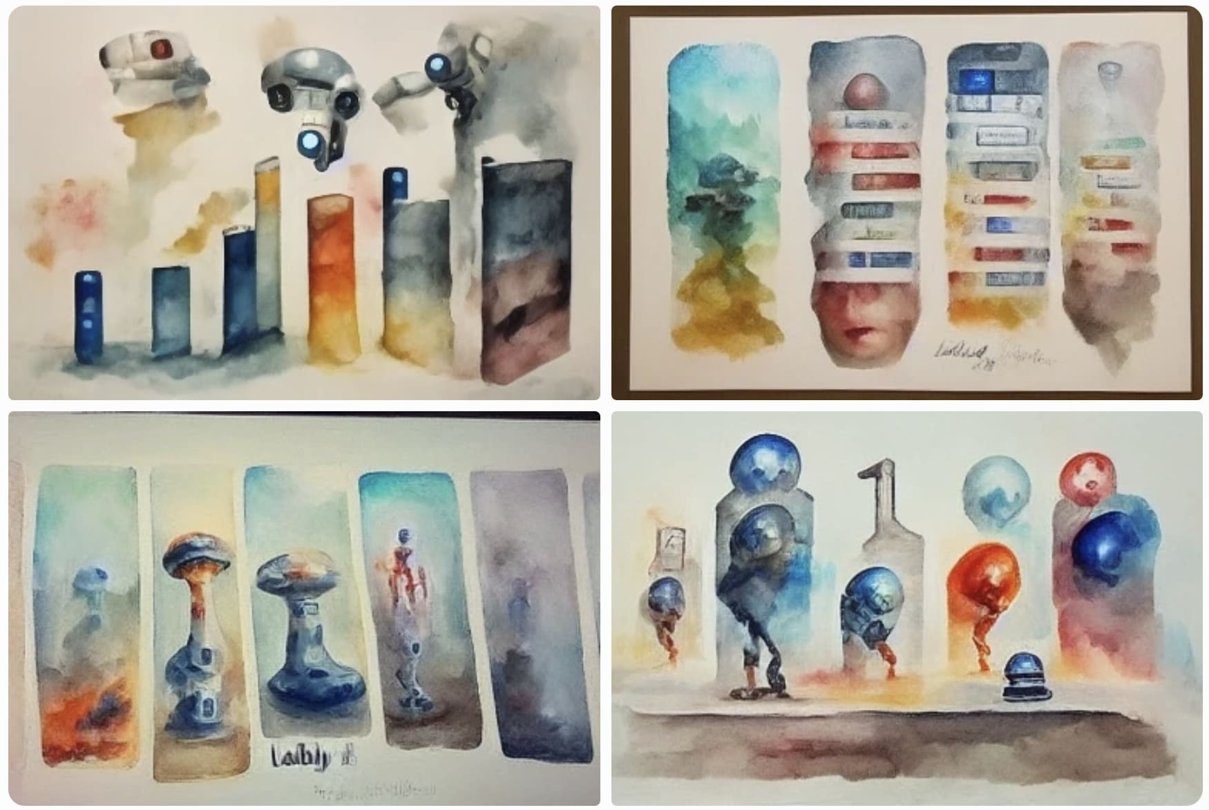
v2
Midjourney v3 feels like hit some kind of sweet spot of "relatively high quality" but also "a bit more weird/quirky/dreamlike."
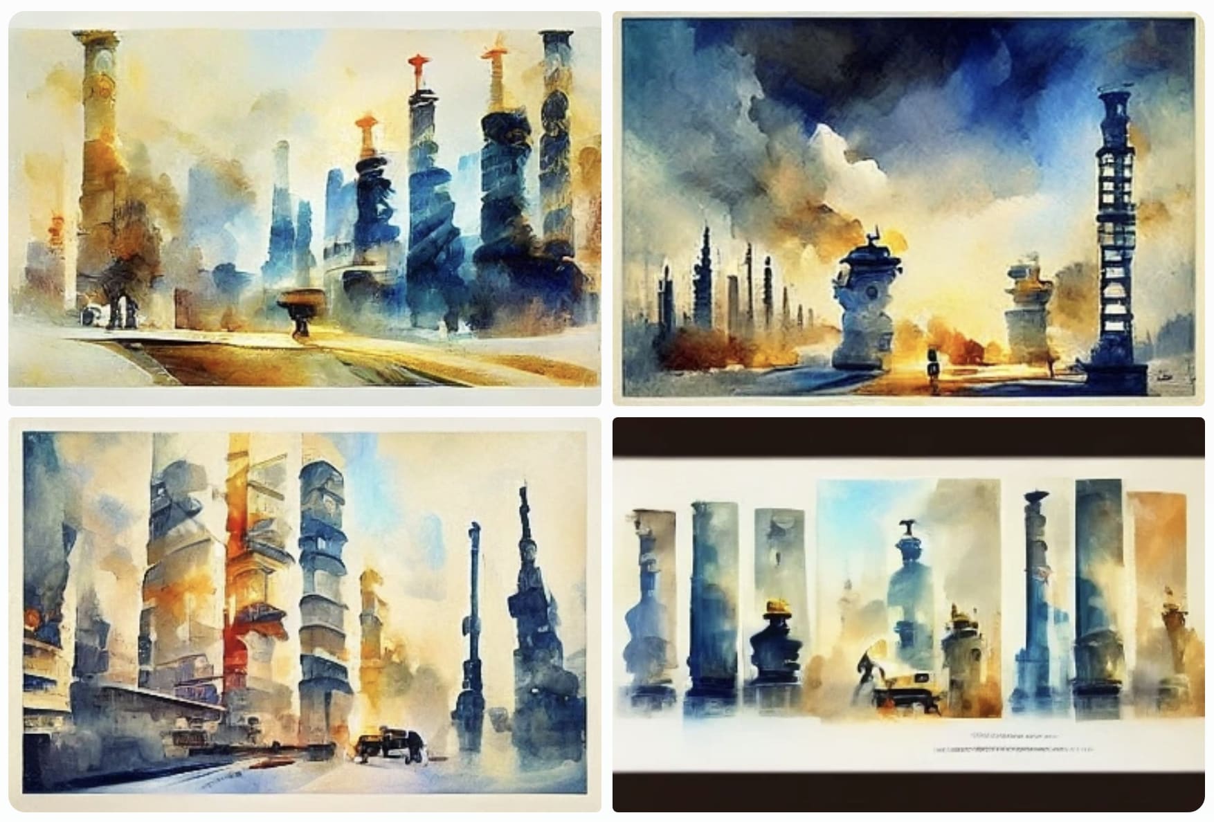
I went and tried to do Midjourney v3, this time putting in more "quality" words since it isn't automatically trained on aesthetics as hard:
"Liability regimes for AI", beautiful aquarelle painting by Thomas Schaller, high res:
okay now I guess I'll just wander back up the chain of versions, this time using my Metis on what kinds of prompts will get better results rather than seeing how it handles the dumbest case:
"Liability regimes for AI", beautiful aquarelle painting by Thomas Schaller, high res –– Midjourney V4
"Liability regimes for AI", beautiful aquarelle painting by Thomas Schaller, high res --MJ version 6
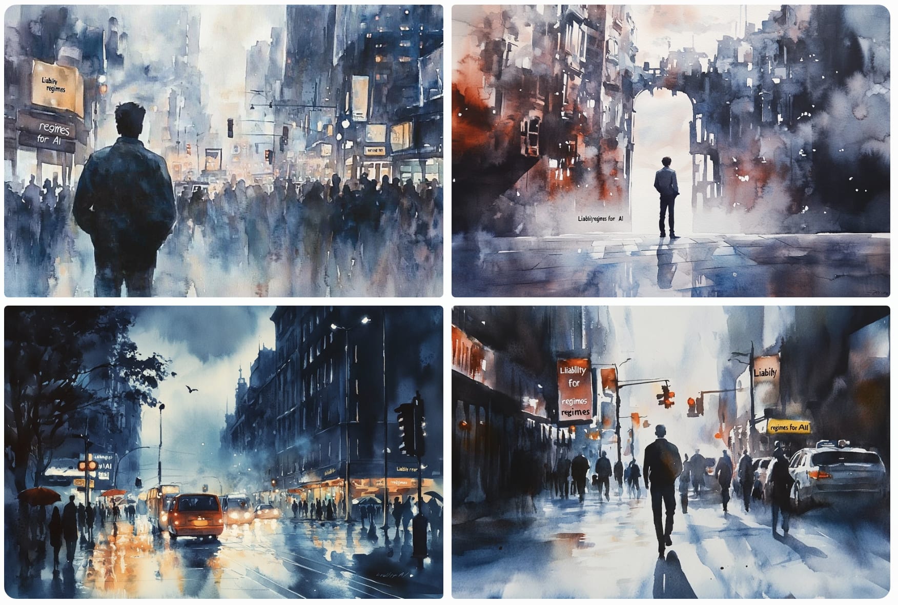
I preferred your v4 outputs for both prompts. They seem substantially more evocative of the subject matter than v6 while looking substantially better than v3, IMO.
(This was a pretty abstract prompt, though, which I imagine poses difficulty?)
I am not an artist.
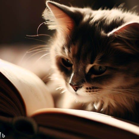
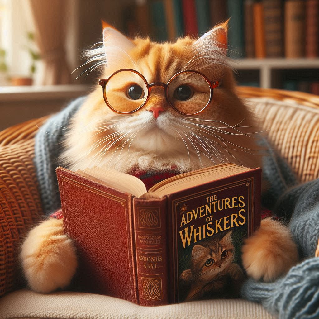
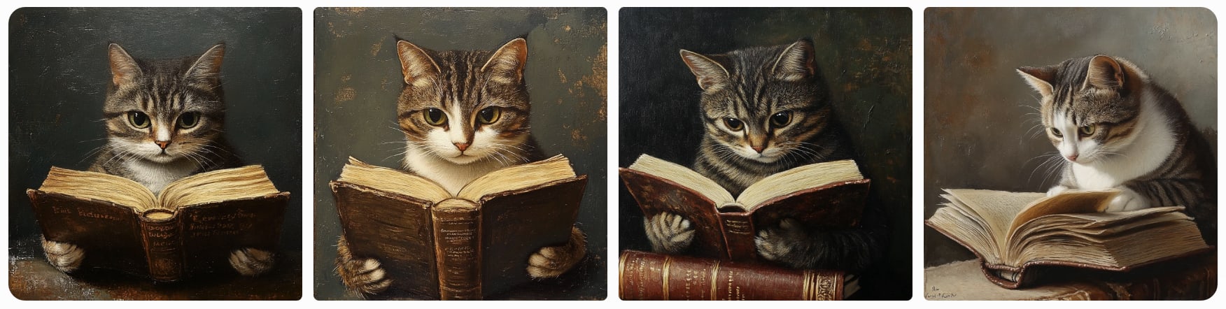
Oh, so current Midjourney is actually far better than Dall-E 3 in terms of aesthetics. One thing I still liked about the old Dall-E 2.5 was its relatively strong tendency towards photorealism. Because arguably "a cat reading a book" describes an image of an actual cat reading a book, rather than an image of an illustration of a cat reading a book, or some mixture of photo and Pixar caricature, as in the case of Dall-E 3. Though this could probably be adjusted with adding "a photo of".
I guess the bad aesthetics are to some extent a side effect of some training/fine-tuning step that improves some other metric (like prompt following), and they don't have a person who knows/cares about art enough to block "improvements" with such side effects.
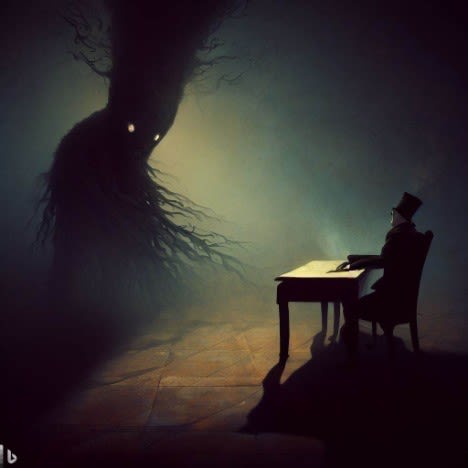
In case of Dall-E the history was something like this: Dall-E 1/2: No real style, generations did look presumably like an average prediction from the training sample, e.g. like a result from Google Images. Dall-E 2.5: Mostly good aesthetics, e.g. portraits tend to have dramatic lighting and contrast. Dall-E 3: Very tacky aesthetics, probably not intentional but a side effect from something else.
So I guess the bad style would be in general a mostly solvable problem (or one which could be weighed against other metrics), if the responsible people are even aware there is a problem. Which they might not be, given that they probably have a background in CS rather than art.
I guess the bad aesthetics are to some extent a side effect of some training/fine-tuning step that improves some other metric (like prompt following), and they don't have a person who knows/cares about art enough to block "improvements" with such side effects.
Also probably a lot of it is just mode collapse from simple preference learning optimization. Each of your comparisons shows a daring, risky choice which a rater might not prefer, vs a very bland, neutral, obvious, colorful output. A lot of the image generations gains are illusory, and caused simply by a mode-collapse down onto a few well-rated points:
Our experiments suggest that realism and consistency can both be improved simultaneously; however, there exists a clear tradeoff between realism/consistency and diversity. By looking at Pareto optimal points, we note that earlier models are better at representation diversity and worse in consistency/realism, and more recent models excel in consistency/realism while decreasing the representation diversity.
Same problem as tuning LLMs. It's a sugar-rush, like spending Mickey Mouse bucks at Disney World: it gives you the illusion of progress and feels like it's free, but in reality you've paid for every 'gain'.
I found that Midjourney had become more generic in some way that was hard to place.
What you can try doing is enabling the personalization (or use mine), to drag it away from the generic MJ look, and then experimenting with the chaos sampling option to find something more interesting you can then work with & vary.
I'm told (by the 'simple parameters' section of this guide, which I have not had the opportunity to test but which to my layperson's eye seems promisingly mechanistic in approach) that adjusting the stylize parameter to numbers lower than its default 100 turns down the midjourney-house-style effect (at the cost of sometimes tending to make things more collage-y and incoherent as values get lower), and that increasing the weird parameter above its default 0 will effectively push things to be unlike the default style (more or less).
it's sad that open source models like Flux have a lot of potential for customized workflows and finetuning but few people use them
We've talked (a little) about integrating Flux more into LW, to make it easier to make good images. (maybe with a soft-nudge towards using "LessWrong watercolor style" by default if you don't specify something else),
Although something habryka brought up is a lot of people's images seem to be coming from substack, which has it's own (bad) version of it.
I imagine some of it is due to this part of the blog post UI making people feel like they might as well use some quickly generated images as an easy way to boost engagement. Perhaps worth rewording?
Little additional note: if the art fades to white around the edges, then it looks way more at-home on LessWrong. It looks like part of the page.
… at least in the default light theme. (This is arguably a secondary reason not to overuse images.)
Good news: there is no way to opt in because you are already in. (If you want to opt out, we have a problem.)
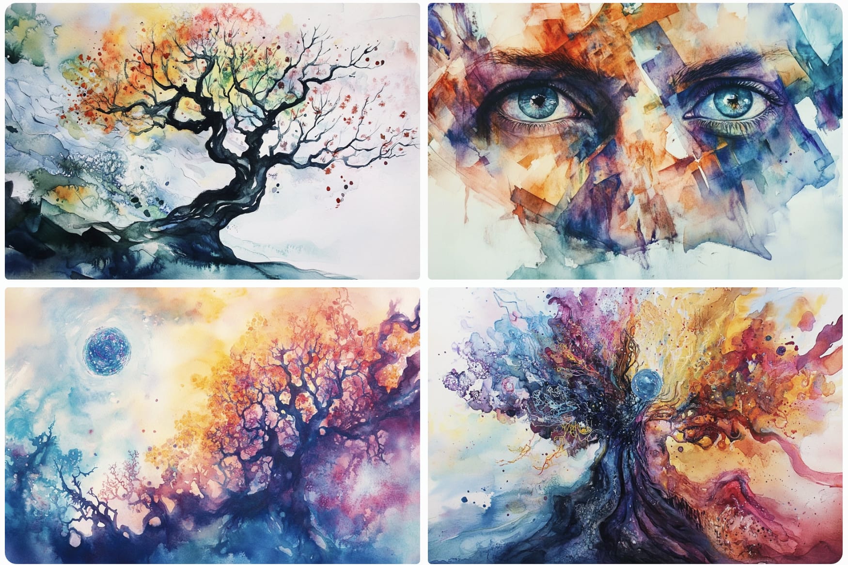
I'm using some AI art in my linear diffusion of sparse lognormals sequence, in particular for performance optimization as a metaphor for life and comparison and magnitude/diminishment. I'd be curious what you think about those two pictures; I'd personally say I didn't really follow the rules about making it aesthetic or flow well, but instead just wanted something more concrete to point to.
I'm also using AI art for the banner of the sequence. That's more intended to be for aesthetic reasons, and it more closely follows your guidelines, though it still is just something I quickly threw together.
I'd certainly like to have more aesthetic art for all of this. And better writting, and better explanations, and better everything. But each improvement takes time and effort and I'd rather concentrate on getting more posts for the sequence out there than on making it nicer.
I don't have particularly objections against any of the things there. In particular, they are not doing the thing where the top of the post is an image that is a little garish and clip-arty while not really having to do withe the post.
The image in the sequence page has a reasonable aesthetic. The main thing that feels off is that the rest of your sequence doesn't followup on that aesthetic – you could imagine a world where the photoreal images you later used were instead matching the painterly-blocky-children's-book-vibe of the sequence header. But, this is kinda a nice-to-have.
The image in the first post seems totally fine (apart from the not-matching-header-image). Instead of being randomly added to the beginning, it fits into the post later on fairly seamlessly, in a way you explicitly make use of.
The second one is also fine except it takes up a lot of vertical space at the top of the post when I'm still trying to figure out what the post is about and makes it a bit harder to briefly scan the intro. That's where the "do a widescreen aspect ratio" comes in.
I'd certainly like to have more aesthetic art for all of this. And better writting, and better explanations, and better everything. But each improvement takes time and effort and I'd rather concentrate on getting more posts for the sequence out there than on making it nicer.
Yeah also to be clear I'm not saying everyone should invest a ton in art skills, just that if you're going to bother putting art at the top of your post... I dunno, invest at least a little (and at the very least figure out how to widescreen ones, which ameliorate some of the downsides). Most posts don't need art and I think it's better to either invest until it's passable or not add it.
Your posts/images all seem above Raemon's Aesthetic Bar.
Relatedly, I see a lot of people use mediocre AI art when they could just as easily use good stock photos. You can get free, watermarkless stock photos at https://pixabay.com/.
The LessWrong Review runs every year to select the posts that have most stood the test of time. This post is not yet eligible for review, but will be at the end of 2025. The top fifty or so posts are featured prominently on the site throughout the year.
Hopefully, the review is better than karma at judging enduring value. If we have accurate prediction markets on the review results, maybe we can have better incentives on LessWrong today. Will this post make the top fifty?
Epistemic Status: Old Man Blogs at Cloud
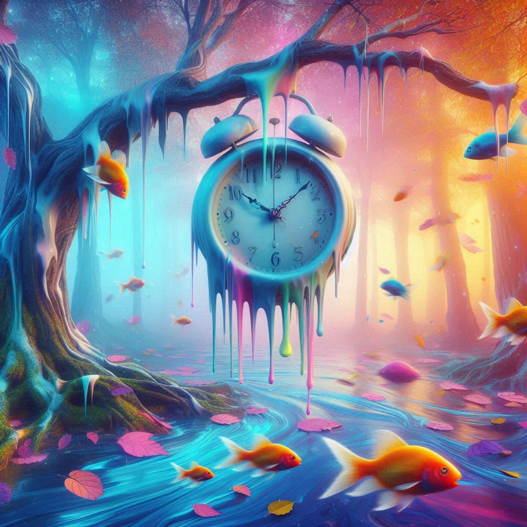
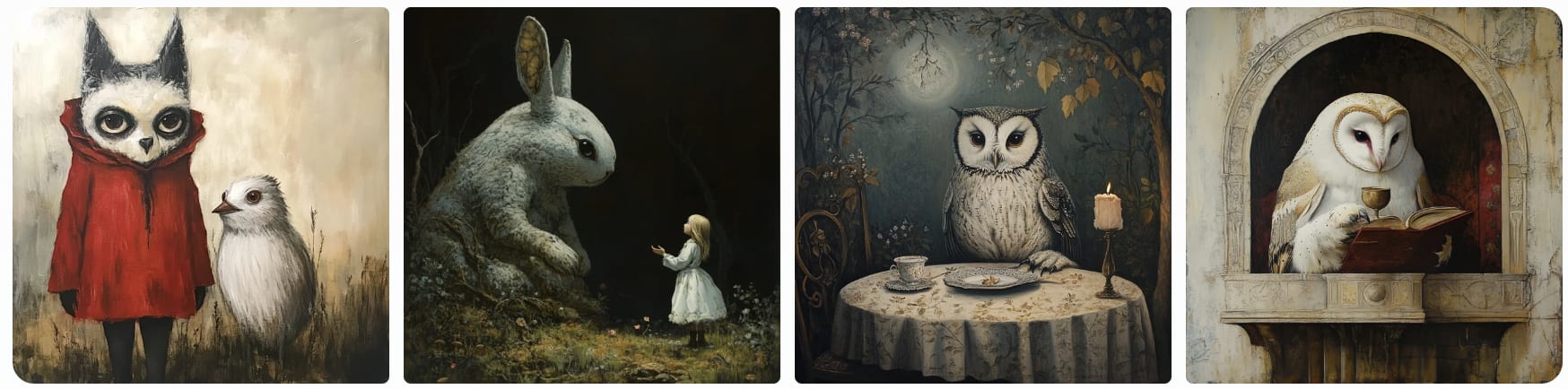
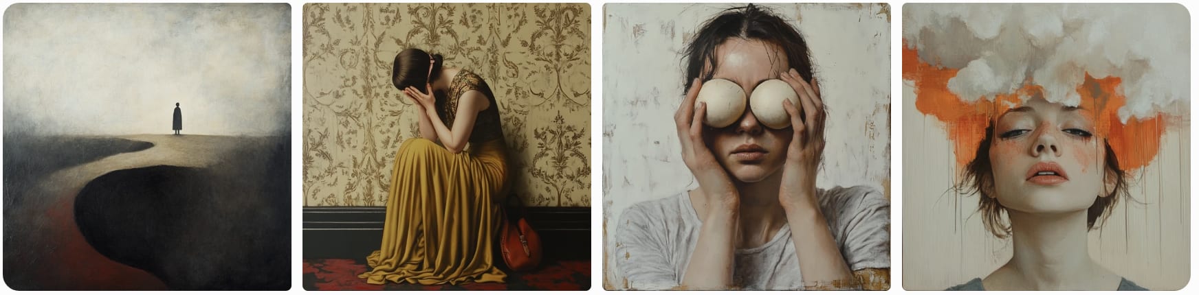
Lately there's been a wave of people on LessWrong (and maybe the whole internet) starting off their essays with some Dall-E3 art.
I don't object (and think it can be cool if done nicely) to get some good ML art to add some visual interest to your posts. But, the default thing I'm seeing is mediocre and making the web feel tacky.
I have an art background, which means I both have a lot of experience making/evaluating art and also probably have random-ass snooty connoisseurship syndrome. Also I was involved with the fleshing out of the current LessWrong Watercolor Aesthetic, and random clip-art looking images undercut it. (But, to be fair nobody actually voted for or opted into the LessWrong Watercolor Aesthetic, and maybe that's just my problem).
I think not all posts need art. But, if you do want art for your post, here's some hopefully slightly constructive advice/requests.
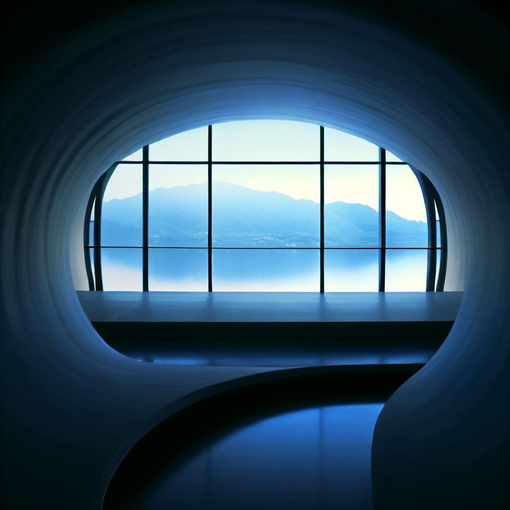
1. Generally, make landscape (widescreen) art.
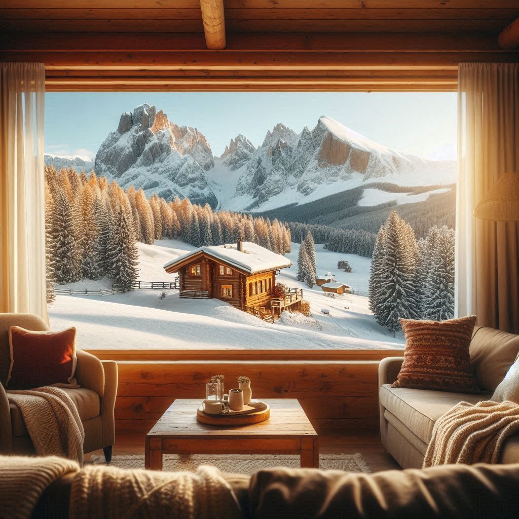
Most image models output square images by default. This actually fits fairly awkwardly into blogposts – it either takes up a huge amount of vertical space, or you shrink it to fit and then it has weird padding. (The motivating instance for this blogpost was this post, which IMO would be greatly improved if the image was designed to take up more horizontal space).
Sometimes a post makes good use of a very tall art, to set some kind of mood, but it works better for more contemplative posts. (See On Green for an example).
2. Good AI art still takes a fair number of generations and effort.
I'm not sure how many generations people typically do that outputs that mediocre art, but I do want to note, for reference, when I'm making a quick piece of AI art for something (like a facebook event) it still usually involves at least like 5 generations (in Midjourney, where each generation includes 4 options), and often more like 20. And when I'm trying to make actually good art for something I want people to really appreciate (such as the Carving of Reality books), it might be hundreds of generations.
and then some post-processing in photoshop.
3. Think about the mood you want to convey, not just the posts' intellectual content.
Good art sets a tone and helps shift someone into a particular headspace. This doesn't just include the content of the art but the style and color palette.
This is particularly important if you're opening the post with art, where it's setting the very first impression (and is also more likely to show up in the Recent Discussion feed, where it'll look more random).
That's probably not very helpful advice on it's own. Making good art is, like, a whole-ass skill. But, on the offchance you weren't thinking about that at all, maybe giving it at least some consideration will probably help.
Okay, that's it I guess thank you for indulging my rant.