At first look, I like your design a lot. Even though I am required to (because "imitation is the sincerest flattery"), it has its own fairly unique style which doesn't immediately remind me of anything else. I like the playfulness and use of some color. I am also impressed by your design writeup: you have covered far more than I would have expected and definitely thought it through. I may wind up stealing some ideas here.
More miscellaneous observations:
-
dark mode selector: you use a 2-state light vs dark selector. This is the obvious thing, but we think that it is ultimately wrong and you need a three-state selector to accommodate "auto". I think this is especially important given how many people now read websites like yours or mine on their smartphones, often at night or in bed, and just assume now that everything will use dark-mode as appropriate. (I'm sure you've seen many screenshots of Gwernnet on Twitter at this point, and noticed that they are almost always smartphones, and then much of the time, dark-mode. I am pretty sure that in most of those cases, it is not because the reader specifically opted-into dark-mode forever, but simply because auto fired, and readers take it for granted. I don't expect auto to become any less common, and the 2-state selector will just get more inappropriate and defaulting to the wrong thing. We have also noted that increasingly, websites are choosing 3-state rather than 2-state the past 2 years, often with nearly-identical semantics & icons, and take this as confirmation of our earlier choice.)
-
Smallcaps acronyms: I did the same thing originally but ultimately removed them. They wound up adding a lot to the page, and while they initially (ahem) looked cool and fancy, they alienated readers and over time I just kept noticing them and feeling more and more alienated by them. Smallcaps may be "proper" typographically, but I think that ship has sailed: we read so little material with acronyms typeset in true smallcaps, that it now achieves the opposite of the intended effect - it's the 'NASA' which is smallcapsed which is bizarre and alien looking, not the regular old 'NASA'. Is it worth spending "weirdness points" on? I ultimately felt not.
-
Color: You mention that link-icons can be chaotic if colored. I agree, but in your case, I think you have a lot of scope to be playful with color.
For example, you went to a lot of trouble to separate the dropcaps and enable the fun colored dropcaps.... but then don't use the colored ones anywhere (right?). So why not make the dropcaps colored... on hover?
In fact, why not make 'fun on hover' a core design principle? "If not friend, why friend-shaped?" Make everything on the site a little friend you can play with. (This would be a good time to try to write down a few catchphrases or design principles to sum up your goals here. Why dropcaps or the animated pond logo? etc) When I look at your pond, I feel like it would be wonderful if the pond was animated on hover - if when I hovered, then it was animated.
Right now, it feels a bit awkward. It's animated just enough to bother me in the corner of my eye, but not enough to consciously notice it. It is also too small, IMO. The detail is illegible at this size, beautiful as the fullsize version is. (What looks good at large size almost never looks as good at small size, like line-height or less, and needs to be redone. This is part of why link-icons are hard.*) Also, in the long run, I think you are better off looking into generative pixel art for adding more images/video in that style. You may think you are willing to pay $270 each time, I'm sure you could afford lots of them for something as close to your heart as your personal website - but you're not. The cost and time will gradually deter you and inherently create a scarcity mindset, sabotaging your creativity and playfulness and willingness to go "wouldn't it be fun if...?". Beware more than trivial inconveniences! This is a website design which would benefit from fun little pixel art motifs all over the place, and you want to be able to flip over to your generative tool as soon as an idea for a trout element hits you and start creating it. You don't have to go all Yamauchi No.10 Family Office on the reader, but for this sort of cozy playful design, I think the more the better, so there's a feeling of always something cute around the corner.
You have a nice fleuron footer. But wouldn't it be so much niftier if that fish were cheerfully animated once I hover over it, and it does little trout flips around my cursor? And if the fleurons became brighter blue or richer texture and more water-like?
And wouldn't it be nice if all of the trout link-icons also turned blue on hover? (I think the trout link-icon spacing is a bit off, incidentally. The Youtube link icon is also definitely bad with the "YouTube's logo is definitely red" example - way too close to the 's'.) We have recently implemented link-icon colors on Gwernnet (some background), and while I'm still not sure how appropriate it is for Gwernnet or if it needs to be rethought, I feel it's very appropriate for your design.
Lots of things you could do with it. For example, you could have a gentle "breathing" cycle of all of the colors, similar to some of Apple's light icons - the page could use JS to very slowly cycle through the default color-less version to the hover versions and back. (Perhaps just for the first minute, or perhaps instead after a few minutes, whatever feels more esthetic.) And Pope suggests that for the AI risk articles, like empowerment, you could have the eyes turn red at random times.
Or you could define the hover colors to be a 'theme' and have different parts of the site have different themes. Theming is a classic thing to do with websites (see eg GreaterWrong). For example, the same way that Gwernnet has different dropcaps for different subjects - the dropcats for the cat essays, the yinit for technical articles, the Goudy for biology, cheshire for literature etc - you could have, I don't know, personal stuff be yellow, technical AI be blue, humanities stuff be green, and so on.
-
Might note "callouts" are also called "admonitions".
-
Visual regression testing: you can also check snapshots of the raw HTML too. Since you are trying to bake a lot into the HTML, this should work well for you and complement the image approach. This can be as just downloading some URLs and running
diffagainst a directory of older downloads. I implemented this a few months ago and it was easy to implement and has given me more confidence when I review the lorem unit-test pages to check that any changes in the final HTML make sense. -
I notice way down in the footer a backlinks section, but doesn't seem to be covered in the design page yet? Also, possible bug: the backlinks section of the design page includes... the design page?
-
"Text transformers" seems like a risky terminology choice, especially given your profession & site content. I know I did a double-take when skimming - "he's using text transformers? ooh how interesting - oh wait." Maybe just call them "compilers" or something.
-
Collapses: I prefer collapses to not require clicks because it reduces friction. I think this is especially true of the Table of Contents - if you don't display that by default (which seems like a bad choice on long pages like the design page), at least make them as easy as possible to access!
-
List indentation: your lists do not indent the contents / outdent the list marker. Is that deliberate? (Actually, is this even consistent? It felt like I saw it happening somewhere but not other places...)
-
Overall clutter: on reflection, I agree with the other comments that right now the pages have some degree of clutter. Just doing too much.
An example here would be the underlining in the superscripted counter of the dates like "Published on October 31st, 2024" - it really jumps out at you, when you look at the date line, the 'st' is the first thing you read. This is bad because this is neither in line with the semantics of the rest of the page, where underlining always denotes a hyperlink, nor is it decorative in a way which improves the rest of the page appearance or is consistent with the blue-pixel-art-book esthetic. The 'st' shouldn't be underlined, it should if anything be even smaller or faded out.
Another example would be the slashed-zeros: the slash is somewhat distracting and overloaded on its own and questionable at best (this isn't source code or raw data where confusing 'O'/'0' can be catastrophic) but combined with the zeros also being funny little squashed zeros, you have this overloaded effect where the zeros all over the page keep popping out at you from the corner of your eye or while scanning.
Then you have all of the other flourishes like the swashes for the capital 'Q'... It's just too much. You can have lots of semantics, like the link-icons, or you can have lots of decoration, but you can't have both, not if they are going to often be on the screen together. (Like just at the top of the design page, you're being hit with logos, toggles, faded out text, underlined superscripts, doubly-variant common letters (8 instances of '0' alone), very fancy capital swashes, dropcaps, collapses with icon+chevrons+backgrounds, screenshots inline without a clear border (and everything inside the screenshots tugging at the eye), 2 link-icons, monospace+italics+bold+roman...)
-
Collapses: the '>' for the disclosure toggles seem oddly offset, and just above the midline enough to look like a bug. Either commit to it being superscript or make it exactly middle-looking/inline.
Overall, best new personal website I've seen in a while: ★★★★☆.
I look forward to it being tidied up some more, and seeing what clever new touches you put on it as you keep evolving it and presumably can experiment with things like LLM rewrites or integration or add more pixel art, so I can add that last star. :)
* There is a semi-famous game development anecdote about this effect, about how John Romero's Daikatana wound up shipping so late due to poor management: an artist proudly showed off the multi-thousand-pixel art of the fancy sword they had been slaving away for a while on. The person pointed out to the artist that the sword in question was going to be rendered at like 64x64 pixels, and every detail was going to be invisible when resized, and it was going to look like s---t and so they had just wasted all that work, were going to have to throw it away and start from scratch, and they had fallen that much further behind schedule. A small image is not a large image with fewer pixels, and pixel art is not a drawing with blockier points. · This affects a lot of things - like part of why our new link-icon color feature is so difficult to implement well is that a color which looks fine as a big logo will look totally different as a thin line of a few pixels. It's really quite surprising to me how different things can look when you scale them way down. Something that is clearly purple when I clone it from Paul Graham's website will turn into a 'white' line when I use it as the link color for pg links, or some blue that is medium-colored as a page background will become jet black. So even after the considerable manual labor of getting all of the right colors defined, you still have to do esoteric colorspace transforms to ensure they look right, and I think we're going to have to adjust a bunch of them on top of that as well, once we have time and I can catch up post-Dwarkesh-Patel interview etc. /sigh Good web design is only easy if you don't really care about good results.
turntrout.com is now at 1.1, after about 1,300 more commits. Some of the commits addressed feedback from your generously detailed comment:
- Auto-dark mode!
- List indents now consistent (if I understood your point correctly); before I was doing something hacky with a
content:override on the list markers. - The mobile table of contents is open by default,
- I've reduced clutter but haven't cut many flourishes. Consider the before and after:
At site launch
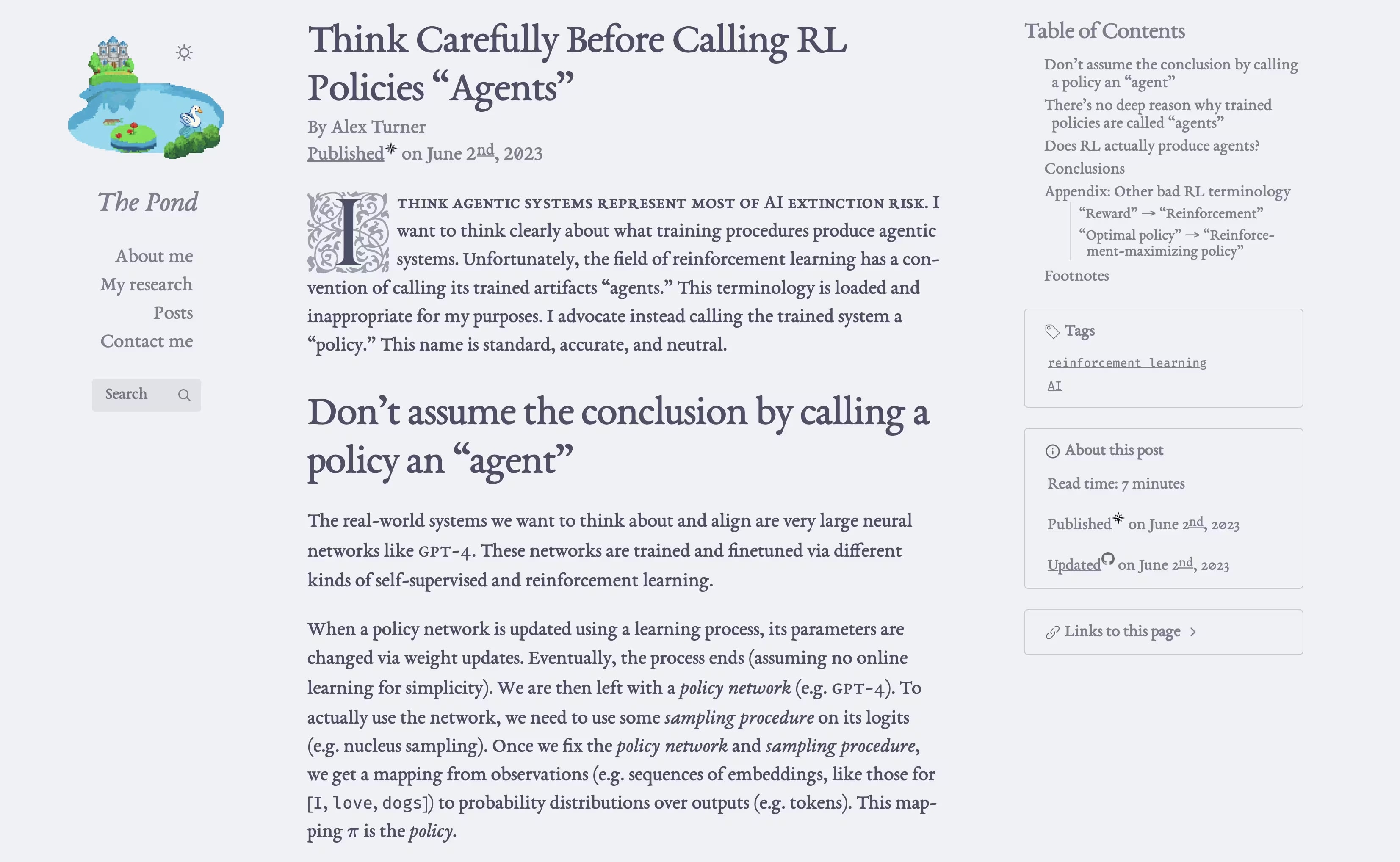
Now
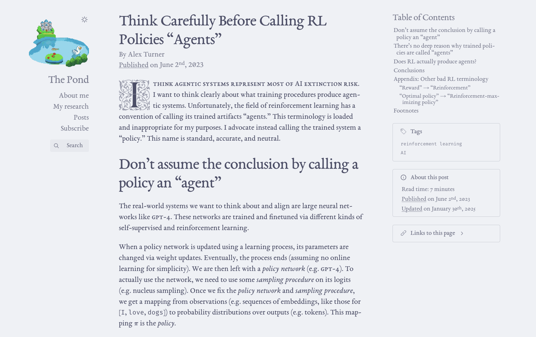
- I removed distracting flourishes outside of the main text (like favicons in the side bar),
- removed most underlines outside of the main text (like in the "Tags" section) and from e.g. date superscripts,
- tweaked font weights and anti-aliasing,
- removed italics from "The Pond" title (just another font variant on the page),
- gave elements more room to breathe (like with the "Links to this page" chain-link icon; it now has appropriate
margin-right), and - improved alignment along the margins (creating two "gutters" running along the center).
The site is still somewhat busy, granted.
The overall feature diff from the last four months is much longer. I may write another post about it. I haven't yet gotten to the really fun features on my list, like the ability to listen to AI-generated readings in my voice (for the less math-y articles). I've focused on linting and testing the hell out of everything.
Changes not made (yet?)
- Smallcaps kept; I personally enjoy them too much to cut them!
- I want to do something about the desktop logo animation being distracting. I don't know what that is, yet. I can't play/pause the GIF on hover because GIFs don't allow that (AFAIK). I'll probably find a way to move it to a WEBM while also making it autoplay across browsers, at which point I can implement the feature.
- I still need to make the mobile site "icon" different from the full-size GIF.
- I don't really mind the zeros. If I hear from more people that the slashed zeros bother them, I'll reconsider.
I think it's substantially better and calmer - even just the thumbnails look calmer now.
I still think you are going a bit overboard on visual complexity, things like slashed-zeros aren't bad (I like them), just too much of a good thing and using up your visual complexity budget where there may be a better deal elsewhere: the question I ask myself is, "do I want to look at this for the next 20 years? If I add X, will it 'look painfully 2025' in a few years?" Elements which don't seem excessive in the excitement of implementation may, with the passage of time, gradually come to rub you the wrong and need to be sanded down or removed. If you aren't careful, you may slowly, one accretion at a time, come to resemble a site like "Agora of Flancia": encrusted with neat experimental features which are too half-baked to be genuinely useful, but which burden and deter readers. (I try to avoid a reluctance to 'kill my darlings' by cultivating the mindset that every addition is an experiment, and thus if I have to remove them, they're not wasted, they're just a new 'Design Graveyard' writeup, is all.) But I suppose you'll find out your own preferences on this matter over the next few years as the novelty wears off.
I want to do something about the desktop logo animation being distracting. I don't know what that is, yet. I can't play/pause the GIF on hover because GIFs don't allow that (AFAIK). I'll probably find a way to move it to a WEBM while also making it autoplay across browsers, at which point I can implement the feature.
I also still think that the logo should probably not play by default, and for animations like this, it's better to take an Apple-like attitude about them being enhancements, opted into by user actions, to 'spark joy', but not to be used by default. What do the worst websites do? They animate tons of stuff gratuitously. How much more delightful it is to discover a website with taste & restraint, where there are easter eggs and features to discover as you surf, where, say, the animated logo plays only when you hover over it... Truly an oasis or quiet little pond amidst the howling desert of the contemporary Internet. (I'm reminded of a Family Guy meme I re-ran into recently: why does Peter Griffin dislike The Godfather? Because "It insists upon itself." A website animating the logo unasked for insists upon itself.) And this helps instill a design feature: you the reader are in control, and you express this control in part because you can hover over everything to learn more or focus on some things.
However, if you insist upon it, perhaps you could reduce its impact by some sort of limitation. Let it cycle a few times or seconds, and then slow it down or fade it or stop it. If the reader hasn't appreciated it by then, why keep flickering it in the corner of their eye? Another idea would be a site-wide limitation on animation: on Gwern.net, we have a 'demonstration mode' feature which tracks how many times something has happened / been shown, and changes it (usually to disable it) after n times, tracking n site-wide by using a cookie in LocalStorage counting that particular event. We use it to do things like simplify obtrusive text labels, or to disable the educational theme-toggle-bar animation after a few animations.
Also, have you considered animating the dark-mode setting to move the sun/star around? The sun over the pond to the right, then the moon to behind the castle and swap the palette for a 'night' palette. (The 'night' label can be omitted, typeset vertical, or you can do it by horizontal mirroring of the whole image.) If you don't do something like that, that would be a real shame. The perfect twist on dark-mode for The Pond.
like the ability to listen to AI-generated readings in my voice (for the less math-y articles)
This sounds like it would make for a better project & writeup than actual long-term website feature intended for actual reader use. Is this something readers want or will use? It never once occurred to me that I might want a spoken version of your articles (human, AI sexy-Scarlett-Johansson, or AI-Turntrout - ok maybe Scarlett). These aren't poems or autobiographical essays or even fiction, where there can be value to hearing the author read it. (Although even there most of the reasons to want that are ones where an AI can't substitute: if you want to hear the author's unique intonations or pacing for subtle insights into the text or the author*, obviously an AI model voicing it is useless.)
On a sidenote, ahem, you might want to rethink how the popups work. I was unaware you even had popups, until I noticed in the network tab that a lot of pages were being prefetched when I hovered over them. It might be an oversight to prefetch if you aren't doing a popup. But regardless, since I'm on a fullscreen 4k portrait monitor, and I have to zoom out before I can see popups at all, you may have gone overboard in your width requirements.
* when I questioned the value of Dwarkesh Patel et al investing in making a spoken version of our interview, this was given as one of the reasons that people valued audio over the transcript. We split the difference by the voice actor, Chris Painter, having the audio and performing it. It's uncanny for me to listen to.
I also still think that the [site-wide pond video] should probably not play by default
Per your suggestion, the pond video no longer plays by default:
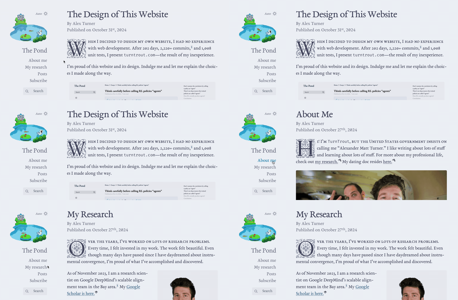
By using micromorph to preserve the video element, the video doesn't unload as you navigate through the site. Therefore, the current video frame stays constant until the user hovers over the video again. Since the auto / light / dark mode selector hovers above the pond, "what does the 'auto' text mean' -> ooh, the 'image' moves!" provides a natural interaction pathway for the user to realize the "pond image" is actually a "pond video"!
But regardless, since I'm on a fullscreen 4k portrait monitor, and I have to zoom out before I can see popups at all, you may have gone overboard in your width requirements.
The desktop view (and therefore, popups) now render at viewport widths as thin as 1305px. Previously, the minimal width was 1580px.
Auto-dark mode!
Good; however:
- “Auto” has the same icon as light—confusing!
- “Auto” has a label, while the others do not—likewise confusing
- The “Auto” label is styled just like the sidebar links, but of course it’s not a link at all (indeed, it’s not clickable or interactable in any way)
For #1, I suggest the “black & white cookie” (a.k.a. “contrast”) icon, as seen on gwern.net (this trio of “B&W cookie” / “sun” / “crescent moon” for “auto” / “light” / “dark” is becoming increasingly common for tri-state mode selectors, in my experience).
For #2, you should label all or none. My advice would be “all”, with a compromise: show labels on hover only (and make them a bit less obtrusive, and style them differently: smaller text, put the label off to the left—there’s room, given the shape of the logo—and perhaps set them in smallcaps? or even a different font, perhaps a sans; this would also solve problem #3).
- “Auto” has the same icon as light—confusing!
The "auto" icon is the sun if auto says light mode, and the moon if it says dark mode. Though ideally it'd be self-explanatory.
A black-and-white cookie hanging above the pond doesn't quite have the same charm as a sun or moon, I'm afraid. Therefore, unless UX substantially suffers from lack of a specialized icon, I'd prefer to keep the existing asset. I'm open to argument, though.
The “Auto” label is styled just like the sidebar links, but of course it’s not a link at all (indeed, it’s not clickable or interactable in any way)
This is a good point. That interpretation would have never occurred to me! The simplest solution feels too busy:
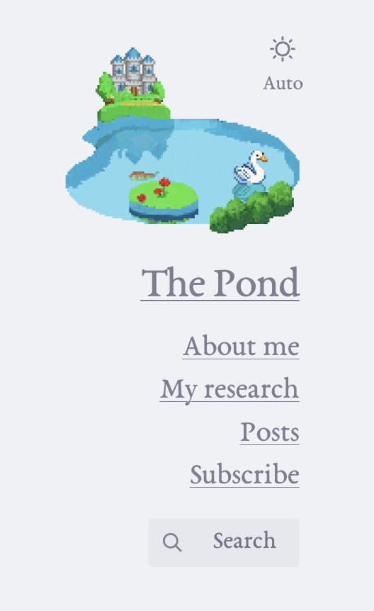
Here's what I'm currently leaning towards for addressing (2) and (3), ignoring potential issue (1) for now:
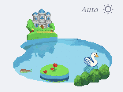
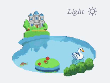
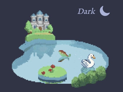
I found setting it in smallcaps to be quite distracting, so I settled for italics. What do you think?
The “auto” icon is the sun if auto says light mode, and the moon if it says dark mode. Though ideally it’d be self-explanatory.
Hmm, I see. Alright, that’s not too bad, given the labels.
I found setting it in smallcaps to be quite distracting, so I settled for italics. What do you think?
Seems reasonable. (I agree that underlining the links is no good.)
I can’t play/pause the GIF on hover because GIFs don’t allow that (AFAIK).
-
Make a static version of the image (the first frame of the animation, perhaps?). Set that image to load by default.
-
At the end of page load, in the background, load the animated version.
-
On hover (by adding a listener to the
mouseenterevent), rewrite thesrcattribute of the image element to point to the animated image. -
On un-hover (
mouseleaveevent), rewrite thesrcback to the static one.
I don’t really mind the zeros. If I hear from more people that the slashed zeros bother them, I’ll reconsider.
Slashed zeroes are Correct™.
I was hoping to have the hover-mode animation seamlessly pause and unpause - your proposal would have the displayed image revert back to the first frame on mouseleave IIUC.
your proposal would have the displayed image revert back to the first frame on
mouseleaveIIUC
Yes, correct.
I was hoping to have the hover-mode animation seamlessly pause and unpause
This SO question has several answers, all of which seem like reasonable solutions to me (if I were doing this, I’d try them all and pick the most performant one, most likely).
Do you think a 3-state dark mode selector is better than a 1-state (where "auto" is the only state)? My website is 1-state, on the assumption that auto will work for almost everyone and it lets me skip the UI clutter of having a lighting toggle that most people won't use.
Also, I don't know if the site has been updated but it looks to me like turntrout.com's two modes aren't dark and light, they're auto and light. When I set Firefox's appearance to dark or auto, turntrout.com's dark mode appears dark, but when I set Firefox to light, turntrout.com appears light. turntrout.com's light mode appears to be light regardless of my Firefox setting.
Do you think a 3-state dark mode selector is better than a 1-state (where “auto” is the only state)? My website is 1-state, on the assumption that auto will work for almost everyone and it lets me skip the UI clutter of having a lighting toggle that most people won’t use.
Gwern discusses this on his “Design Graveyard” page:
Auto-dark mode: a good idea but “readers are why we can’t have nice things”.
OSes/browsers have defined a ‘global dark mode’ toggle the reader can set if they want dark mode everywhere, and this is available to a web page; if you are implementing a dark mode for your website, it then seems natural to just make it a feature and turn on iff the toggle is on. There is no need for complicated UI-cluttering widgets with complicated implementations. And yet—if you do do that, readers will regularly complain about the website acting bizarre or being dark in the daytime, having apparently forgotten that they enabled it (or never understood what that setting meant).
A widget is necessary to give readers control, although even there it can be screwed up: many websites settle for a simple negation switch of the global toggle, but if you do that, someone who sets dark mode at day will be exposed to blinding white at night… Our widget works better than that. Mostly.
Is it possible that someday dark-mode will become so widespread, and users so educated, that we could quietly drop the widget? Yes, even by 2023 dark-mode had become quite popular, and I suspect that an auto-dark-mode would cause much less confusion in 2024 or 2025. However, we are stuck with the widget—once we had a widget, the temptation to stick in more controls (for reader-mode and then disabling/enabling popups) was impossible to resist, and who knows, it may yet accrete more features (site-wide fulltext search?), rendering removal impossible.
(The site-wide fulltext search feature has since been added, of course.)
IIRC my site checks (in descending priority):
localStorageto see if they've already told my site a light/dark preference;- whether the user's browser indicates a global light/dark preference (this is the "auto");
- if there's no preference, the site defaults to light.
The idea is "I'll try doing the right thing (auto), and if the user doesn't like it they can change it and I'll listen to that choice." Possibly it will still be counterintuitive to many folks, as Said quoted in a sibling comment.
Possibly it will still be counterintuitive to many folks, as Said quoted in a sibling comment.
No, this is a little different. Your approach here sounds like ours and the intuitive one (just at the cost of additional complexity).
The 'auto dark mode' we abandoned is where you just use step #2 there and you skip #1 (and thus, any widget or toggle which enables a reader to do anything with localStorage), and 'auto is the only state'. The logic there is, the reader already has access to a widget or toggle to set their dark mode preference: it's just their OS/browser, which will have some config page somewhere with various settings like 'turn on dark mode at night' or 'always use dark mode' or 'always use light mode'. Just trust the OS/browser and use whatever setting it sends to the web page. Don't waste the effort and screen real estate to add in a redundant widget/toggle. It's handled already. Easier for everyone - it Just Works™!
Unfortunately, the connection between 'a year ago when I updated my Android phone and it asked me if I wanted to use the cool new dark mode, I said yes' and 'this webpage I am reading now is in dark mode for some reason, and I can't change it back to normal???', apparently winds up eluding some readers. (This is what Said's sibling comment is about.) It winds up being "too much magic".
The current toggle+localStorage+auto approach, on the other hand, while adding to the clutter, does not seem to confuse readers: "the page is in dark-mode, for some reason. But I want want light-mode and I am unhappy. I see a little light-mode button. I push that button. Now the page is in light-mode. I am happy." (And then it is light-mode ever after.) At least, I have seen many fewer (or no) complaints about the dark mode being on when it shouldn't be after we moved to the toggle. So as far as we can tell, it's working.
The main problem with your approach is not that it is counterintuitive (although it is, and more so than ours!), but that there is no way to return to “auto” mode via the site’s UI![1] Having clicked the mode selector, how do I go back to “no, just use my browser preference”? A two-state selector with a hidden, ephemeral third state, which cannot be retrieved once abandoned is, I’m afraid, the worst approach…
You can go into your browse’s dev tools and deleting the
localStorageitem, or clear all your saved data via the browser’s preferences. (Well, on desktop, anyway; on mobile—who knows? Not the former, at least, and how many mobile users even know about the latter? And the latter is anyhow an undesirable method!) ↩︎
Great point! I made this design choice back in April, so I wasn't as aware of the implications of localStorage.
Adds his 61st outstanding to-do item.
The cost and time will gradually deter you and inherently create a scarcity mindset, sabotaging your creativity and playfulness and willingness to go "wouldn't it be fun if...?".
You caught something here with my own thinking. I have limitations associated with my own static site generator that acts as a simple barrier of just enough strength to deter my will and likely hinder output. I hadn't really concidered or thought of it at detail.
It isn't financial, but it is a time/mental tax I must pay to create, which should be eliminated. I'll aim to mentally emphasise it's credence as an issue requiring a solution.
Thanks for prompting the thought.
I think I speak for all of the LessWrong commentariat when I say I am sad to see you go.
That said, congratulations for building such a wonderfully eigen website!
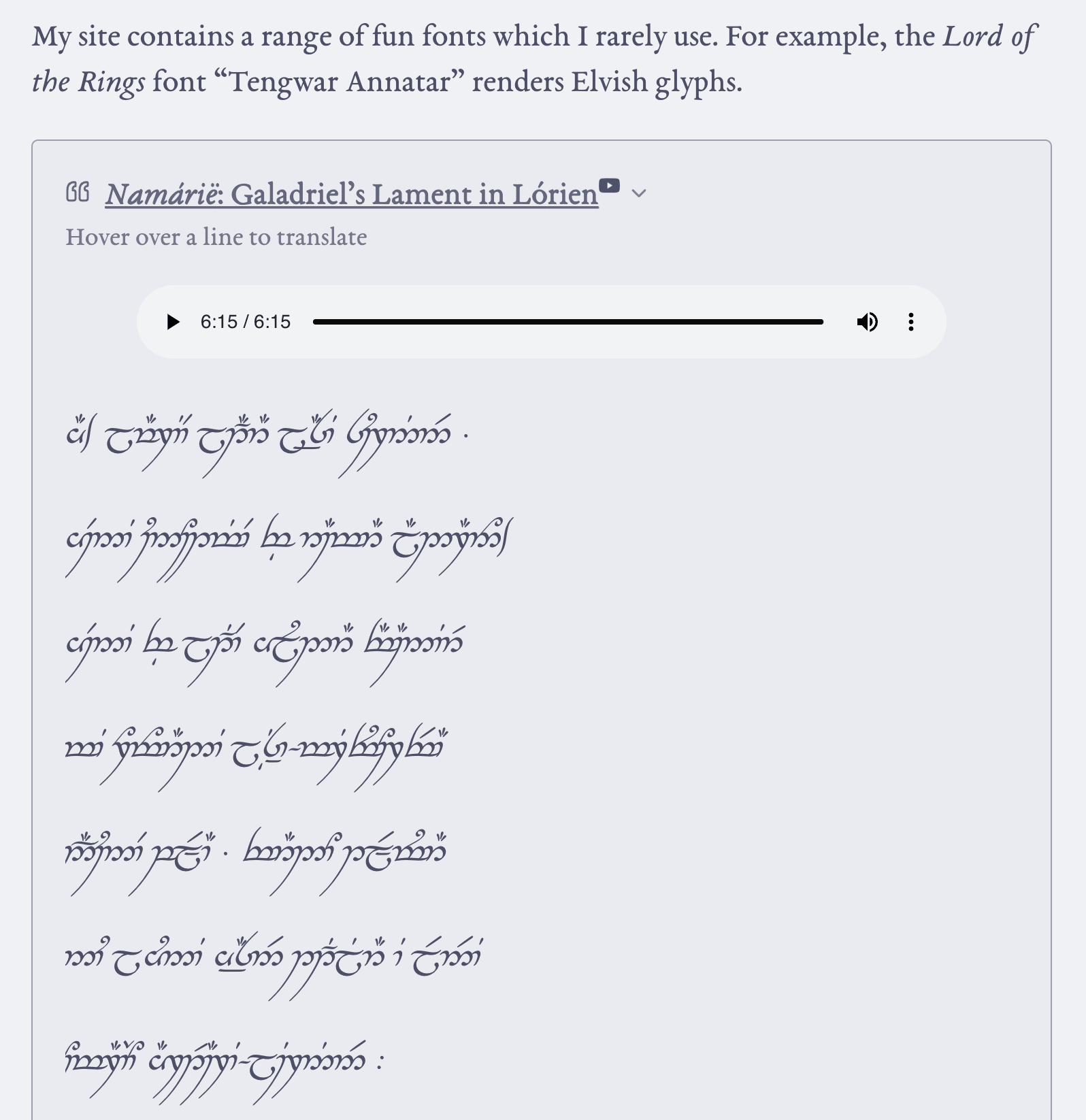
Ah! Might I recommend Tengwar Artano instead? It uses the same glyphs, but includes many modern "smart font" features, such as ligatures, automatic under/overbar widths, and improved diacritic placement. (And perhaps most usefully, and my primary motivation for reëncoding it, it's easy to use it with XeLaTeX.)
Also, you probably want to use the Quenya mode mode for Namárië.
Thanks for the Quenya tip. I tried Artano and it didn't work very quickly. Given that apparently it does in fact work, I can try that again.
I remember writing a note a few years ago on who I wished would to create a long site, and your pseudonym was on the list. Happy to see that this has happened, even if for unfortunate reasons.
I plan to cross-post to LessWrong but to not read or reply to comments (with a few planned exceptions).
:( why not?
Historically, I've found that LW comments have been a source of anxious and/or irritated rumination. That's why I mostly haven't commented this year. I'll write more about this in another post.
If I write these days, I generally don't read replies. (Again, excepting certain posts; and I'm always reachable via email and enjoy thoughtful discussions :) )
Thanks for crossposting! I've highly appreciated your contributions and am glad I'll continue to be able to see them.
The fatebook embedding is so cool! I especially appreciate that it hides other people's predictions before you make your own. From what I can tell this isn't done on Lesswrong right now and I think that would be really cool to see!
(I may be mistaken on how this works, but from what I can tell they look like this on LW right now)

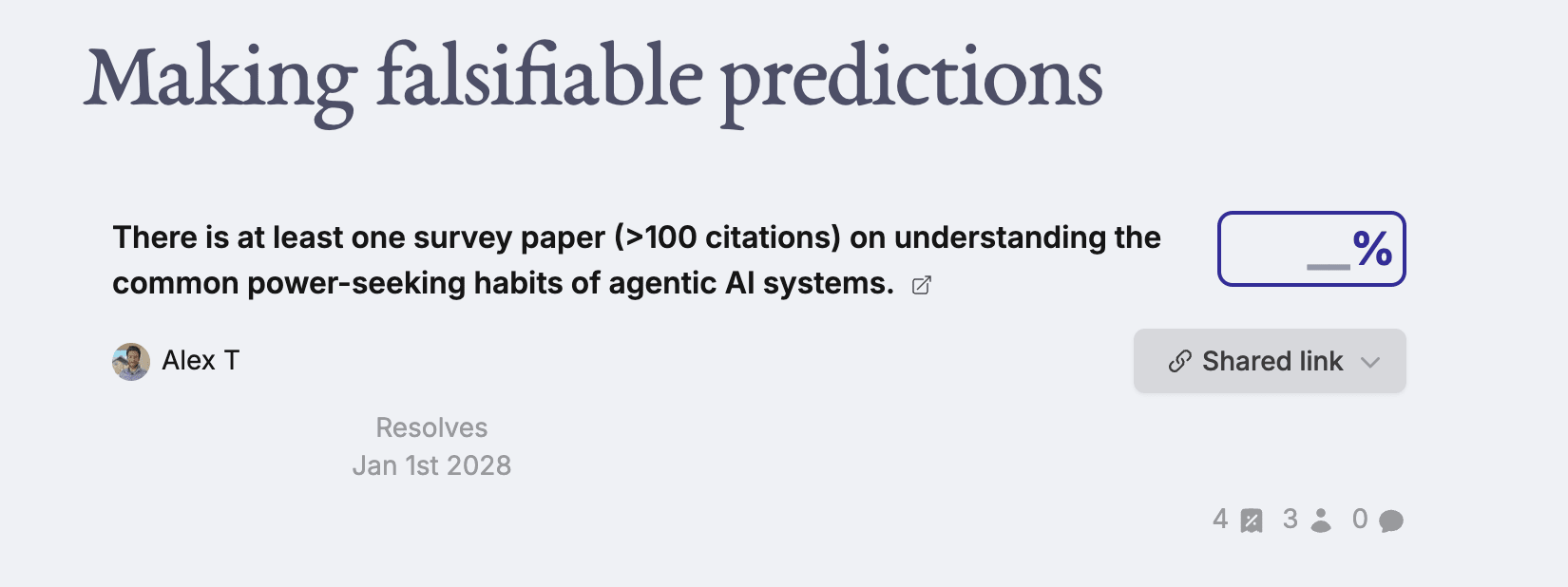
I've recently made a pull-request (not quite ready to merge yet) that gives LessWrong Fatebook hoverovers (which are different from embeds. I'm considering also making embeds, although I think the UI takes up a bit too much space by default).
I am into "more Fatebook integration everywhere".
(I think individual FB questions can toggle whether to show/hide predictions before you've made your own)
(I think individual FB questions can toggle whether to show/hide predictions before you've made your own)
I think it should be hidden by default in the editor, with a user-side setting to show by default for all questions.
It doesn't actually say one-way-or-another in the creation screen (in the chrome-extension tool at least). So, uh, let's see!
Not bad at all! Needs some work on the details and some bug fixes, but—really not bad! The dropcaps, in particular, are well done; and the overall theme is elegant.
Happy to see you doing your own thing! Your design idea reminds me of Art Nouveau book pages (e.g. 1 2 3), these were so cool.
Just to share one bit of feedback about your design, it feels a bit noisy to me - many different fonts and superscripts on the same screen. It's like a "buzz" that makes it harder for me to focus on reading. Some similar websites that I like because they're more "quiet" are Paul Stamatiou's and Fabien Sanglard's.
Read the full post at
turntrout.com/launch!Tweet thread: https://x.com/Turn_Trout/status/1858203701682536680
From now on, I will write my content from turntrout.com. I plan to cross-post to LessWrong but to not read or reply to comments (with a few planned exceptions). For example, I'll be reading and replying to some comments on this post. :)
Find out when I post more content: newsletter & RSS