LessWrong now has side-comments. This feature is in beta; you can turn it on for yourself on individual posts using the triple-dot menu below the post title, or enable it for all posts by going to your user settings and checking the "Opt into experimental features" checkbox in the Site Customization section.

Side-coments on LessWrong are conceptually similar to the side-comments you may be familiar with from Google Docs and other places, with one key difference: side-comments are placed automatically by lining up blockquotes. As a result, many historical posts already have side-comments on them! Side-comments are also still displayed in the comments section below the post as usual.
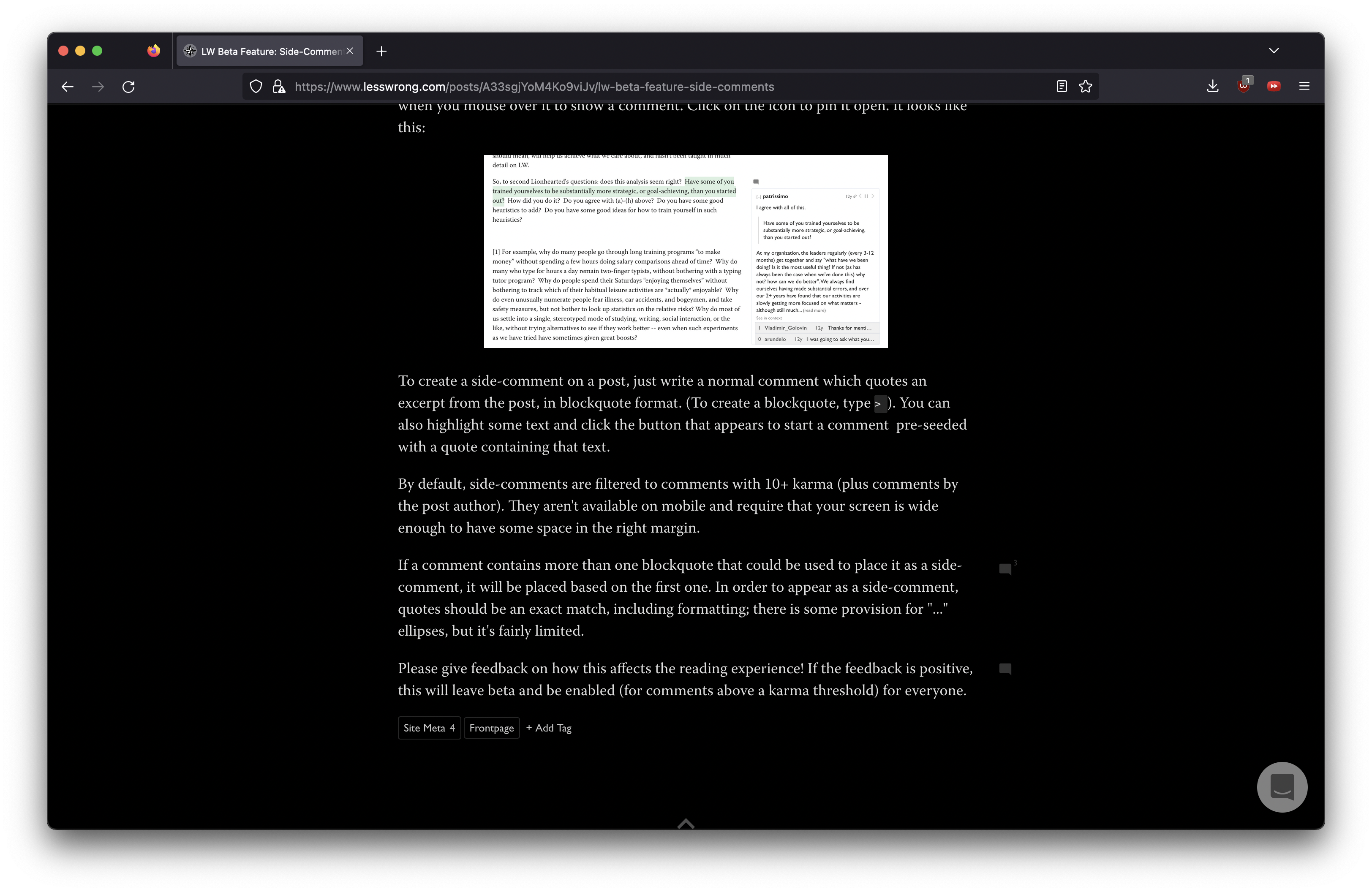
Side-comments take the form of a comment icon in the right margin, which expands when you mouse over it to show a comment. Click on the icon to pin it open. It looks like this:

To create a side-comment on a post, just write a normal comment which quotes an excerpt from the post, in blockquote format. (To create a blockquote, type > ). You can also highlight some text and click the button that appears to start a comment pre-seeded with a quote containing that text.
By default, side-comments are filtered to comments with 10+ karma (plus comments by the post author). They aren't available on mobile and require that your screen is wide enough to have some space in the right margin.
If a comment contains more than one blockquote that could be used to place it as a side-comment, it will be placed based on the first one. In order to appear as a side-comment, quotes should be an exact match, including formatting; there is some provision for "..." ellipses, but it's fairly limited.
Please give feedback on how this affects the reading experience! If the feedback is positive, this will leave beta and be enabled (for comments above a karma threshold) for everyone.
Yeah, this is pretty annoying. We spent a decent amount of time trying to make it so that the whole page shifts to the left when you open a comment, but it ended up feeling too janky. We might still make it work later on.
The current layout is optimized for 1440px wide screen size, which is the most common width that people use the site with, but we can probably make it work for people who are more zoomed in or have smaller screens after a bit more work.
Hmm, this seems likely a bug. What browser and OS are you using?
The way I've found it most comfortable to engage with the side comments was to hover, read the first few lines, author and karma, then click to pin the comment open and then read the rest. This... is of course harder if you are on a smaller screen and can't even get that basic information without scrolling first. As a bandaid (though this isn't great), the hover-area over the comment icon actually extends horizontally all the way to the right of the screen, so you should be able to start hovering, then scroll to the right, and then decide to click (though if you decide to not click and hover away, your scroll position is janked in a disorienting way, which is also pretty annoying, IMO).
I think overall we probably should find some way to make the post move further to the left. The big problem with this (which you can't see on this post) is the Table of Contents which actually takes up most of the available space on the left when it is present, and making both the side comments appear and the ToC appear is actually pretty hard and we don't have a ton of extra space to work with.