I was reading a post on the economy from the political statistics blog FiveThirtyEight, and the following graph shocked me:
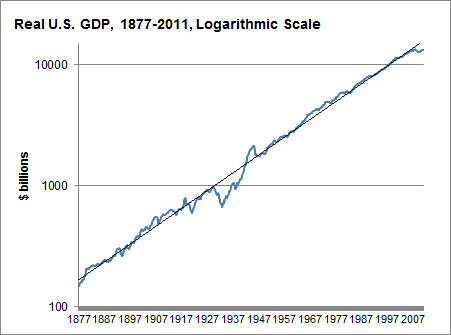
This, according to Nate Silver, is a log-scaled graph of the GDP of the United States since the Civil War, adjusted for inflation. What amazes me is how nearly perfect the linear approximation is (representing exponential growth of approximately 3.5% per year), despite all the technological and geopolitical changes of the past 134 years. (The Great Depression knocks it off pace, but WWII and the postwar recovery set it neatly back on track.) I would have expected a much more meandering rate of growth.
It reminds me of Moore's Law, which would be amazing enough as a predicted exponential lower bound of technological advance, but is staggering as an actual approximation:
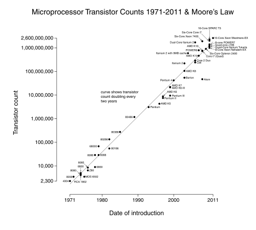
I don't want to sound like Kurzweil here, but something demands explanation: is there a good reason why processes like these, with so many changing exogenous variables, seem to keep right on a particular pace of exponential growth, as opposed to wandering between phases with different exponents?
EDIT: As I commented below, not all graphs of exponentially growing quantities exhibit this phenomenon- there still seems to be something rather special about these two graphs.

http://www.greatplay.net/offsite/us-econ-growth.png
When you look at a graph of the growth rate itself, the data doesn't look like a perfect fit for a line anymore.
Instead, I think the 3.5% is an average that looks good when you have a graph that is rather zoomed out, but overall isn't that much of some sort of pattern that needs explaining.
Instead, the economy seems to fluctuate and cycle a lot, and we already have some theories of business cycles to explain why that is so.
You can also see points in history where certain geopolitical events caused lower or higher than average growth, so the idea that the GDP is seemingly immune to geopolitical events is hardly there in actuality.
~
I can't explain Moore's Law (that's an area I haven't studied at all), but I'd be willing to wager that if you looked at the graph of growth like this, you would see some fluctuations as well. (No negative growth though, obviously.)
It would be interesting to see. If the Moore's Law graph really didn't fluctuate much, then I think you have something in need of explaining.
~
Also, you might be wondering something like "if technology has improved drastically, why hasn't GDP growth shot up to something wild like 7% per year?". But growth itself requires more and more change every year just to keep at a constant growth percentage, and as Moore's Law shows, technology itself improves at a mostly exponential rate, so we would only expect the same exponential increase in GDP, not something more-exponential-than-exponential.
Hey, what happened to your graph?
Anyway, it seemed to me that if you calculated GDP change over 10-year periods in order to drown out year-to-year fluctuations and business cycles, that you'd have essentially constant 3.5% annualized change except for the 1930s and 1940s. The absence of long-term trends is what confuses me.