In a world where we have reacts, do you prefer to keep agreement voting?
- agree-react for "keep agreement voting"
- disagree-react for "at least for an initial react experiment, get rid of agreement voting and just design the react-palette to facilitate agreement voting"
This isn't a binding poll, but a couple people had mentioned this deeper in comment threads and I wanted to comment making the question somewhat more explicit and take the temperature of how people are feeling about it.
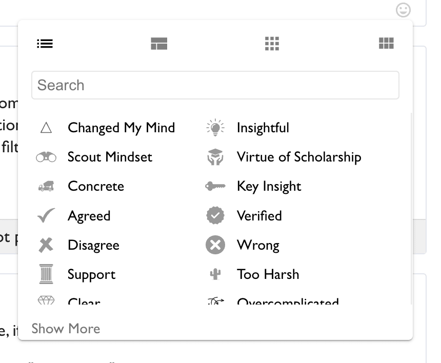
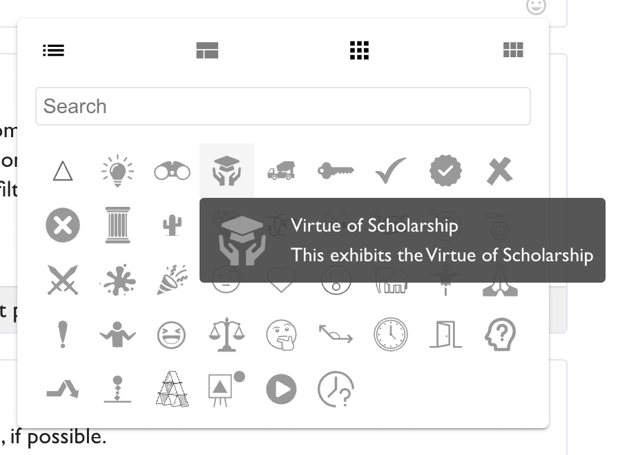
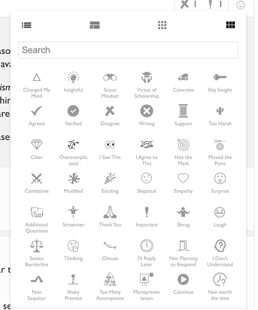
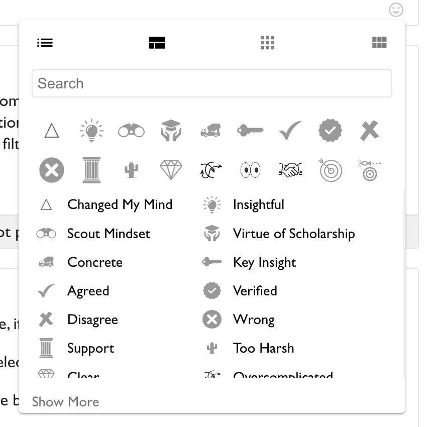
Today's UI tweaks include the ability to try out different layouts for the React Palette. You can click the icons in the top of the React Palette and see options like:
Default:
Icons only:
Icons / name grid
Mixed:
(the idealized version of this one probably shows you reacts in the order of frequency-that-you-use-them)
With some further thinking, I'm realizing one of my concerns is that this is an unfortunate direction for LW. I LIKE that LW is text-heavy. I LIKE that the norm is to use complete sentences, and to leave actual comments when there are questions or clarifications to the main point.
I don't think adding more mechanisms for low-effort low-information-content (what, 5 bits per react?) will make LW better, and in fact could make it much worse, if it substitutes for some amount of comments. Cutesy icon debates are fun, but don't actually add value.
[ note: partly posted to see if I can get some downvotes or negative reacts. but also because it's a real concern, though I don't think I understand the dynamics well enough to know if this is actually a problem for this feature. ]
Separately, I'm skeptical of this feature because I fear the prospect of getting this kind of feedback would be draining and aversive and distracting.
-
NEGATIVE FEEDBACK: LW has a feature to see karma upvotes but not downvotes in the top corner periodically. I think it's the default. It's a great feature! Negative feedback is helpful but also exhausting; low-bandwidth negative feedback has all the emotional energy costs without much of the benefits. Here we're making negative feedback very on-the-nose / difficult to ignore, and coming from specific people, which makes it worse I think.
-
POSITIVE FEEDBACK: Is also an issue!! I have issues checking feedback over and over when I have better things to do. I'm mostly managing the issue on LW, with the help of a browser tweak that hides karma and approval on my user page. I feel like I'm a recovering alcoholic and this feature is putting a bottle of wine on my nightstand. Two things in particular: the lack of anonymity and ability to request clarification etc. would make me feel like I should check over and over because it's part of an active conversation. Like, I already have issues checking feedback when there's no logical reason to!
We should distinguish between possible worlds that have low realityfluid due to implausible physics (like FTL travel, which only occurs in simulations, because causal universes don't look like that), and those that have low realityfluid due to implausibly fine-tuned sociology/psychology/&c. (which mostly occur in simulations rather than the basement, because the fine-tuning is most parsimoniously explained in terms of what Powers in the basement are interested in simulating).
This thought occasioned by how I'm really enjoying Hello, Tomorrow! on Apple TV+. It's about salesmen hawking real estate on the moon in a setting with robots and rockets but 1950s-like culture and æsthetics, which gives it an extra layer of fine-tuning: it's not just that the real future doesn't look like that (as is the problem with most science fiction, where the present day's depiction of the future bears the "design signature" of the present day); it's that it's a present-day depiction of a 1950s depiction of the future. An analogue of this show that was actually made in the 1950s wouldn't have a racially integrated cast (without special remark), or present-day production values, or make use of any number of TV storytelling tropes that were popularized in recent decades that I'm not enough of a film buff to be aware of.
Raw feedback: I feel a sense of being overwhelmed with information. It doesn't seem like I should have this feeling - it's not actually a lot of information and it's easy enough in theory to ignore - but nevertheless, I do experience it.
Ok, I should probably wait a bit before making this recommendation, but I currently think this is a nice addition, which should REPLACE agree/disagree, rather than being yet another mechanism for low-effort feedback. Don't overcomplicate it with different placement or fancy anti-reactions, just put a straightforward reaction display and selector where the agreement buttons are today.
I'm tempted to recommend that it replace Karma as well, but that's more baked into the site and would be trickier.
Suggestion: 'true but unhelpful' react with the icon being a bored/tired face. I currently express this with karma downvote and agreement upvote, but the sorts of people who write these sorts of comments will usually have difficulty interpreting that feedback signal, given that the behavior often correlates with not understanding how agreement and discursive productivity are very different things.
Reason we need this: It's a good way of pointing out choir-preaching and succinctly explaining how it can make the site worse (it's boring and unproductive).
UI thought: in practice I actually find it hard to tell whether a react applies to the parent or child comment, and meanwhile because I'm not used to looking on the bottom-right I just wasn't noticing them at all.
Agreed. The reactions also feel inconsistent with the existing voting options. I'd suggest something more like this:

I'd also suggest that the react-add icon should have a plus somewhere on it. eg, compare discord's:

slack:

and unlike my screenshot, maybe it would be best to put the add-react at the end, rather than the beginning, of the list of reacts. I'd also put just a little more spacing between react types.
Balanced reaction and anti-reaction seems to remove the icon, rather than showing a 0. I don't think antireactions are a good idea - I'd much rather someone who feels otherwise just choose a different reaction to show, rather than trying to remove someone else's opinion.
The vote-like counter on the react popup is hard to find if not looking for it, and the concept is confusing as to when to use it.
I think my main objections are not those (though reducing others' voice is a worry, and this is related to it). It's the assymetry of reaction and anti-reaction. Reactions are about the post, anti-reactions are about the reactions. An anti-reaction to "concrete", for instance, does not claim that the post is vague, it just claims that someone else's reaction of concrete should be suppressed.
I would support having a near-antonym for each reaction, and encourage people to say "vague" if that's their reaction, EVEN IF someone else said "concrete". But anti-concrete is a very strange way to do that.
I guess the other way to go would be NOT to suppress a reaction if it's 0 or negative, but to show it in red, as an indicator that the majority felt it was the opposite of concrete. Still seems overcomplicated, compared to just counting discrete reactions and not trying to net anything out.
First round of changes based on feedback from this thread. There are a bunch of new reactions, some UI changes, and some small bugfixes. Not being in this changeset does not mean that a suggestion has been rejected; this is just a first pass.
- New reactions: Agree, Disagree, Obtuse, I'll Reply Later, Not Planning to Respond, I Don't Understand, Non Sequitur, Shaky Premise, Too Many Assumptions, Misrepresentation, Continue, Not Worth the Time
- The add-reaction button is moved to the bottom-right
- The reactions display highlights reactions that you yourself made or antireacted to
- Replaced the icons for Support and Concrete
- Recapitalized some reaction titles to be in title-case
I miss coffee. I used to have iced-coffee in the morning a lot, but I've been scared of caffeine ever since my insomnia scare of January 2021. (I've been to psych prison for sleep deprivation madness twice, and I never want that to happen again.) Yes, I know about decaf, but they don't get all of the caffeine out, and if you haven't been using, your tolerance is all gone and you're super-sensitive to even small doses; I feel safer just abstaining altogether.
I was catching up with Seinfeld on Netflix out of '90s nostalgia, and in one episode they mentioned ...
Subthread for proposing new reactions. Icons for the existing reactions come from The Noun Project, so this is a good place for finding more icons that match the existing ones.
If this feature is in part meant to address the problems of 1) threads often ending without people knowing why and 2) people feeling bad about receiving certain kinds of criticism or about certain critics because it's costly to both respond and not respond, I would suggest adding the following reactions:
- I plan to respond later.
- I'm not planning to respond. (On second thought this could be left out, as it would be implied if someone gave a reaction without also giving "I plan to respond later.")
- I don't understand.
- I disagree. (Similar to "wrong" but I think I prefer this wording.)
- It's probably not worth the time to resolve this.
- I wish this thread would continue. (Could be used to remind someone to respond, or when you see an interesting thread that ended too early.)
Maybe too hard but it might be nice to have somewhere you can go to see all the comments you've reacted "I plan to respond later" to that you haven't yet responded to.
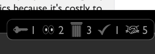
I reacted to Wei_Dai's comment. It had 3 keys and 3 thank yous, in that order left to right. I clicked the key, so now there's 4 keys and 3 thank yous. When I clicked it, the icons switched positions so that there were 3 thanks and 4 keys, in that order. I don't like that it switched positions, e.g. because I have to reparse the icons and numbers to verify that what I did had the intended effect.
What does "I saw this" mean? "I already saw this in another place" or "I saw this comment, if it's important"? I think it needs clarification.
I do want to thank you for NOT including my least-favorite part of karma and agreement voting. Thank goodness for no strong reactions!
Happy to see experimentation here. Some quick thoughts:
- The "Column" looked a lot to me like a garbage can at first. I like the "+" in Slack for this purpose, that could be good.
- Checkmark makes me think "agree", not "verified". Maybe a badge or something?
- "Support" and "Agreement" seem very similar to me?
- While it's a different theme, I'm in favor of using popular icons where possible. My guess is that these will make it more accessible. I like the eyes you use, in part because are close to the icon. I also like:
- 🚀 or 🎉 -> This is a big accomplishment.&nb
Reacts have been in use for some time now. Having seen various posts and comments with reacts, and how they're being used, I think that the "I checked, it's false" react, and probably also the "I checked it's true react" are net-negative. Basically the issue (which I've seen mostly with the "I checked, it's false" react) is that a lot people are using it as basically equivalent to a "disagree". (As a rough estimate, I'd guess a least a third of usages have this problem.) Despite the fact that the description says "I looked up sources, did empiricism, check...
I think the "changed my mind" Delta should be have varied line widths, like https://thenounproject.com/icon/delta-43529/ (reads too much like "triangle" to me at the moment).
The fact that the title of this post says "Open Thread" makes me think that the intention is for the conversation in the comments to not just be about this new reactions feature. However, the lack of mention of this in the post plus the other comments only being about reactions makes me think otherwise. What is the intent?
"Concrete" reaction should be a concrete truck imo https://thenounproject.com/icon/concrete-truck-1791966/ the current one is a brick wall, which is not really suggestive of concrete at all, and a wall in this context is far more suggestive of an accusation of obtuseness.
A cement truck is an entity who brings concreteness, so it would be like saying "you have the virtue of a concrete truck" and I find it delightful.
I haven't seen any discussion about this part of the motivation for reactions:
In my experience, seeing a list of names that I respect, marked as having reacted positively to my writing, feels much more motivating than a high karma number. Conversely, seeing negative reactions from names I don't respect feels less bad than a low karma number. And seeing a mixed reaction, with positive reactions from people I recognize and negative reactions from people I don't, creates a feeling of community.
That does NOT match my experience, and it anti-matches the ex...
In the current UI, the list of reactions from which to choose is scrollable, but that's basically impossible to actually see. While reading the comments I was wondering what the heck people were talking about with "Strawman" and so forth. (Like... did that already get removed?) Then I discovered the scrolling by accident after seeing a "Shrug" reaction to one of the comments.
Can one react (and see reactions) to a post, or only comments? I have to admit I worry a bit about information overload, as we now have karma, agreement, and reactions, none of which have particularly great guidance on how to make best use of them (either as a reader, for filtering or understanding comments, or as a voter, for communicating with the poster and other readers).
I'd really like to be able to see all the reactions at once, if possible.
I think the "I agree to this" react should simply be labeled "Handshake".
Also, a react to indicate that this comment should have been split into multiple comments might be nice (like you may think this comment should have :p).
Neat. Looking at the list of reactions, one jumps out to me as out of place: the wrong reaction. The others reflect various feelings or perceptions and can be interpreted that way, but the wrong one seems too strong to me and overlaps with the existing agree/disagree voting. If you think something is wrong and want more than the disagree vote, seems like that's a case where we want to incentivize posting a reply rather than just leaving a wrong react with no explanation.
Basically my theory is that reactions should be clearly personal reactions and stuff that can't be objected to (e.g. I can't object if you found my presentation overcomplicated, that's just how you felt about it), and anything that can be read as a bid to make claims should not be included because there's no easy way to respond to a reaction. I think on this grounds I also dislike the strawman and seems borderline reactions.
I've just had an interesting experience that changed my felt-sense of consciousness and being embodied.
I've played over 80 hours of the newly released Zelda game, which is a lot given that it's only been out for 14 days. I do not normally play video games very much, this has been a fairly drastic change in how I've spent my personal time.
I'm really focused while playing it, and feel very immersed in the world of the game. So much so that I had a quite odd experience coming back to the rest of my life.
Yesterday, after playing the game for an hour, I wandere...
Poor icon choices:
- triangle for changed mind
- scales looks like "fair and balanced" rather than "borderline nitpick"
- support pillar ... but mostly I don't know what support means
Eh / nitpicks
- elephant for "requesting additional info" is a bit obscure.
- cactus looks a bit like a person and does not actually look pointy.
- exclamation implies "wow" more than it does importance
- does graduation cap need the hands? maybe a book for scholarship would be easier to parse?
Particularly good icon choices:
- lightbulb, key, checked, x, hits the mark,
Might make this a post later, but here a few of my current thoughts (will post as separate comments due to length).
And I’m not sure about the scales being an icon for “seems borderline.” Some sort of fuzzy line or something might be more appropriate. Scales make me think “well measured.”
Some other comments touch on whether the react panel is too complicated. On any other platform, I would agree. Not here. It is not even more complicated than Slack, and troves of people use Slack with no trouble. I think the posters/commenters the moderators seem to want to see on LW are easily capable of dealing with much more complexity. All useful data. If you are worried about distraction, add an personal setting to hide it.
Having some way to view whether I've already left a reaction on a post would be great. Currently it just shows a number, and then if I click on it, the number decreases if I've already left a reaction. Would be nice for the background to be some color if I left the relevant reaction (maybe green if I pro-reacted and red if I anti-reacted).
The subtitle copy on most of these is uninformative or duplicating the title. "I saw this", "this exhibits the scout mindset", "I feel empathy towards this". Maybe remove the subtitles for most of the reactions?
Very nitpicky (sorry): it'd be nice if the capitalization to the epistemic status reactions was consistent. Currently, some are in title case, for example "Too Harsh" and "Hits the Mark", while others are in sentence case, like "Key insight" and "Missed the point". The autistic part of me finds this upsetting.
I think a reaction which suggests that something is mislabelled might also be helpful. Like for reacting to misleading titles (... can people react to top-level posts?) or similar.
When people see content they agree with and want to support, that mostly gets expressed through upvotes; when they see content they disagree with, that's more likely to result in writing a comment. This biases the perceived reception in a negative direction.
Agreed. I think I previously had some vague belief in something like this being true, but reading the above really helped crystalize the belief. And if true, I think it's important.
It makes me think back to this talk about code review.
...“Your code is bad and you are bad. Have a bad day.” Too many code rev
What does it mean to anti-react “Wrong” when no one has reacted “Wrong” (for example)? (Or “Shrug”, or “Additional questions”.)
Also, the hover tooltip for a reaction covers up the one(s) below it—very annoying, makes it hard to browse them.
Feedback on "I saw this": I think that's the wrong icon, the eyes are open too wide, that emoji ends up being used to mean like "holy shit, omfg, WOW", which is different. It's worth having that as a reaction, but you already have "changed my mind", which is a more appropriate way to express that in the LW context.
I'd recommend one of the single eye logos like this. instead https://thenounproject.com/icon/eye-100409/
Or a single eye that's looking up and to the left, at the comment, would be better. So I drew one like that, uploaded to the noun project. It's awaiting moderation.
I partly support the spirit behind this feature, of providing more information (especially to the commenter), making the readers more engaged and involved, and expressing a reaction with more nuance than with a mere upvote/downvote. I also like that, as with karma, there are options for negative (but constructive) feedback, which I mentioned here when reviewing a different social discussions platform that had only positive reactions such as "Aha!" and "clarifying".
In another sense, I suspect (but could be wrong) that this extra information could also have ...
I'm surprised to see a "Wrong" icon as a counterpart to "Verified" and not something like "Citation Needed / Requested" or something else that solicits information / evidence.
The icons are small (unavoidable), some have too many details, and the outlined ones are too thinly stroked. The lack of color makes them harder to distinguish.
This will be great for shortform! (Though maybe people don't use shortform so it doesn't matter)
When I moussed over all the reactions I saw "missed the point", and assumed it means "I can't see what the point of this comment is.", where as the explainer text seems to suggest that it actually means "this comment has missed the point." ("You missed the point." vs "I am missing your point).
"Missed the point" and "Hits the mark" appear to be exact opposites. So I suppose a negative react of "Hits the mark" is kind of a equivalent to a "Missed the point"?
No suggestion, just this one seemed like a react that might be used or interpreted more ambiguously than the others.
It takes time to iterate on features like this to improve them and iron things out, so I think "promising" is more aligned with what the bar should be then "I'm happy with this in it's current state". And IMO it meets the bar of "promising" pretty easily.
The support icon looks at first glance like a garbage can although I can tell it’s meant to be a pillar.
Currently the most-reacted to icons are on the very right of the list. This feels like it's the wrong way around. I want to notice the most-reacted icons first, which will still be on the left side.
For comparison, I wanted to link the post a while back that did the other experiment with reactions. I can't find it. The closest I got was this:
Improving on the Karma System
This would be a good time to streamline requesting explanations from voters.
It's very common that the person issuing the reaction doesn't know whether the recipient wants or needs a full explanation, and it's very common for the recipient to really really want an explanation for the reaction after all, and for the recipient to be too worried about being rude or annoying or looking dumb or wasting space by asking for one, so I think it would be worth making that a private, two-click action.
Is it a bug that I don't seem to be able to react to comment replies, only to top-level comments? Currently using Chrome on MacOS, if that matters. Oh, even worse - I can't vote or agree with replies either - that row of icons is unresponsive.
Further testing, including refreshing the page (and losing the green bar for new comments), shows this is very inconsistent. Some threads seem to work, some do not. Also, some rollovers seem broken - I keep getting the popup for author information "stuck" on the screen, obscuring stuff undernea...
Bug: I can't undo my vote in the react/anti-react voting widget. When I click on the upvote/downvote buttons it just reapplies the vote instead of undoing it.
The LessWrong Review runs every year to select the posts that have most stood the test of time. This post is not yet eligible for review, but will be at the end of 2024. The top fifty or so posts are featured prominently on the site throughout the year.
Hopefully, the review is better than karma at judging enduring value. If we have accurate prediction markets on the review results, maybe we can have better incentives on LessWrong today. Will this post make the top fifty?
I find myself wanting to react (Actionable) / (Non-actionable). Or to say: yes, let's act on this. This reflection makes me want, (Can we make this actionable) / ... I suppose the opposite is covered by existing Concrete and Examples reactions. I don't find my thinking well-factored to these categories of reactions.
I find myself a little frustrated needing to scroll out sideways to engage with reactions. Maybe a pop-down option, and maybe a more stateful modal, I might find easier.
These reactions strike me as remarkable compatible with Web Annotation WG re...
I've recently read about the sequence about quantum mechanics, and now I feel interested about experiment with two half-mirrors where amplitudes cancel out (Configurations and Amplitude).
- Is such an explanation approximately equivalent to quantum one? I've heard that phase of wave represents angle of amplitude complex value.
"On each reflection, light wave phase is shifted by pi/2; there are two ways that light goes to the top, with 1 and 3 reflections; these ways cancel out due to interferention with phase difference = pi". - Is it possible to do such an exper
The "Borderline" icon currently being a balance is something I most naturally interpret as "balanced fairly", whereas a similar-ish alternative -- open hands gesturing up & down -- reads more like "iffy" to me and might better communicate the concept. Here's a simultaneously too complex and too crude mockup based on https://thenounproject.com/icon/hand-disinfection-3819834/ :

A similar idea to indicate that something might be kind of a toss-up (which at first blush strikes me as less good than palms balancing, yet maybe better than the icon already in u...
Using a plain heart to express empathy seems easier to confuse with "I love this" than seems ideal. Here are a few other options that seemed potentially appealing after looking through results at The Noun Project for "Empathy" and "Hug":
https://thenounproject.com/icon/take-care-4694299/
https://thenounproject.com/icon/hug-4400944/
https://thenounproject.com/icon/heartbeat-977219/
Isn't this an empirical question?
Trying to guess how we'll like it and how it will change behavior seems crazy compared to just running the experiment.
Make the change, record differences in commenting behavior. Get feedback on how people like it. Take a vote to keep or revert it.
I'm shocked and a bit disturbed that treating it as an empirical question isn't higher-ranked and more commonly suggested.
I think "Muddled" unfortunately seems easier to naturally interpret in an accusatory way, so something else indicating "this was hard for me to see / wasn't clear to me" might work better. My initial thought was to maybe use "Foggy" as a metaphor (as in, "there might be something there, but I'm having a hard time seeing it"). I suppose something with a lighthouse probably looks more like "a beacon of clarity", though here are some other possible Hazy / Cloudy things:
"Strawman" seems like it might be kind of niche, so I went on a quest looking for something more indicative of "I find this to be misleading / misrepresentative" before realizing this apparently already exists. I can't say I really have any issue with the one already in use, but since there seems to be lots of ways to approach this and I already have several at hand, here's a multitude of alternatives just in case any seem especially resonant. Themes depicted below include loss of signal or mutations in translation, frames being warped or distorted or stuf...
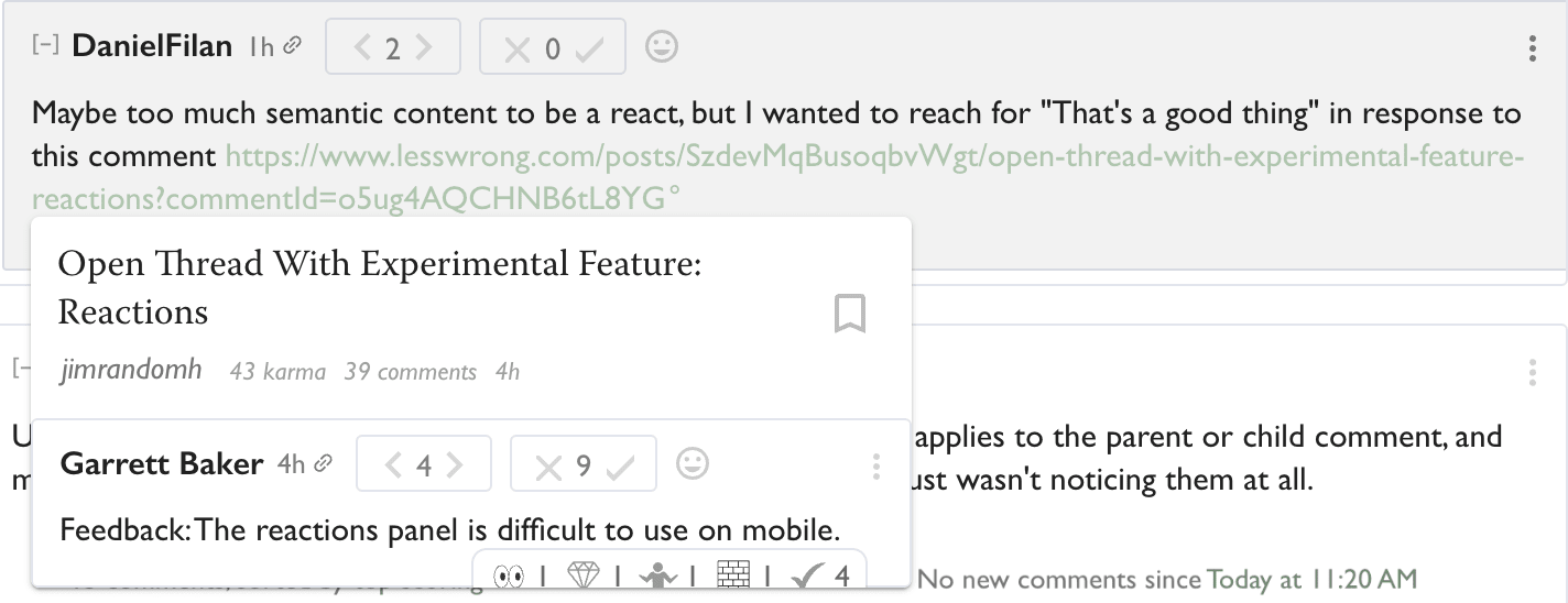
UI feedback: The preview widget for a comment appears to cut off part of the reaction bar. I don't think this makes it unreadable, but was probably not intended.

This open thread introduces an experimental extension of LessWrong's voting system: reactions. Unlike votes, reactions are public; hovering over the reactions will show a list of users who reacted. For now, this feature is only for comments on this post in particular; after collecting feedback, we might roll out more broadly, or make significant alterations, or scrap it entirely. Reactions to comments in this thread will be preserved while discussions here are active, but they may be lost later if the feature changes in an incompatible way. Using this feature in various ways is planned to have karma minimums, but for this experimental post, those karma minimums are temporarily reduced to zero.
These are similar to the reactions found on other sites such as Slack and Discord, but with a few twists. The first difference is the palette of reactions offered.
The palette of available reactions, and the first page of reactions in particular, is explicitly a claim about what we think people should care about in comments (both positive and negative). On LessWrong, that means ways of relating to comments epistemically, reasons why comments are good and bad contributions.
Reactions currently can only be applied to comments (not posts), only on this thread (for experimentation purposes), and only on entire comments, not individual comment sections. Depending on feedback, we may roll it out to comments on all posts, allow reactions to posts not just comments, and maybe implement something to allow reacting to specific parts of comments and not just to the whole thing.
Antireacts
Unlike other sites that have reactions, LessWrong has antireactions. An antireaction is like downvoting a reaction, or placing -1 reactions. This doesn't affect anyone's karma, but will show your name in the hover-over as someone who disagreed with the react. If there are at least as many antireactions of a given type as there are reactions of that type, then the icon won't be shown to people who don't hover over the reactions icon.
The idea here is that, since we are trying to promote reactions that have more semantic content than the reactions you would find on most sites, many of the reactions in the palette are capable of being incorrect in a way that purely emotive reactions aren't.
Motivation
In my experience, seeing a list of names that I respect, marked as having reacted positively to my writing, feels much more motivating than a high karma number. Conversely, seeing negative reactions from names I don't respect feels less bad than a low karma number. And seeing a mixed reaction, with positive reactions from people I recognize and negative reactions from people I don't, creates a feeling of community.
Other sites on the internet (most notably Facebook) try to use reactions to bias interactions towards positive vibes. I theorize that rationality culture is accidentally doing the opposite; that is, LessWrong has a problem with asymmetrically muted signal. When people see content they agree with and want to support, that mostly gets expressed through upvotes; when they see content they disagree with, that's more likely to result in writing a comment. This biases the perceived reception in a negative direction.
Reactions are meant to serve as a middle ground between voting and commenting. This may capture feedback that would have been lost otherwise. In the case of positive feedback, this makes it more salient and motivating. In the case of negative feedback, I expect (though I could be mistaken) that receiving a reaction that expresses some specific criticism will at least be better, from an author's perspective, than a negative score with no replies.
The default palette of reactions contains many reactions that represent specific virtues, and common flaws, that we want people to know about. This is a culture shaping tool; seeing the default palette of reactions, and seeing commonly used reactions on comments, is meant to influence what people optimize for when writing their comments.
Finally, reactions are now present on so many other sites that they've become a part of how people communicate, and there's value in maintaining feature-parity with the rest of the internet.
Feedback
The main form of feedback I'm hoping for is theorizing about the effect that this will have on site culture, if this feature rolls out broadly (for comments on all posts, and for posts themselves). I'm also interested in feedback about the current UX, and reactions that are worth adding to the palette.
If you're proposing reactions to add to the palette, please include an icon; it should be an image that is legible when it's very small and in greyscale or muted color, and is at least somewhat a mnemonic for the concept it represents.