If it’s worth saying, but not worth its own post, here's a place to put it.
If you are new to LessWrong, here's the place to introduce yourself. Personal stories, anecdotes, or just general comments on how you found us and what you hope to get from the site and community are invited. This is also the place to discuss feature requests and other ideas you have for the site, if you don't want to write a full top-level post.
If you're new to the community, you can start reading the Highlights from the Sequences, a collection of posts about the core ideas of LessWrong.
If you want to explore the community more, I recommend reading the Library, checking recent Curated posts, seeing if there are any meetups in your area, and checking out the Getting Started section of the LessWrong FAQ. If you want to orient to the content on the site, you can also check out the Concepts section.
The Open Thread tag is here. The Open Thread sequence is here.
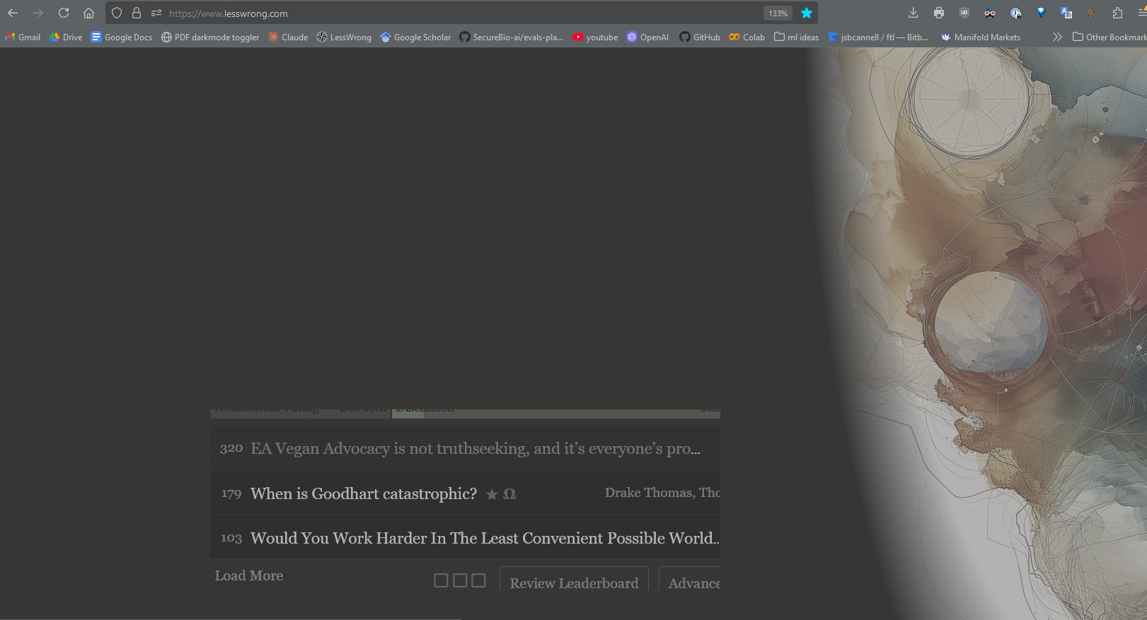
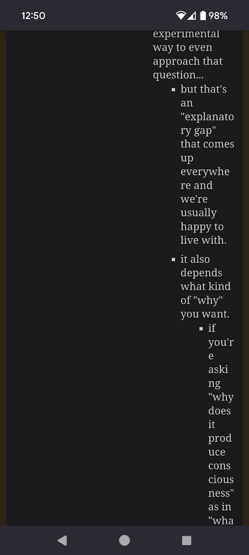
Re: the new style (archive for comparision)
Not a fan of
1. the font weight, everything seem semi-bolded now and a little bit more blurred than before. I do not see myself getting used to this.
2. the unboxed karma/argeement vote. It is fine per se, but the old one is also perfectly fine.
Edit: I have to say that the font on Windows is actively slightly painful and I need to reduce the time spent reading comments or quick takes.
I overlayed my phone's display (using scrcpy) on top of the website rendered on Windows (Firefox). Image 1 shows that they indeed scaled to align. Image 2 (Windows left, Android right) shows how the font is bolder on Windows and somewhat blurred.
The monitor is 2560x1440 (website at 140%) and the phone is 1440x3200 (100%) mapped onto 585x1300.